Quality of graphs
Chapter last updated: 08 December 2025
“Visualization is surprisingly difficult. Even the most simple matters can easily go wrong” (Cleveland 1994, 12)
- Learning outcomes: Learn…
- …what makes bad figures bad? (Examples!)
- …about Tufte’s principles & concepts
- …about common caveats
- …about decoding & perception
- …about focusing attention
Sources: Original material; Healy (2018); Tufte (2001);Nussbaumer Knaflic (2015);
1 General quality criteria? (1)
- Please inspect the image below and take a few minutes to reflect on the following question: What factors are relevant for the comprehension & interpretation of graphs?

Insights
- Viewing context (e.g., online, seminar room)
- Characteristics of audience/reader (e.g., age, substantive knowledge, data visualization literacy)
- Characteristics of presenter/creator (e.g., ability to summarize insights)
- Display (e.g., size, resolution)
- Presenter’s or viewer’s available time
- Type of graph (e.g., barplot vs. sankey chart)
- Content of graph (e.g., complexity of data/question)
- Your aim (e.g., explain, convince, etc.)
- …
2 General quality criteria? (2)
- Are there general principles/criteria that we can use to evaluate graphs?
- Criteria depend on various factors… (see Section 1 and Section 9.3 checklist)
- Audience: For whom are you making the graph?
- Important: Whatever general principles there are, your audience (and you) is the final judge!
- Aim: What goal do you want to achieve with your graphics?
- e.g., explore data, explain data, persuade/convince audience of a fact
- Audience: For whom are you making the graph?
- Section 3: Aims: exploratory vs. explanatory
- Section 4: What makes figure bad?
- Section 6: Perception & decoding
- Section 7: Tufte on theory of data graphics (we skip sections on graphical excellence Section 11.1 and integrity Section 11.2)
- Section 8: Focusing audience’s attention
3 Aims of visualizing
- Exploratory graphs: “forces us to notice what we never expected to see” (Tukey 1977, vi)
- Audience: Ourselves (during research process)
- Objective(s): Explore and interact with the data (size, complexity, characteristics, distribution)
- Approach: Produce many graphs (quick and dirty)
- Interactivity is great for exploration!
- Explanatory graphs (presentation): “forces readers to see the information the designer wanted to convey” (Stephen Michael Kosslyn 1994, 271)
- Audience: Others (of different characteristics) at the end of our research
- Objective(s): Show to, communicate to and convince others (tell story)
- Approach: Produce a final graph that is carefully crafted (and beautiful)
- Convergence/overlap between strictly exploratory and confirmatory appraoches (Healy and Moody 2014, 113)
- Insight: What is a “good” graph depends on our aim & audience!
4 What makes bad figures bad?
Based on Healy (2018, ch. 1.2).
4.1 Bad taste & chart junk
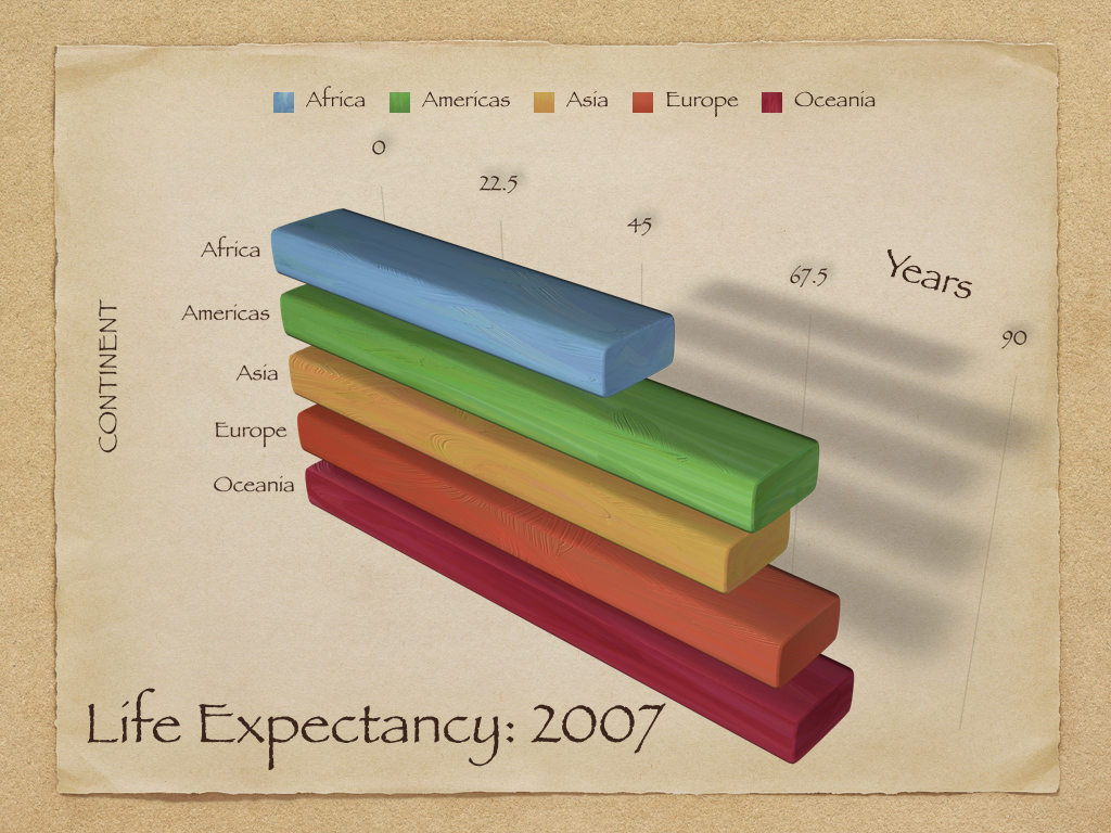
Insights
- Graph illustrates various bad choices
- x-axis: Labelling (0, 22.5, etc.) is unintuitive and hard to grasp
- y-axis: Countries are ordered alphabetically (more difficult decode ranking of contintents)
- Mapping: Continent is mapped both to color and y-axis (only use one mapping per variable!)
- Font: Harder to read and partly capitalized (“CONTINENT”)
- Clutter & jung: Background & shades are unnecessary (too much ink!)
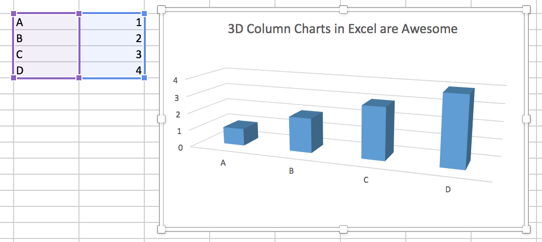
- 3D: Makes it harder to decode the graph, i.e., extract the numerical values that are visualized graph
- Complexity: Graph visualizes 5 numbers.. questionable whether we would need graph for that.
- Notes: Absence of figure notes makes it hard to understand what is shown (e.g., how is life expectancy measured?)
Insights
- Sometimes illustrators may choose memorability/story over interpretability
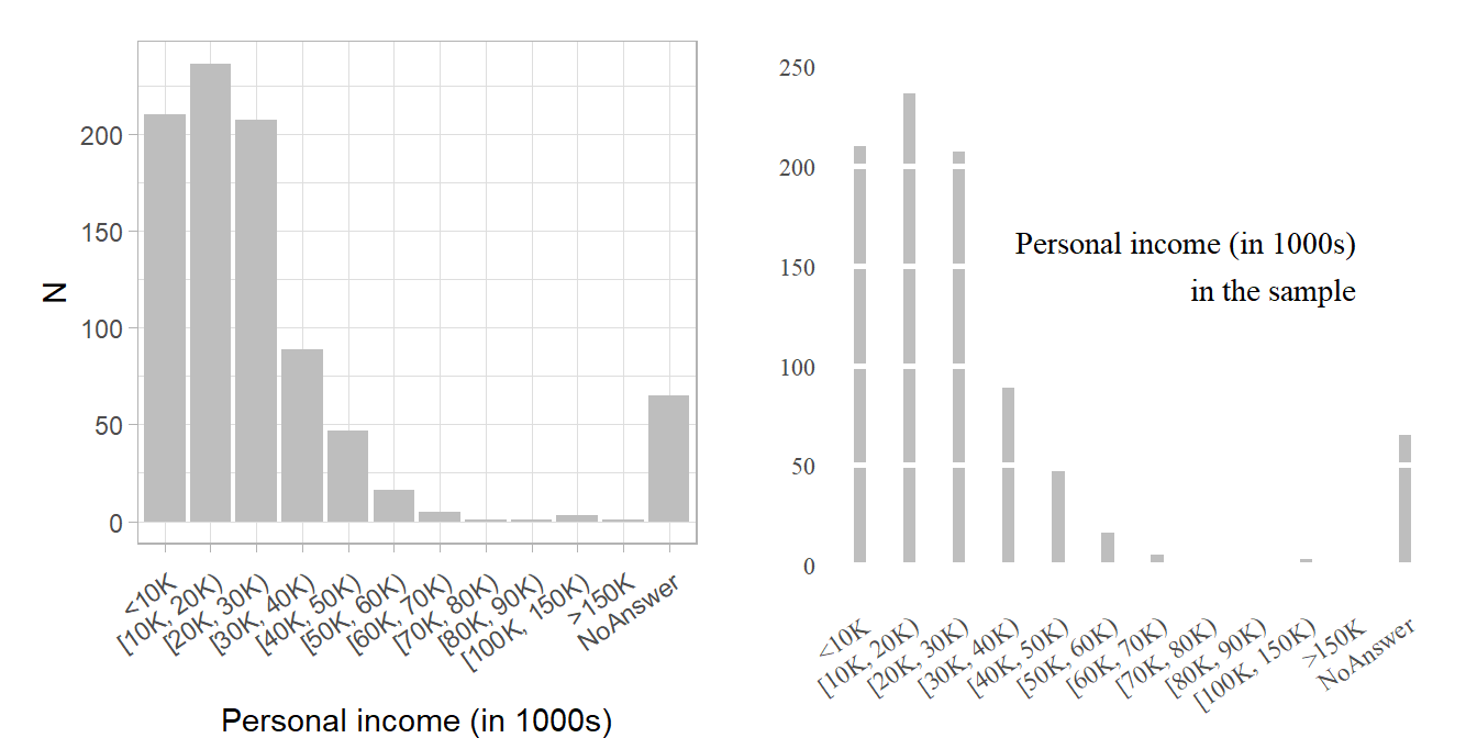
4.2 Bad data!
- “Well-designed figures with little or no junk in their component parts are not by themselves a defence against cherry-picking your data, or presenting information in a misleading way.” (Healy 2018, Ch. 1.2.2)
- See Section 11.2.1 (Tufte on graphical integrity)
Figure 3 and Figure 4 illustrate the relevance of the underlying data.
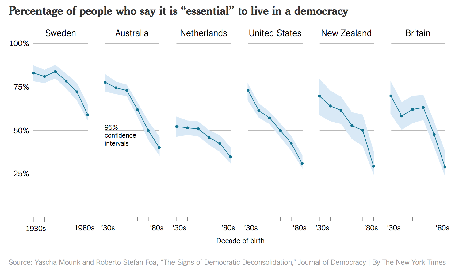
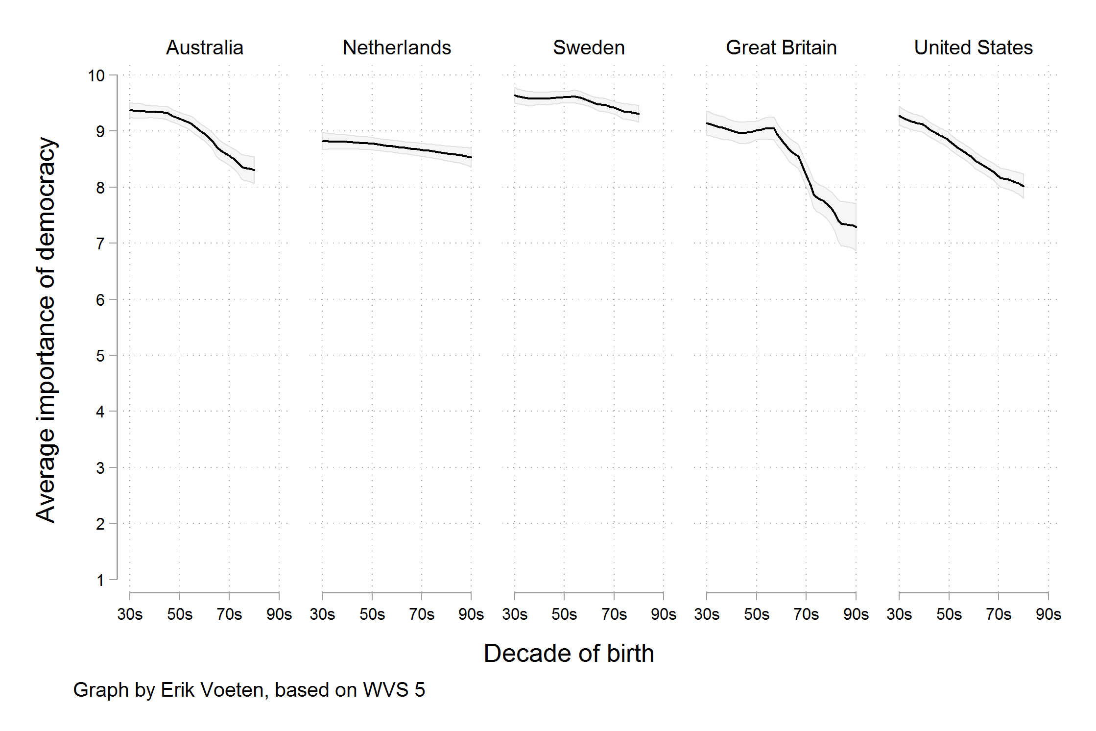
- “Rather, a different measure is being shown. We are now looking at the trend in the average score, rather than the trend for the highest possible answer. Substantively, there does still seem to be a decline in the average score by age cohort, on the order of between half a point to one and a half points on a ten point scale.” (Healy 2018, 9–10)
4.3 Bad perception!
“Visualizations encode numbers in lines, shapes, and colors. That means that our interpretation of these encodings is partly conditional on how we perceive geometric shapes and relationships generally. We have known for a long time that poorly-encoded data can be misleading.” (Healy 2018, Ch. 1.2.3)
Please inpsect Figure 5, Figure 6 and Figure 7: Why are those graphs bad/good/striking?
5 Dataviz caveats
- The collection by data-to-viz.com provides a good overview of data viz caveats caveats
- A few examples
- Alphabetical ordering: Categorical variables often displayed in alphabetical ordering (“Alabama first!” mistake (Wainer 2005)) (e.g., here)
- Overplotting: Too many points may make us fail to see density (e.g., here or here)
- Mappings vs. variables, e.g., country is encoded both on y-axis and through color but only one of two mappings would be necessary
- Homework: Read through the collection of dataviz caveats.. which are the most important ones?
6 Perception & decoding
6.1 Perception & decoding (1)
- “an effective display must be easily encoded and comprehended by the visual information-processing system” (Stephen M. Kosslyn 1989, 192)
- Visual information processing: Perceptual image (1) → Short-term memory (2) → Long-term memory (3) (Stephen M. Kosslyn 1989, 190–91)2
- Decoding, i.e., perception and interpretation involve specific visual tasks
- Data values were encoded or mapped in to the graph, and now we have to get them back out
- Test: Ask questions about your graph.. what value does Europe have? Bigger or smaller than Americas? (cf. Figure 1)
- Data values were encoded or mapped in to the graph, and now we have to get them back out
- Colors matter (color blindness, pick the right ones: colorbrewer, HCL, localization/cultures3)
6.2 Perception & decoding (2)
- Very good discussion in Healy (2018), Chapter 1.3 and 1.4
- “For each graph type, subjects were asked to identify the smaller of two marked segments on the chart, and then to”make a quick visual judgment” estimating what percentage the smaller one was of the larger. As can be seen from the figure, the charts tested encoded data in different ways.” (Source)4
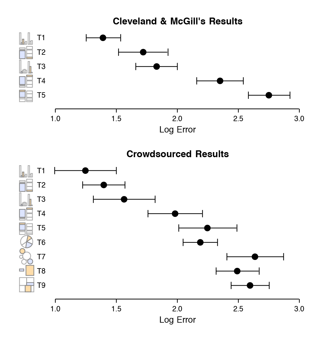
- “The overall pattern of results seems clear, with performance worsening substantially as we move away from comparison on a common scale to length-based comparisons to angles and finally areas. Area comparisons perform even worse than the (justifiably) much-maligned pie chart.” (Healy 2018, 24–25)
7 Tufte: Principles & Concepts
Tufte popularized and discussed different principles/concepts that help us in data visualization such as data-ink (Section 7.2), data-density (Section 7.8), chart-junk (Section 4.1), aesthetics (Section 7.10), graphical excellence (Section 11.1) and graphical integrity (Section 11.2).
7.1 Edward Tufte
- Quotes from his website.
- “One visionary day….the insights of this class lead to new levels of understanding both for creators and viewers of visual displays.” WIRED
- “The Leonardo da Vinci of data.” THE NEW YORK TIMES
- “The Galileo of graphics.” BLOOMBERG
- Tufte provides recommendations/insights across his books
- We’ll mostly focus on “The Visual Display of Quantitative Information” (Tufte 2001)
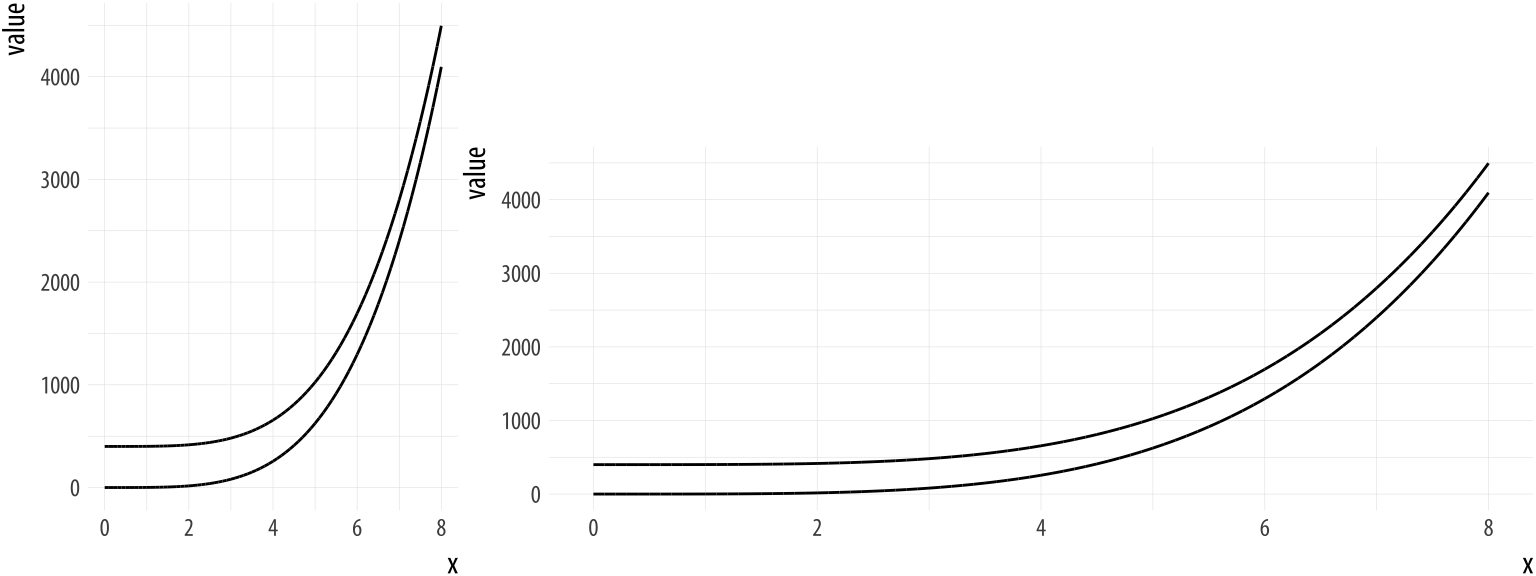
7.2 Data-ink
- Large share of ink on a graphic should present data-information, the ink changing as the data change (Tufte 2001, 2:93)
- Data-ink: Non-erasable core of a graphic, the non-redundant ink arranged in response to variation in the numbers represented (Tufte 2001, 2:93)
- \(\text{Data-ink ratio} = \frac{\text{data-ink}}{\text{total ink used to print the graphic}}\) = proportion of a graphic’s ink devoted to the non-redundant display of data-information = 1.0 - proportion of a graphic that can be erased without loss of data-information (Tufte 2001, 2:93)
- Rule: Maximize the data-ink ratio, within reason (Tufte 2001, 2:96)
- Two Erasing Principles (Tufte 2001, 2:96)
- Erase non-data-ink, within reason
- Erase redundant data-ink, within reason
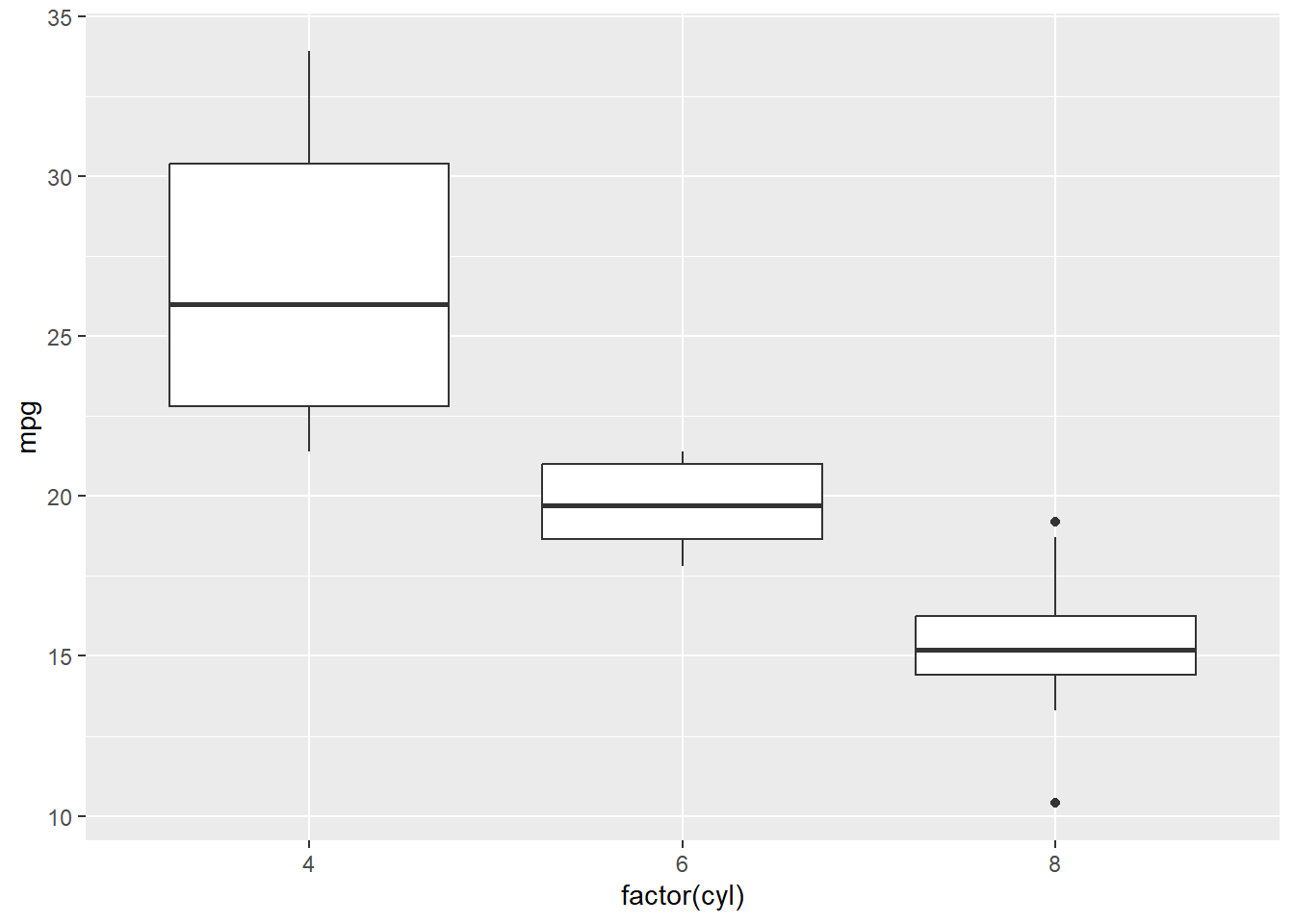
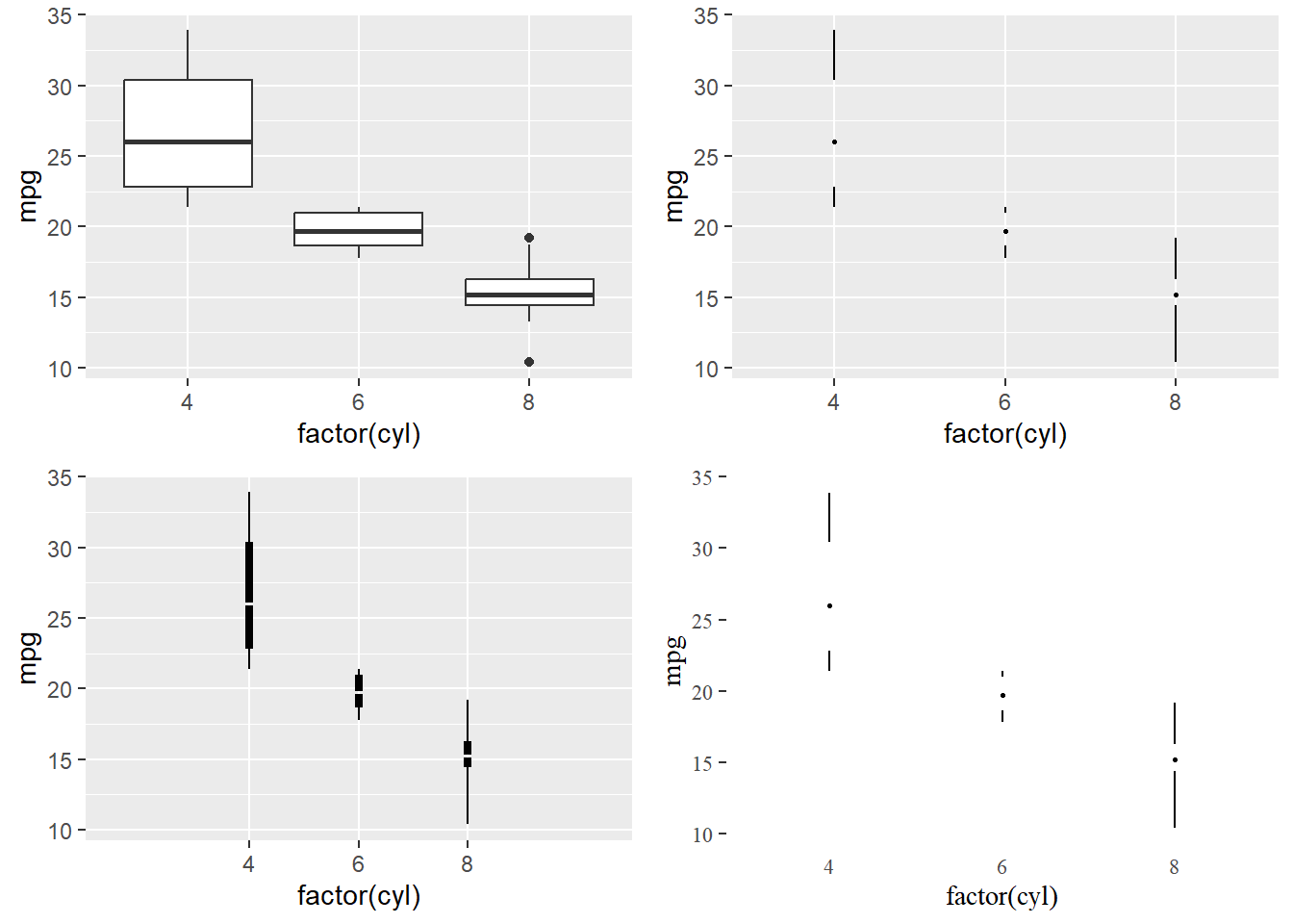
7.3 Data-ink Exercise 1
- Q: How could we change Figure 8) with the aim of erasing non-data-ink (within reason) and erasing redundant data-ink (within reason)? How many datapoints does a boxplot how?5
7.4 Data-ink Exercise 1 (Solution)
- Tufte provides examples in his book and Tufte in R provides R code
- See Figure 9) below
7.5 Data-ink Exercise 2 (skip!)
- Q: How could we change Figure 10) (Bauer and Poama 2020) with the aim of erasing non-data-ink (within reason) and erasing redundant data-ink (within reason)?
7.6 Data-ink Exercise 2 (Solution)
- Q: See Figure 11) below: What is shown? Which ones use less/more data-ink? Which ones do you prefer?8
7.7 Principles
- 5 principles produce substantial changes in graphical design. The principles apply to many graphics and yield a series of design options through cycles of graphical revision and editing. (Tufte 2001, 2:105)
- Above all else show the data.
- Maximize the data-ink ratio.
- Erase non-data-ink.
- Erase redundant data-ink.
- Revise and edit.
7.8 Data density and small multiples (1)
\(\text{Data density of a graphic} = \frac{\text{number of entries in data matrix}}{\text{area of data graphic}}\) (Tufte 2001, 2:168)
Rule: Maximize data density and the size of the data matrix, within reason
- Graphics can be shrunk way down.
- → small multiples
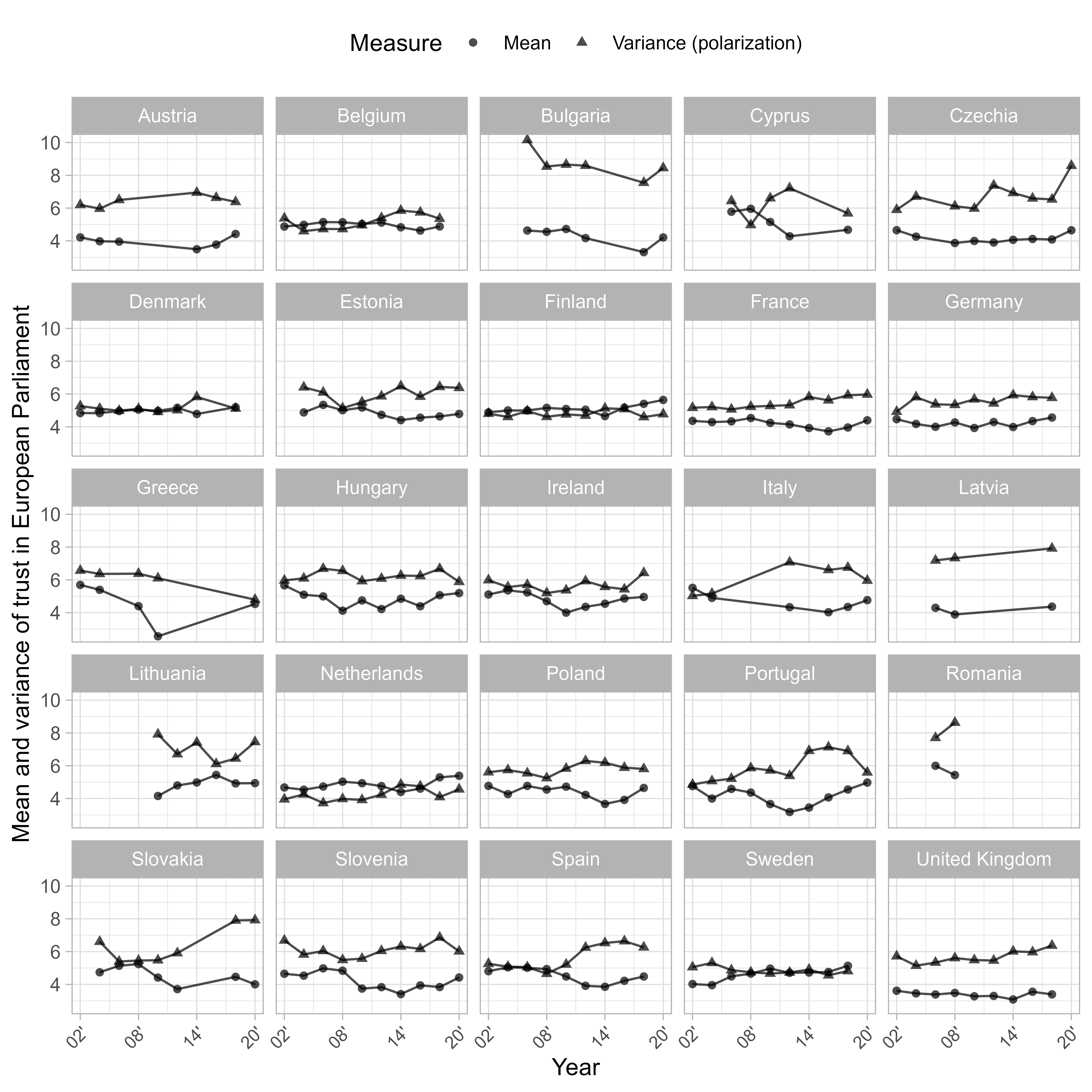
Figure 12, a small-multiples example, was published in Bauer and Morisi (2023).
- Q: How many variables are visualized and on what kind of scales?9
- Figure 14 uses a heatmap to display trends (negative or positive).
7.9 Data density and small multiples (2)
- Tufte (2001, 2:175): “Well-designed small multiples are
- inevitably comparative
- deftly multivariate
- shrunken, high-density graphics
- usually based on a large data matrix
- drawn almost entirely with data-ink
- efficient in interpretation
- often narrative in content, showing shifts in the relationship between variables as the index variable changes (thereby revealing interaction or multiplicative effects ).”
- Small multiples reflect much of the theory of data graphics:
- For non-data-ink, less is more.
- For data-ink, less is a bore. (Tufte 2001, 2:175)
7.10 Aesthetics and Technique in Graphical Design (1)
- Discusses different issues: Choice of design (text vs. table); Combining words & numbers; Proportion & Scale (Line weight and lettering), Shape of graphics (2 \(\times\) 1)11
- Graphical elegance is often found in simplicity of design and complexity of data (Tufte 2001, 2:177)
- “Attractive displays of statistical information
- have a properly chosen format and design
- use words, numbers, and drawing together
- reflect a balance, a proportion, a sense of relevant scale
- display an accessible complexity of detail
- often have a narrative quality, a story to tell about the data
- are drawn in a professional manner, with the technical details of production done with care
- avoid content-free decoration, including chartjunk.” (Tufte 2001, 2:177)
- Examples: Tufte (2001) (Table page 179, Figure 180),
7.11 Aesthetics and Technique in Graphical Design (2)
- Below Tufte (2001, 2:183)’s criteria for a friendly data graphic, i.e., recommendations to make complex things accessible (accessible complexity): We don’t have to agree with everything!
| Friendly | Unfriendly |
|---|---|
| words are spelled out, mysterious and elaborate encoding avoided | abbreviations abound, requiring the viewer to sort through text to decode abbreviations |
| words run from left to right, the usual direction for reading occidental languages | words run vertically, particularly along the Y-axis; words run in several different directions |
| little messages help explain data | graphic is cryptic, requires repeated references to scattered text |
| elaborately encoded shadings, cross-hatching, and colors are avoided; instead, labels are placed on the graphic itself; no legend is required | obscure codings require going back and forth between legend and graphic |
| graphic attracts viewer, provokes curiosity | graphic is repellent, filled with chartjunk |
| colors, if used, are chosen so that the color-deficient and color-blind (5 to 10 percent of viewers) can make sense of the graphic (blue can be distinguished from other colors by most color-deficient people) | design insensitive to color-deficient viewers; red and green used for essential contrasts |
| type is clear, precise, modest; lettering may be done by hand | type is clotted, overbearing |
| type is upper-and-lower case, with serifs | type is all capitals, sans serif |
7.12 Design is choice
- Tufte (2001, 2:191)’s epilogue to his classic
- The theory of the visual display of quantitative information = principles that generate design options and that guide choices among options
- Principles should not be applied rigidly
- Better to violate any principle than to place graceless or inelegant marks on paper
- Greet principles with skepticism
- Search for clear portrayal of complexity. Not the complication of the simple
8 Focusing attention
Based on Nussbaumer Knaflic (2015, Ch. 4).
8.1 Memory
- Three types of memory are important
- Iconic memory (= visual sensory memory): pertains to visual domain and a fast-decaying store of visual information12
- Processes visual information incredibly quickly, influenced by evolutionary adaptations for survival
- Information briefly resides in iconic memory before being transferred to short-term memory, with preattentive attributes13 being crucial for effective visual communication and design.
- Short-term memory: capacity for holding a small amount of information in an active, readily available state for a short interval
- Long-term memory: long-term storage
- e.g., images can help us more quickly recall things stored in our long‐term verbal memory (e.g., picture of Eiffel Tower)
- Strategies for focusing attention concentrate on the iconic memory
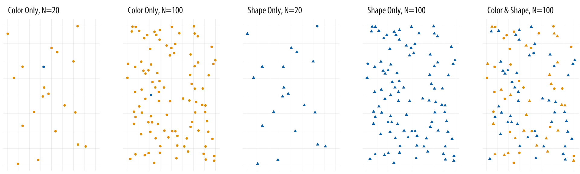
8.2 Preattentive attributes signal where to look
- Try to search for the blue dot and start with the image on the left in Figure 15.
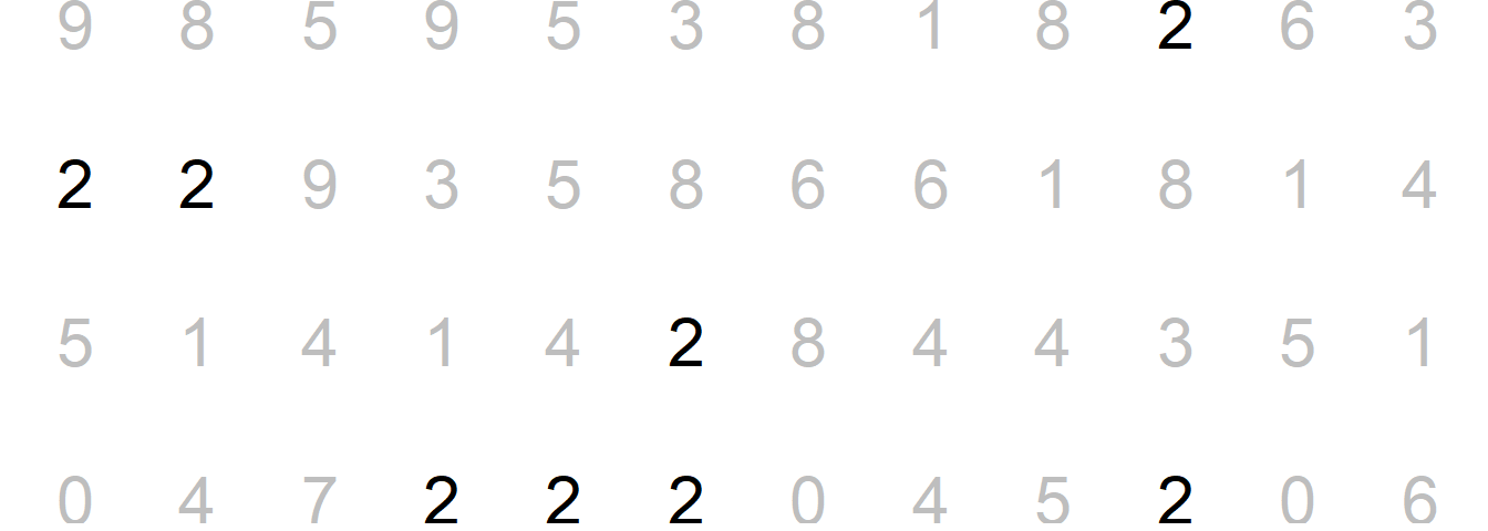
- Nussbaumer Knaflic (2015) use Figure 16 to illustrate the power of preattentive attributes. Please try to count the number of 2s.

Now with a bit of color…
- Now try to do the same exercise again in Figure 17. Has it become easier?
8.3 Preattentive attributes
- Figure 18 by Nussbaumer Knaflic (2015) illustrates preattentive attributes: What are your eyes drawn to (our brains are hardwired to do so)?
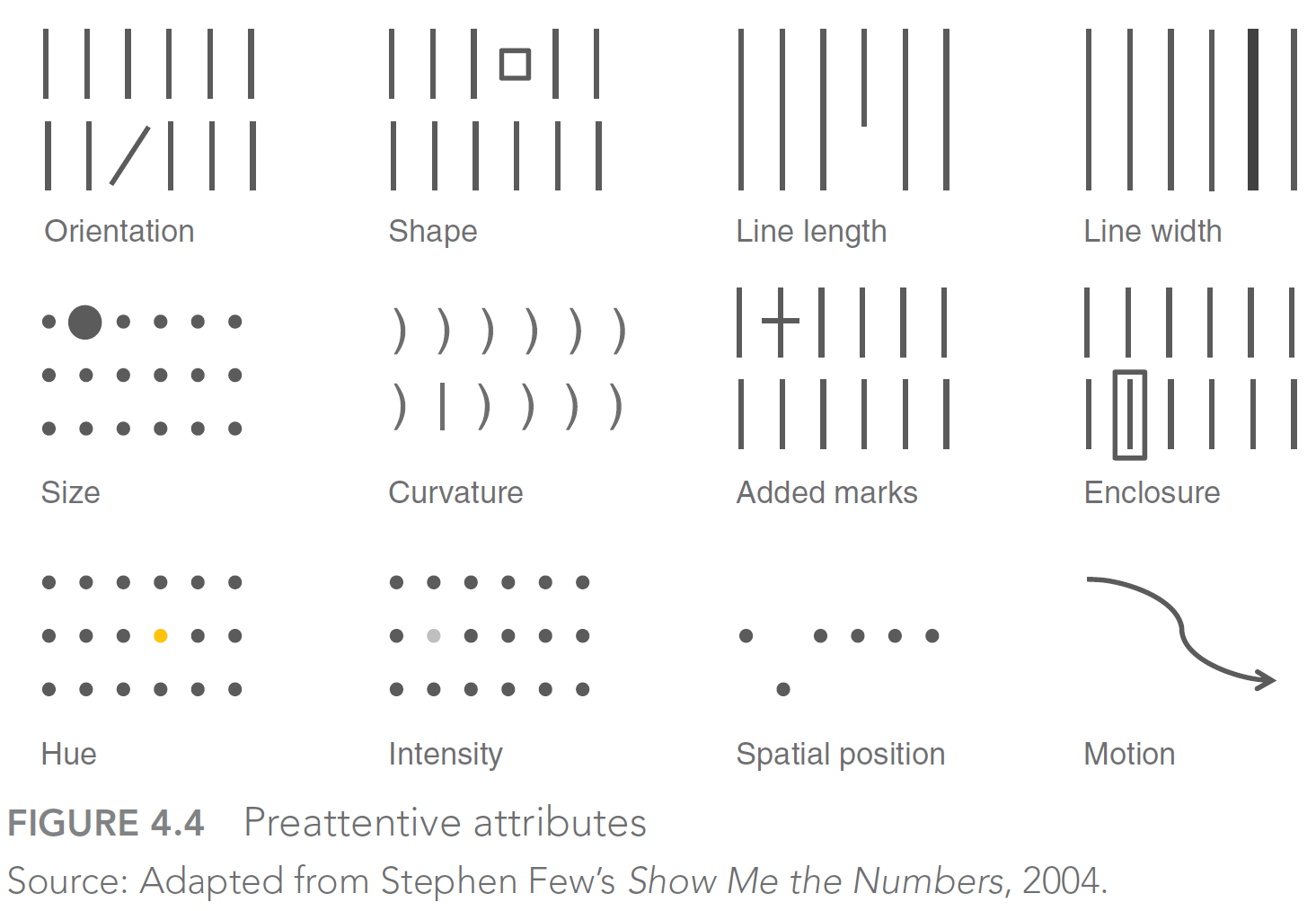
- Nussbaumer Knaflic (2015) also discusses preattentive attributes in text (make sure to use them!)
- Also check out Fig 4.5 in her book.
8.4 Using preattentive attributes in graphs
- Strategy: Push everything in the background → make the data stand out → add marks for data points/numeric labels → reduce markers to the essential
- Fig. 4.7-4.9 (p. 110f) and 4.10 - 4.14 (p. 113f) in Nussbaumer Knaflic (2015) illustrate this strategy
- Warning: Highlighting one aspect makes other things harder to see (Nussbaumer Knaflic 2015, 112)
- Ideally: Give the graph to someone else and ask…
- …what stands out?
- …what main message do you take out?
9 Bauer et al. 2025 insights
- Socius Special Collection: Data Visualization
- “Visualization submissions are evaluated based on two characteristics. First, the visualization should provide a visually appealing display of information following accepted principles of data visualization. The visualization should be self-explanatory without reference to the text.Second, visualizations must illustrate an interesting and worthwhile sociological finding.”
- How should we visualize data? Lessons learned from reviewing high quality graphs in the Socius Special Collection Data Visualization (Link)
- 137 high quality data visualizations published between November 2, 2017 and March 26, 2024
- Rated by 14 raters (~3 raters per visualization)
- 137 high quality data visualizations published between November 2, 2017 and March 26, 2024
- Table 1 in the paper provides the data visualizations with the highest ratings (attractiveness, understandability, innovativeness)
- Let’s check out some less perfect examples
9.1 Visual summary
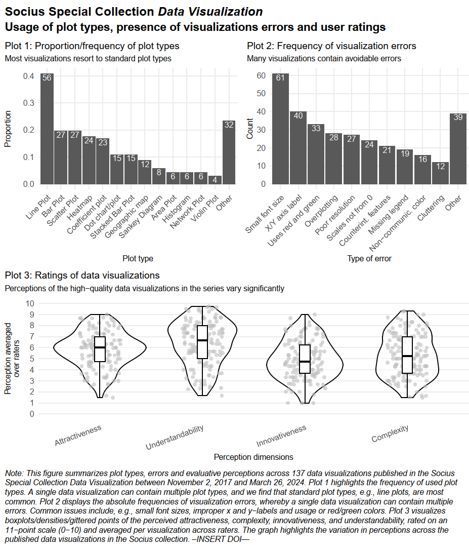
9.2 Insights
- Graph Choice & Innovation
- Subjectivity rules: Ratings depend heavily on the viewer’s background and personal taste, not just objective quality.
- Innovation pays off: Highest-rated graphs often use non-standard formats (e.g., Sankey, network plots) rather than standard charts.
- Complexity trade-off (see Fig. A3-A5): Novelty must balance with clarity; simple, direct presentations often beat complex ones.
- Design & Execution Flaws
- Basic errors persist: Avoidable flaws like poor resolution, tiny fonts, and missing labels are still common.
- Accessibility ignored: Many graphs still use red-green scales, excluding color-blind readers.
- Not standalone: Graphs often fail without the article text (missing notes/sources), making them unshareable on social media.
- Communicating the Message
- Lack of focus: Authors frequently fail to visually highlight the main insight.
- Fix via decluttering: Remove non-critical elements (gridlines/labels) to reduce noise.
- Fix via highlighting: Use active headlines and color to direct attention to the specific story.
- Lack of focus: Authors frequently fail to visually highlight the main insight.
- Audience & Value
- Literacy strategies: Either “dumb down” (use standard bars) or “up-level” (teach the reader how to read the complex graph).
- Two paths to value: A graph should either surprise (challenge existing knowledge) or synthesize (make abstract facts undeniable).
9.3 Checklist
10 Can software or AI save/help us?
- Can software (such as ggplot2) solve those problems?
- ggplot2 = spellchecker: Plot won’t work unless components correctly specified (Wickham 2010, 24–25)
- ggplot2 \(\neq\) grammar checker: Would need to identify common mistakes/warn user (Wickham 2010, 24–25)
- Tools: Default template, default parameters.. but mostly we need education! (Wickham 2010, 25)
- Q: Can AI save/help us? What speaks against using AI?14
- Ideally, explore AI for every step in your data analysis pipeline!
- Image upload since roughly late 2023/early 2024
- Try uploading your data visualization (screenshot including figure notes, titles etc.) and prompting: “What could be improved in this data visualization? Please check for errors.”
- Show example: Seems to miss bad resolution but recognizes small font..
- Evaluate graphs (explore graphs in
www/graphs_with_errorsusing AI) - How could we adapt the prompt above to particular audiences?15
11 Appendix
11.1 Tufte on graphical excellence
11.1.1 Graphical displays should…
- “Excellence in statistical graphics consists of complex ideas communicated with clarity, precision and efficiency” (Tufte 2001, 2:13)
- “Graphics reveal data. Indeed graphics can be more precise and revealing than conventional statistical computations.” (Tufte 2001, 2:13)
- “Graphical displays should:
- show the data
- induce the viewer to think about the substance rather than about methodology, graphic design, the technology of graphic production or something else
- avoid distorting what the data has to say
- present many numbers in a small space
- make large data sets coherent
- encourage the eye to compare different pieces of data
- reveal the data at several levels of detail, from a broad overview to the fine structure
- serve a reasonably clear purpose: description, exploration, tabulation or decoration
- be closely integrated with the statistical and verbal descriptions of a data set.” (Tufte 2001, 2:13)
- Remember the “best graph” ever drawn.
11.1.2 Principals of graphical excellence
- Graphical excellence… (Tufte 2001, vol. 2, chaps. 1, 51)
- …is the well-designed presentation of interesting data - a matter of substance, of statistics, and of design.
- …consists of complex ideas communicated with clarity, precision, and efficiency.
- …is that which gives to the viewer the greatest number of ideas in the shortest time with the least ink in the smallest space.
- …is nearly always multivariate.
- …requires telling the truth about the data.
- Q: Do our plots reflect these ideas?
11.2 Tufte on Graphical integrity
11.2.1 Graphical integrity (1)
- Principles of graphical integrity (Tufte 2001, vol. 2, chaps. 2, 77)
- The representation of numbers, as physically measured on the surface of the graphic itself, should be directly proportional to the numerical quantities represented.
- Clear, detailed, and thorough labeling should be used to defeat graphical distortion and ambiguity. Write out explanations of the data on the graphic itself. Label important events in the data.
- Show data variation, not design variation.
- In time-series displays of money, deflated and standardized units of monetary measurement are nearly always better than nominal units.
- The number of information-carrying (variable) dimensions depicted should not exceed the number of dimensions in the data.
- Graphics must not quote data out of context.
11.2.2 Graphical integrity (2): Example & exercise
- Why No 10’s Covid-19 death toll slides don’t tell the whole story
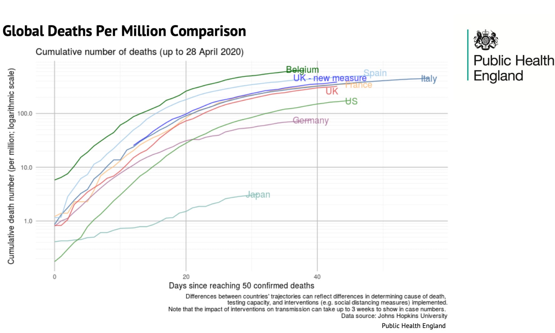
- 1, Figure 21 and Figure 22 are taken from a press briefing by the UK government.
- Q: What’s the intendend message of those graphs? In what way do they violate (or not) principles of graphical integrity/excellence?
.jpg)
11.2.3 Graphical integrity (3): Example & exercise
- “allowed the government to say that, even after adding non-hospital deaths in England to its daily tally, the UK’s rate was below Belgium, Spain and Italy and almost in step with France” (McIntyre and Duncan 2020)
- “the small print under the graphic proved important:”Differences between countries’ trajectories can reflect differences in determining cause of death, testing capacity, and interventions (eg social distancing measures) implemented.” (McIntyre and Duncan 2020)
- The devil was in the detail: the UK’s daily figures only included deaths where the patient tested positive for Covid-19. The Belgian figures included all suspected cases regardless of whether a test was carried out.
- Chart by Guaridan below:
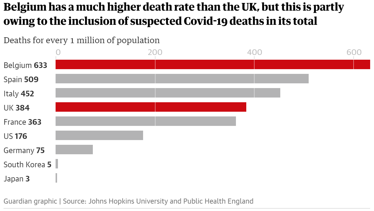
- “if we strip out nursing home deaths in the UK and Belgian, things look a lot different.” (McIntyre and Duncan 2020)
- “A total of 3,419 hospital deaths had been recorded in Belgium by 29 April, or 295 deaths per 1 million population. There were 22,286 hospital deaths in the UK recorded by the same day (excluding those who did not receive a positive test beforehand) or 328 deaths per 1 million population.”; “The deaths each government includes or excludes matter. France includes care home deaths in its total, whereas the UK only includes some care-home deaths as set out above.” (McIntyre and Duncan 2020)
- “The daily death toll figures released by the government are not an accurate reflection of the number of deaths in the UK”
- “Up to 28 April, the figures included only those hospital deaths where a patient had received a positive Covid-19 test. Since 29 April, the figures have included non-hospital deaths in England. Deaths in other settings in the devolved nations were already being counted in the daily government figure.” (McIntyre and Duncan 2020)
- “However, the requirement for a positive test still stands, meaning hundreds of deaths are missing from the daily toll.” (McIntyre and Duncan 2020)
- “confusion as to whether the government figures are per date of reported death or date of actual death – the figures fluctuate day by day which could be due to corrections to the daily totals, making it hard to be sure.” (McIntyre and Duncan 2020)
- “regardless of which metrics are being used, the figures in the bar chart on the government’s screen each day – including its use of a seven-day rolling average – is still not a fair reflection of the current situation.” (McIntyre and Duncan 2020)
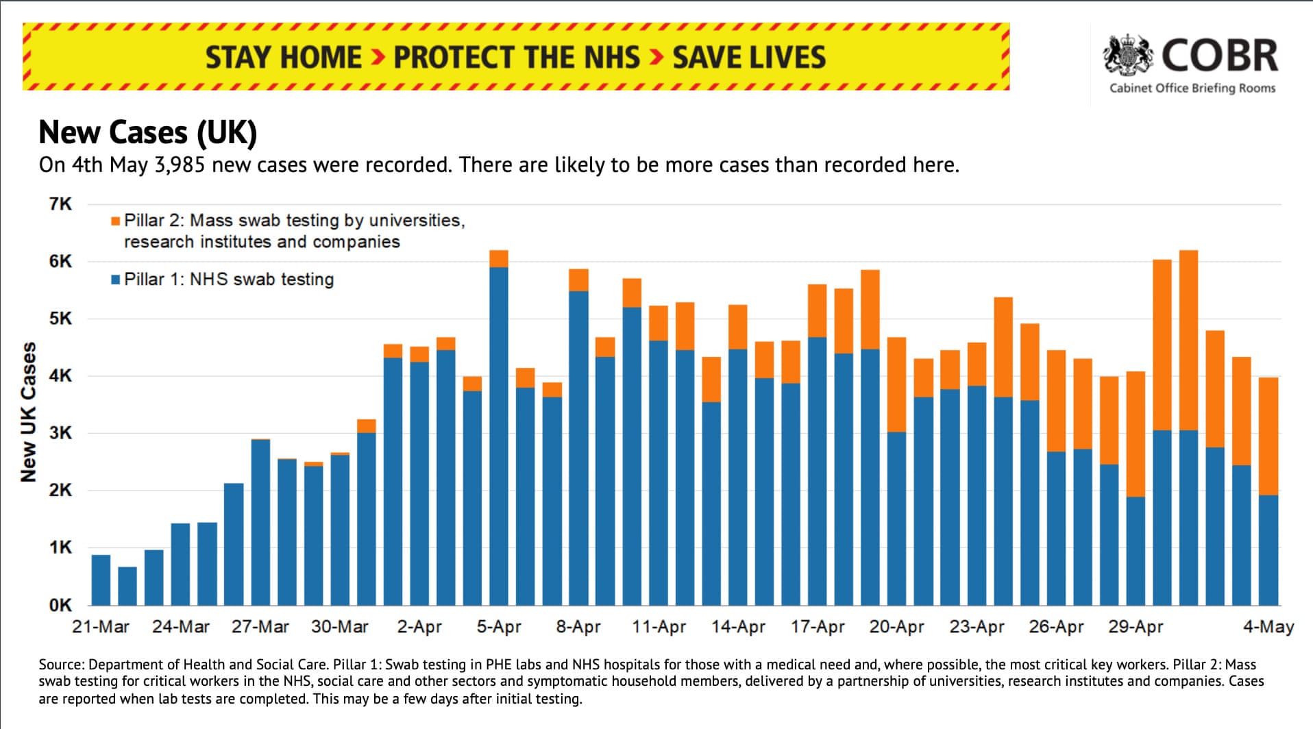
- “The briefing also contains an update on the number of new coronavirus cases confirmed each day. During the 4 May press conference 3,985 new cases were confirmed by lab testing. Despite the nice bar graph, we have no idea how many cases there are in the UK.” (McIntyre and Duncan 2020)
- “Although testing capacity has increased substantially, the UK is nowhere near the widespread”test and trace” strategy recommended by the World Health Organization and followed by other countries such as Germany and South Korea.” (McIntyre and Duncan 2020)
Another recent example (not sure if it’s true…).
- Questions we should always ask…
- How are these things measures (are measures valid)? Was every of the underlying data points measured in the same way?
- What is the time period? Does time correspond to measurement?
References
Bauer, Paul C, and Davide Morisi. 2023. “Has Trust in the European Parliament Polarized?” Socius 9 (January): 23780231231175430.
Bauer, Paul C, and Andrei Poama. 2020. “Does Suffering Suffice? An Experimental Assessment of Desert Retributivism.” PLoS One 15 (4): e0230304.
Cleveland, W S. 1994. “The Elements of Graphing Data.” NJ: Hobart Press.
Healy, Kieran. 2018. Data Visualization: A Practical Introduction. Princeton University Press.
Healy, Kieran, and James Moody. 2014. “Data Visualization in Sociology.” Annu. Rev. Sociol. 40 (July): 105–28.
Kosslyn, Stephen M. 1989. “Understanding Charts and Graphs.” Appl. Cogn. Psychol. 3 (3): 185–225.
Kosslyn, Stephen Michael. 1994. Elements of Graph Design. WH Freeman.
McIntyre, Niamh, and Pamela Duncan. 2020. “Why No 10’s Covid-19 Death Toll Slides Don’t Tell the Whole Story.” The Guardian, May.
Munzert, Simon, and Paul C Bauer. 2013. “Political Depolarization in German Public Opinion, 1980–2010.” Political Science Research and Methods 1 (1): 67–89.
Nussbaumer Knaflic, Cole. 2015. Storytelling with Data: A Data Visualization Guide for Business Professionals. John Wiley & Sons.
Tufte, Edward R. 2001. The Visual Display of Quantitative Information. Vol. 2. Graphics press Cheshire, CT.
Tukey, John W. 1977. Exploratory Data Analysis. Vol. 2. Reading, Massachusetts: Addison-Wesley Publishing.
Wainer, Howard. 2005. Graphic Discovery: A Trout in the Milk and Other Visual Adventures. Princeton University Press.
Wickham, Hadley. 2010. “A Layered Grammar of Graphics.” J. Comput. Graph. Stat. 19 (1): 3–28.
———. 2016. Ggplot2: Elegant Graphics for Data Analysis. Springer.
Footnotes
Prompt(s): (1) I want to create 4 different images that illustrate in what contexts graphs are used and consumed. 1 image where a person looks at a graph in the metro on their smartphone (see attached example), 1 image were a person presents a graph in a presentation in front of people, 1 image were a person looks at a graph in a scientific paper, 1 image where a person presents a graph in a zoom call. (2) Can you combine the four images as four tiles in one image?↩︎
A graph that is stored in my long-term memory: Korrektur der Nationalfarben (Brehmer).↩︎
Colors may have different effects and meanings across cultures.↩︎
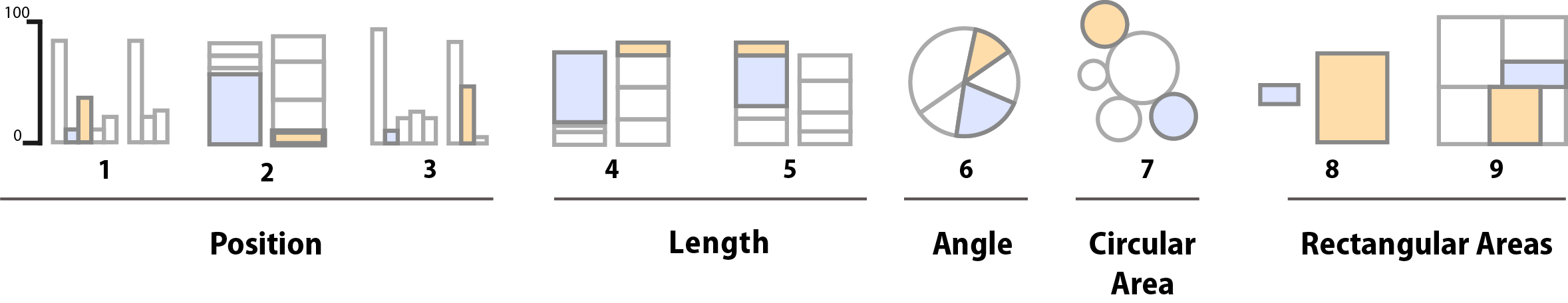
“Types 1-3 use position encoding along a common scale while Type 4 and 5 use length encoding. The pie chart encodes values as angles, and the remaining charts as areas, either using circular, separate rectangles (as in a cartogram) or sub-rectangles (as in a treemap).”↩︎
Minimum: The lowest data point (excluding outliers). First Quartile (Q1): The value below which 25% of your data falls. Median: The middle value of your dataset (the 50th percentile). Third Quartile (Q3): The value below which 75% of your data falls. Maximum: The highest data point (excluding outliers). Points that are statistically unusually high or low (typically 1.5 times the Interquartile Range beyond the quartiles) are usually plotted as individual dots or asterisks beyond the “whiskers.”↩︎
See Tufte (2001, 2:123ff) for analogue graphs.↩︎
“The grey background gives the plot a sim-ilar typographic colour to the text, ensuring that the graphics fit in with theflow of a document without jumping out with a bright white background. Finally, the grey background creates a continuous field of colour which ensures that the plot is perceived as a single visual entity” (Wickham 2016, 172).↩︎
See Tufte (2001, 2:123ff) for analogue graphs.↩︎
4 variables: x-scale = year (ratio); y-scale = value of mean AND value of variance (2 variables) (ratio); Facets = country (categorical); 25 countries * ~20 measurement values per country = 500; For some countries fewer measurement values↩︎
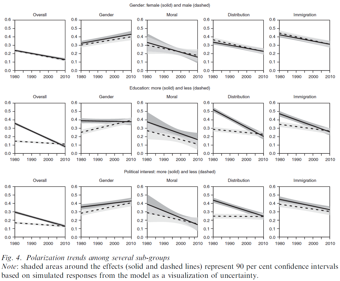
Figure 4 provides an overview of the estimated trends. All figures visualize results from multilevel models based on the same logic as the models presented above. Both intercepts and slopes are allowed to vary for each sub-group. Models visualized under the label ‘Overall’ display the average trend across all attitude scales and are specified in Model A. The four other panels under each sub-group distinguish between issue dimensions-that is, they report results from Model C specification. While each of the figures may tell its own complex story—and should be the subject of greater study in the future—our focus is on general patterns. Levels and trends differ considerably between certain sub-groups, but not between all. We want to point out the findings we regard as the most illuminating. Regarding the overall trend (Column 1), there are no significant differences for sub- populations of gender, income and religious groups. However, the overall decreasing trend is much stronger among highly educated, highly interested people, and somewhat stronger among respondents from West Germany. The trend of increasing polarization on the gender dimension (Column 2) is similar across most sub-populations. Only the difference between the more and less educated is striking. Whereas the more educated display no increase (or a decrease) in attitude alignment, the increase in polarization seems to take place among the less educated on this dimension. Concerning the moral dimension (Column 3), the plots reveal a general decreasing trend of polarization across several sub-populations. On the distribution dimension (Column 4) , we again find significant differences between sub-populations of education, political interest and respondents from West and East Germany. In contrast, trends are similar among the other sub-populations. On the immigration dimension (Column 5) , trends are similar across most sub-populations .↩︎
“Visual preferences for rectangular proportions have been studied by psychologists since 1860, but, even given the implausible assumption that such studies are relevant to graphic design, the findings are hardly decisive. A mild preference for proportions near to the Golden Rectangle is found among those taking part in the experiments, but the preferred height/length ratios also vary a great deal” (Tufte 2001, 2:190).↩︎
“The mental representation of the visual stimuli are referred to as icons (fleeting images.) Iconic memory was the first sensory store to be investigated with experiments dating back as far as 1740. One of the earliest investigations into this phenomenon was by Ján Andrej Segner, a German physicist and mathematician. In his experiment, Segner attached a glowing coal to a cart wheel and rotated the wheel at increasing speed until an unbroken circle of light was perceived by the observer. He calculated that the glowing coal needed to make a complete circle in under 100ms to achieve this effect, which he determined was the duration of this visual memory store. In 1960, George Sperling conducted a study where participants were shown a set of letters for a brief amount of time and were asked to recall the letters they were shown afterwards. Participants were less likely to recall more letters when asked about the whole group of letters, but recalled more when asked about specific subgroups of the whole. These findings suggest that iconic memory in humans has a large capacity, but decays very rapidly.” (Wikipedia)↩︎
Preattentive attributes are visual features like color, size, shape, position, and movement that the human brain processes instantly and unconsciously, allowing us to quickly spot differences, patterns, or important information without focused effort.↩︎
Trust, privacy/sensitivity, dependency↩︎
“I want to show this chart at a conference of Sankey Chart enthusiasts.”; “I want to show this chart in the first week of a Bachelor statistics lecture.”↩︎