# Load necessary packages
    # install.packages("synthpop")
    library(datasets)
    library(synthpop)
    library(readr)

# Load the dataset
    data <- swiss # load your own dataset here

# View the original swiss dataset
    head(data)

# Generate synthetic data to anonymize the original dataset
# The syn function will generate synthetic data while preserving the structure and statistical properties
    synth_data <- syn(data)

# View the synthetic data
    head(synth_data$syn)

# Replace the original data with the synthetic data
    data <- synth_data$syn

# Display to copy/paste
dataUsing LLMs for data visualization
Chapter last updated: 09 December 2025
0.1 Avaible LLMs
- Closed-source
- ChatGPT X (OpenAI, ~Microsoft): https://chat.openai.com/
- Gemini (Google) https://gemini.google.com/
- Amazon Titan: https://aws.amazon.com/bedrock/titan/
- Open-source (or both)
- HuggingChat: https://huggingface.co/chat/ (121 models, 9.12.2025)
- Interfaces that provide both: https://ai-openwebui.gesis.org/ (something similar at the MPI?)
- LMSYS Chatbot Arena Leaderboard
0.2 Some of the risks
- Data Security Risk
- Pitfall: Data Leakage (PII, confidential data).
- Action: Never paste sensitive data; use dummy data or structural metadata only.
- Code Integrity Risk
- Pitfall: Subtle bugs, statistical errors, or inefficiency in generated code.
- Action: Review, test, and validate all code before running it.
- Interpretation Risk
- Pitfall: Statistical Hallucinations (confident but false explanations).
- Action: Do not rely on LLMs for final interpretation; trust your statistical knowledge.
- Context/Domain Risk
- Pitfall: Flawed Analytical Strategy due to lack of domain expertise.
- Action: The user must define the problem, variables, and overall approach.
- Data Quality Risk
- Pitfall: Data Integrity issues from blind cleaning (outlier removal, imputation).
- Action: Always inspect data before and after LLM-suggested preprocessing.
- Performance Risk
- Pitfall: Context Window limits lead to performance degradation and ‘forgetfulness.’
- Action: Only share data structure (column names/types), not large datasets.
0.3 Hallucination..
- Attention: Always cross-validate the information given by a LLM
- Why? Hallucination.. (see characterization statements on Wikipedia)
- “a tendency to invent facts in moments of uncertainty” (OpenAI, May 2023)
- “a model’s logical mistakes” (OpenAI, May 2023)
- fabricating information entirely, but behaving as if spouting facts (CNBC, May 2023)
- “making up information” (The Verge, February 2023)
- Why? Hallucination.. (see characterization statements on Wikipedia)
- Very good overview on Wikipedia
- Discussions in Zhang et al. (2023), Huang et al. (2023) and Metz (2023)
0.4 Useful prompts
| Objective | Prompt |
|---|---|
| Get simple code example | I have a dataset called “data” that includes the continuous variable age. Please provide me with ggplot code to produce a histogram. |
| Get simple code example | Please provide ggplot code to produce a histogram for the variable age. + paste output of summary(data) |
| Correct coding errors | The ggplot code below gives me the following error. Please correct the error. + code of graph + copy of error message |
| Get feedback on a graph | What could be improved in this data visualization? Can you identify any errors?. + Paste graph |
| Explain code | Please explain the code (add comments to the code). + paste the code |
| Change details of a graph | I want to change the x-axis lables (angle 50%). |
| Explore plot types | What plot types could I use to visualize the variables Fertility, Agriculture and Catholic? Please provide examples of plots. + paste output of summary(data) |
| Explore/suggest plot types | I want to visualize the relationship between Catholic and Fertility. What options do I have? Please provide different graph types. + Paste dataset (e.g., native swiss dataset in R) |
| Explore complex plotting problems | How can I ideally visualize a linegraph where the two lines are perfectly overlapping each other but I want to visualize just that. |
| Update old code examples | How can I translate the code below when I want to use the sf package in R instead of rgdal? readOGR(dsn=“www/data”, layer=“VG250_GEM”, encoding = “ASCII”, verbose = FALSE) |
| Create an interactive dashboard | Please create an interactive dashboard for the data below. Please link the data in the different graphs. + Paste dataset (e.g., native swiss dataset in R or synthetic dataset) |
Copy style of a graph | Plot1.png contains my plot and I pasted the code below. Please adapt the code so that the plot is styled like Plot2.png + Paste/upload Plot1.png and Plot2.png |
1 Example: Create synthetic data
The code below creates a synthetica dataset that can be directly copied from the console into an LLM, e.g., Gemini.
2 Example: Copying a plot for your own (sensitive) data
The prompt(s)/code below creates synthetic data and then attempts to generate code to a graph that has been copied from somewhere else.
Load the data into R (here we use the preloaded
swissdataset)Create synthetic data using the code below (package description and shiny app)
- “We do not recommend using it for data sets with fewer than around 500 observations because a small data set will not provide enough information about relationships between many variables.” (Source
# Load necessary packages
    # install.packages("synthpop")
    library(datasets)
    library(synthpop)
    library(readr)

# Load the dataset
    data <- swiss # load your own dataset here

# View the original swiss dataset
    head(data)

# Generate synthetic data to anonymize the original dataset
# The syn function will generate synthetic data while preserving the structure and statistical properties
    synth_data <- syn(data)

# View the synthetic data
    head(synth_data$syn)

# Replace the original data with the synthetic data
    data <- synth_data$syn

# View the modified dataset to ensure it has been replaced correctly
    head(data)

# Save the new dataset locally
write_csv(data, "data_fake.csv")- Upload
data_fake.csvand screenshotted Figure 1 (this is just an example) into ChatGPT4o.
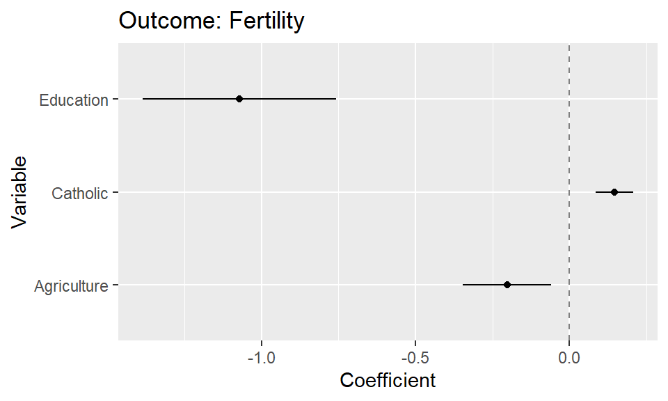
- Use the following prompt. If the plot is not based on that particular dataset, i.e., include the variable names of the dataset, you may have to also add which variables should be mapped in which way.
I uploaded a dataset and a plot. Please provide me the R code that I need to produce that plot based on the data in one code chunk.
- As a follow-up you can refine the plot code through prompts (“Please omit the intercept from the plot”).
References
Huang, Lei, Weijiang Yu, Weitao Ma, Weihong Zhong, Zhangyin Feng, Haotian Wang, Qianglong Chen, et al. 2023. “A Survey on Hallucination in Large Language Models: Principles, Taxonomy, Challenges, and Open Questions,” November. https://arxiv.org/abs/2311.05232.
Metz, Cade. 2023. “Chatbots May ‘Hallucinate’ More Often Than Many Realize.” The New York Times, November.
Zhang, Yue, Yafu Li, Leyang Cui, Deng Cai, Lemao Liu, Tingchen Fu, Xinting Huang, et al. 2023. “Siren’s Song in the AI Ocean: A Survey on Hallucination in Large Language Models,” September. https://arxiv.org/abs/2309.01219.