| Fertility | Agriculture | Examination | Education | Catholic | Infant.Mortality | |
|---|---|---|---|---|---|---|
| Courtelary | 80.2 | 17.0 | 15 | 12 | 9.96 | 22.2 |
| Delemont | 83.1 | 45.1 | 6 | 9 | 84.84 | 22.2 |
| Franches-Mnt | 92.5 | 39.7 | 5 | 5 | 93.40 | 20.2 |
| Moutier | 85.8 | 36.5 | 12 | 7 | 33.77 | 20.3 |
| Neuveville | 76.9 | 43.5 | 17 | 15 | 5.16 | 20.6 |
| Porrentruy | 76.1 | 35.3 | 9 | 7 | 90.57 | 26.6 |
Visualizing statistical models
Chapter last updated: 09 December 2025
- Learning outcomes: Learn how to…
- …efficiently extract model parameters, e.g., coefficients.
- …use coefficient plots.
- …use nested dataframes.
- (Update: Marginal/interaction plot)
Sources: Original material; Wickham (2010)
1 Data
- Here we will work with the ‘famous’ swiss data set (
?swiss)
2 Packages & functions
- Objective: Summarize results in graphs instead of unreadable tables
- Modelling results: Stored in model objects (Extract with
modelname$...) - Approach 1 (I prefer this one!): Estimate models and extract estimates/predictions from model objects using
broompackage and visualizebroom::tidy(...): Use the tidy function to extract estimates etc.conf.int = TRUE, conf.level = 0.95: Add arguments to calculate confidence intervalsbroom::augment(...): Generate & extract predictions
- Approach 2: Use plotting functions that directly plot estimates from model objects
- e.g., sjPlot package package
- Additional functions
geom_linerange(): Plot a line for an intervalcoord_flip(): Flip a plot
3 Extracting coefficients
(Intercept)    Catholic Agriculture   Education
86.2250198 0.1452013 -0.2030377 -1.0721468 (Intercept) Catholic Agriculture Education
86.2250198 0.1452013 -0.2030377 -1.0721468 | term | estimate | std.error | statistic | p.value | conf.low | conf.high |
|---|---|---|---|---|---|---|
| (Intercept) | 86.2250198 | 4.7347179 | 18.211226 | 0.0000000 | 76.6765511 | 95.7734885 |
| Catholic | 0.1452013 | 0.0301466 | 4.816504 | 0.0000184 | 0.0844049 | 0.2059978 |
| Agriculture | -0.2030377 | 0.0711516 | -2.853591 | 0.0066235 | -0.3465286 | -0.0595467 |
| Education | -1.0721468 | 0.1558018 | -6.881477 | 0.0000000 | -1.3863512 | -0.7579425 |
4 Coefficient plots
- Here we will work with the ‘famous’ swiss data set (
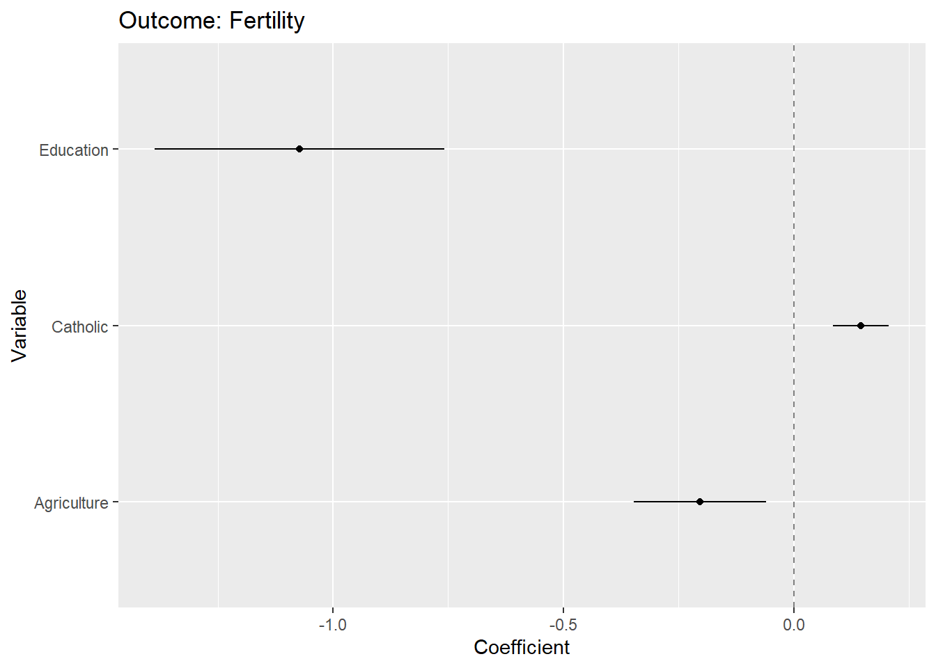
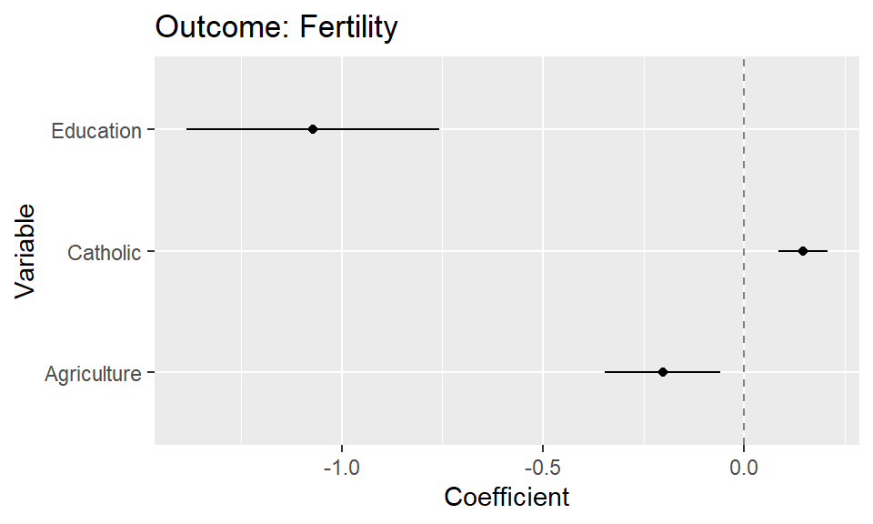
?swiss) - Figure 1 below provides a simple coefficient plot.
- Questions:
- What does the graph show? What are the underlying variables (and data)?
- How many scales/mappings does it use? Could we reduce them?
- What do you like, what do you dislike about the figure? What is good, what is bad?
- What kind of information could we add to the graph (if any)?
- How would you approach a replication of the graph?
4.1 Lab: Data & code
- Learning objectives
- How to plot the results of statistical models
- How to use the broom package/tidy function to extract coefficients
- How to plot different confidence intervals
We start by preparing the data, i.e., estimating the model and extracting the coefficients of interest. Importantly, the table you see below is all you need as a basis for the ggplot functions.
library(broom)
fit <- lm(Fertility ~ Catholic + Agriculture + Education, data = swiss) # see ?swiss
data_coefs <- tidy(fit, conf.int = TRUE, conf.level = 0.95)

data_coefs <- data_coefs %>%
           rename(Variable = term,
                  Coefficient = estimate,
                  SE = std.error) %>%
           filter(Variable != "(Intercept)")

data_coefs <- data_coefs %>% select(-SE,
                              -statistic,
                              -p.value)

data_coefs %>% kable("html") %>% kable_styling(font_size = 10)| Variable | Coefficient | conf.low | conf.high |
|---|---|---|---|
| Catholic | 0.1452013 | 0.0844049 | 0.2059978 |
| Agriculture | -0.2030377 | -0.3465286 | -0.0595467 |
| Education | -1.0721468 | -1.3863512 | -0.7579425 |
Subsequently, we feed those estimates into the ggplot function.
geom_point(),geom_linerange(): Plot estimates and intervalsgeom_hline(): Plot 0 linecoord_flip(): Flip the plot
4.2 Exercise
- Use the code from above but change the model for which you generate the coefficient plot.
- Visualize a coefficient plot in which the outcome variable is
Infant.Mortalityinstead ofFertility. - And add an additional explanatory variable, namely
Examination.
- Visualize a coefficient plot in which the outcome variable is
- Try to reduce the ink that is used in the plot above.
- Change the confidence level of the confidence intervals to 80%.
Exercise solution
library(broom)
fit <- lm(Infant.Mortality ~ Catholic + Agriculture + Education + Examination, data = swiss) # see ?swiss
data_coefs <- tidy(fit, conf.int = TRUE, conf.level = 0.80)

data_coefs <- data_coefs %>%
           rename(Variable = term,
                  Coefficient = estimate,
                  SE = std.error) %>%
           filter(Variable != "(Intercept)")

ggplot(data_coefs, aes(x = Variable, y = Coefficient)) +
        geom_hline(yintercept = 0, colour = gray(1/2), lty = 2) +
        geom_point(aes(x = Variable,
                    y = Coefficient)) +
        geom_linerange(aes(x = Variable,
                     ymin = conf.low,
                     ymax = conf.high),
                   lwd = 0.5) +
        ggtitle("Outcome: Infant Mortality") +
        coord_flip() +
                theme_light()
4.3 Exercise (skip): Higlighting things to focus attention
- Below a quick example of how we could highlight certain coefficients in a coefficient plot. In practice it might be helpful to add annotations in the graph. Please inspect Figure 2 and use the code below, but this time try to produce Figure 3 where only the coefficient of Catholic is highlighted.
- Data in the graph can be colored by simply adding additional
geomson top. - In order to change the color of words you need to use
<span style='color:orange;'>...</span>in combination withtheme(plot.title = element_markdown()).
- Data in the graph can be colored by simply adding additional
library(broom)
library(ggtext)
fit <- lm(Fertility ~ Catholic + Agriculture + Education, data = swiss) # see ?swiss
data_coefs <- tidy(fit, conf.int = TRUE, conf.level = 0.95)

data_coefs <- data_coefs %>%
           rename(Variable = term,
                  Coefficient = estimate,
                  SE = std.error) %>%
           filter(Variable != "(Intercept)")

data_coefs <- data_coefs %>% select(-SE, -statistic, -p.value)

ggplot(data_coefs, aes(x = Variable, y = Coefficient)) +
        geom_hline(yintercept = 0, colour = gray(1/2), lty = 2) +
        geom_point(aes(x = Variable,
                    y = Coefficient)) +
        geom_linerange(aes(x = Variable,
                     ymin = conf.low,
                     ymax = conf.high),
                   lwd = 0.5) +
        geom_point(data = data_coefs %>% filter(Variable=="Education"|Variable=="Agriculture"),
                             aes(x = Variable,
                    y = Coefficient),
                             color = "orange") +
        geom_linerange(data = data_coefs %>% filter(Variable=="Education"|Variable=="Agriculture"),
                                     aes(x = Variable,
                     ymin = conf.low,
                     ymax = conf.high),
                   lwd = 0.5,
                                     color = "orange") +
        geom_point(data = data_coefs %>% filter(Variable=="Catholic"),
                             aes(x = Variable,
                    y = Coefficient),
                             color = "blue") +
        geom_linerange(data = data_coefs %>% filter(Variable=="Catholic"),
                                     aes(x = Variable,
                     ymin = conf.low,
                     ymax = conf.high),
                   lwd = 0.5,
                                     color = "blue") +
        labs(title = "<span style='color:orange;'>Education, Agriculture</span> have a negative effect as<br>opposed to <span style='color:blue;'>Catholic.</span>") +
        coord_flip() +
        theme(plot.title = element_markdown())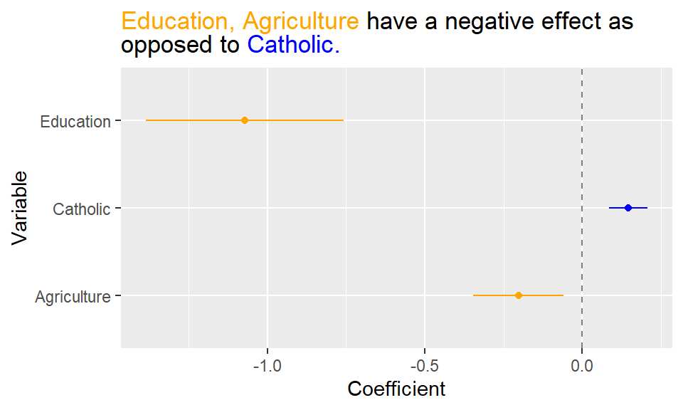

Exercise solution
library(broom)
library(ggtext)
fit <- lm(Fertility ~ Catholic + Agriculture + Education, data = swiss) # see ?swiss
data_coefs <- tidy(fit, conf.int = TRUE, conf.level = 0.95)

data_coefs <- data_coefs %>%
           rename(Variable = term,
                  Coefficient = estimate,
                  SE = std.error) %>%
           filter(Variable != "(Intercept)")

data_coefs <- data_coefs %>% select(-SE, -statistic, -p.value)

ggplot(data_coefs, aes(x = Variable, y = Coefficient)) +
        geom_hline(yintercept = 0, colour = gray(1/2), lty = 2) +
        geom_point(aes(x = Variable,
                    y = Coefficient)) +
        geom_linerange(aes(x = Variable,
                     ymin = conf.low,
                     ymax = conf.high),
                   lwd = 0.5) +
        geom_point(data = data_coefs %>% filter(Variable=="Catholic"),
                             aes(x = Variable,
                    y = Coefficient),
                             color = "red") +
        geom_linerange(data = data_coefs %>% filter(Variable=="Catholic"),
                                     aes(x = Variable,
                     ymin = conf.low,
                     ymax = conf.high),
                   lwd = 0.5,
                                     color = "red") +
        labs(title = "<span style='color:red;'>Catholic</span> has a positive effect.") +
        coord_flip() +
        theme(plot.title = element_markdown())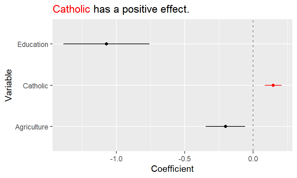
5 Coefficient plots with facetting & nesting
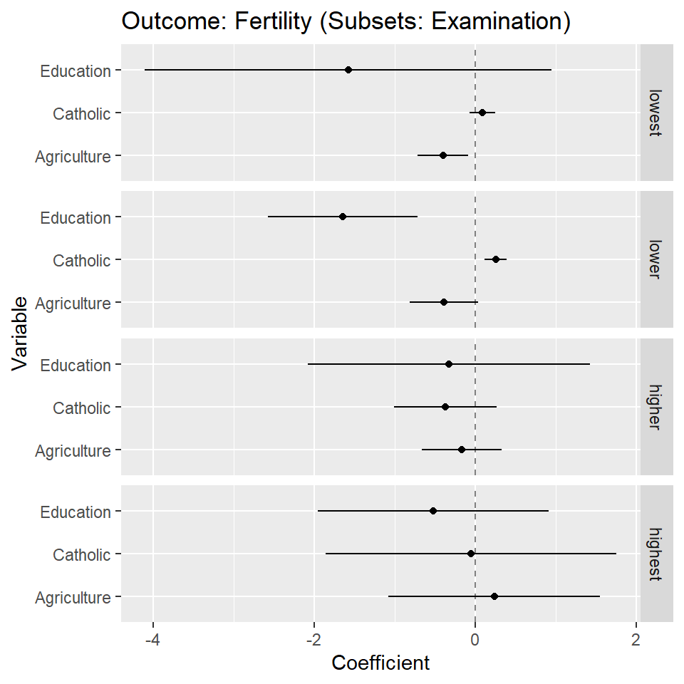
- Figure 4 below provides a coefficient plot for subsets/facets of the data.
- Questions:
- What does the graph show? What are the underlying variables (and data)?
- How many scales/mappings does it use? Could we reduce them?
- What do you like, what do you dislike about the figure? What is good, what is bad?
- What kind of information could we add to the graph (if any)?
- How would you approach a replication of the graph?
5.1 Lab: Data & code
- Learning objectives
- How to estimate models in data subsets using
nest()andmap()and work with nested dataframes - How to plot the results of statistical models accross data subsets (using faceting)
- How to use the broom package/tidy function to extract coefficients
- How to estimate models in data subsets using
Data preparations are somewhat more complicated when we want to show facets. We work with nested dataframes, as well as model results that are nested in a dataframe.
We proceed in several steps:
- We split the dataset into subsets according to values of
Examination_catusing thenest()function. - We estimate the linear models in those subsets (see
map(..lm(...))). - We tidy the estimations as to obtain a nice dataframe.
- We estimate confidence intervals also obtaining nice dataframes (see
map(fit, conf.level = 0.90, confint_tidy)). - We rename the vars in the confidence intervals dataframes (see
rename_all(...)). - We
unnest()the data obtaining one dataframe that contains the estimates and intervals across all subsets. - Finally, we filter the intercepts in those estimations and the result is shown in Table 1.
# Create categorical examination variable
swiss <- swiss %>%
  mutate(Examination_cat = cut(Examination,
    breaks = quantile(Examination, probs = seq(0, 1, 0.25)),
    labels = c("lowest", "lower", "higher", "highest")
  ))
# table(swiss$Examination, swiss$Examination_cat)


data_plot <- swiss %>%
  filter(!is.na(Examination_cat)) %>%
  nest(data = c(Fertility, Agriculture, Examination, Education, Catholic, Infant.Mortality)) %>%
  mutate(
    fit = map(data, ~ lm(Fertility ~ Catholic + Agriculture + Education, data = .))) %>%
    mutate(data_coefs = map(fit, ~tidy(.x, conf.int = TRUE, conf.level = 0.99))) %>%
  unnest(c(data_coefs)) %>%
  rename(
    Variable = term,
    Coefficient = estimate,
    SE = std.error
  ) %>%
  filter(Variable != "(Intercept)") %>%
  select(
    Examination_cat,
    Variable,
    Coefficient,
    conf.low:conf.high
  )

data_plot %>%
    kable("html") %>%
kable_styling(font_size = 11)| Examination_cat | Variable | Coefficient | conf.low | conf.high |
|---|---|---|---|---|
| lower | Catholic | 0.2533255 | 0.1141128 | 0.3925381 |
| lower | Agriculture | -0.3935888 | -0.8181912 | 0.0310136 |
| lower | Education | -1.6441445 | -2.5703935 | -0.7178955 |
| lowest | Catholic | 0.0880331 | -0.0728588 | 0.2489250 |
| lowest | Agriculture | -0.4003087 | -0.7160134 | -0.0846040 |
| lowest | Education | -1.5787587 | -4.1066775 | 0.9491602 |
| higher | Catholic | -0.3684091 | -1.0056639 | 0.2688456 |
| higher | Agriculture | -0.1691309 | -0.6650066 | 0.3267448 |
| higher | Education | -0.3300658 | -2.0818956 | 1.4217641 |
| highest | Catholic | -0.0508162 | -1.8561544 | 1.7545221 |
| highest | Agriculture | 0.2351947 | -1.0774665 | 1.5478558 |
| highest | Education | -0.5220767 | -1.9539828 | 0.9098295 |
Plotting the data is straightforward again. We use the same code as above but now specify the facetting with facet_grid(Examination_cat ~ .) to get Figure 4.
# GGPLOT
ggplot(
  data_plot,
  aes(x = Variable, y = Coefficient)
) +
  geom_hline(yintercept = 0, colour = gray(1 / 2), lty = 2) +
  geom_point(aes(
    x = Variable,
    y = Coefficient
  )) +
  geom_linerange(
    aes(
      x = Variable,
      ymin = conf.low,
      ymax = conf.high
    ),
    lwd = 0.5
  ) +
  ggtitle("Outcome: Fertility (Subsets: Examination)") +
  coord_flip() +
  facet_grid(Examination_cat ~ .)
5.2 Exercise
This exercise only concerns creating the dataframe of coefficients relying on the nesting approach. Please use the code below but adapt as follows.
- Instead of estimating the model across subsets of
Examination_catgenerate an equivalent grouping variable calledEducation_cat(use copy/replace). - Afterwards the estimated models should only include the independent variables
CatholicandAgricultureand they should be estimated for subsets ofEducation_cat. - Finally, please estimate
0.95%confidence intervals.- Tip: Keep only the necessary variables before nesting:
select(Education_cat, Fertility, Agriculture, Catholic)
- Tip: Keep only the necessary variables before nesting:
# Create categorical examination variable
swiss <- swiss %>%
  mutate(Examination_cat = cut(Examination,
    breaks = quantile(Examination, probs = seq(0, 1, 0.25)),
    labels = c("lowest", "lower", "higher", "highest")
  ))
# table(swiss$Examination, swiss$Examination_cat)


data_plot <- swiss %>%
  filter(!is.na(Examination_cat)) %>%
  nest(data = c(Fertility, Agriculture, Examination, Education, Catholic, Infant.Mortality)) %>%
  mutate(
    fit = map(data, ~ lm(Fertility ~ Catholic + Agriculture + Education, data = .))) %>%
    mutate(data_coefs = map(fit, ~tidy(.x, conf.int = TRUE, conf.level = 0.99))) %>%
  unnest(c(data_coefs)) %>%
  rename(
    Variable = term,
    Coefficient = estimate,
    SE = std.error
  ) %>%
  filter(Variable != "(Intercept)") %>%
  select(
    Examination_cat,
    Variable,
    Coefficient,
    conf.low:conf.high
  )

data_plot %>%
    kable("html") %>%
kable_styling(font_size = 11)| Examination_cat | Variable | Coefficient | conf.low | conf.high |
|---|---|---|---|---|
| lower | Catholic | 0.2533255 | 0.1141128 | 0.3925381 |
| lower | Agriculture | -0.3935888 | -0.8181912 | 0.0310136 |
| lower | Education | -1.6441445 | -2.5703935 | -0.7178955 |
| lowest | Catholic | 0.0880331 | -0.0728588 | 0.2489250 |
| lowest | Agriculture | -0.4003087 | -0.7160134 | -0.0846040 |
| lowest | Education | -1.5787587 | -4.1066775 | 0.9491602 |
| higher | Catholic | -0.3684091 | -1.0056639 | 0.2688456 |
| higher | Agriculture | -0.1691309 | -0.6650066 | 0.3267448 |
| higher | Education | -0.3300658 | -2.0818956 | 1.4217641 |
| highest | Catholic | -0.0508162 | -1.8561544 | 1.7545221 |
| highest | Agriculture | 0.2351947 | -1.0774665 | 1.5478558 |
| highest | Education | -0.5220767 | -1.9539828 | 0.9098295 |
Exercise solution
# Create categorical Education variable
swiss <- swiss %>%
  mutate(Education_cat = cut(Education,
    breaks = quantile(Education, probs = seq(0, 1, 0.25)),
    labels = c("lowest", "lower", "higher", "highest")
  ))
# table(swiss$Education, swiss$Education_cat)


data_plot <- swiss %>%
  filter(!is.na(Education_cat)) %>%
    select(Education_cat, Fertility, Agriculture, Catholic) %>%
  nest(data = c(Fertility, Agriculture, Catholic)) %>%
  mutate(
    fit = map(data, ~ lm(Fertility ~ Catholic + Agriculture, data = .))) %>%
    mutate(data_coefs = map(fit, ~tidy(.x, conf.int = TRUE, conf.level = 0.95))) %>%
  unnest(c(data_coefs)) %>%
  rename(
    Variable = term,
    Coefficient = estimate,
    SE = std.error
  ) %>%
  filter(Variable != "(Intercept)") %>%
  select(
    Education_cat,
    Variable,
    Coefficient,
    conf.low:conf.high
  )

data_plot %>%
    kable("html") %>%
kable_styling(font_size = 11)| Education_cat | Variable | Coefficient | conf.low | conf.high |
|---|---|---|---|---|
| higher | Catholic | 0.0976509 | -0.0561241 | 0.2514258 |
| higher | Agriculture | -0.1807685 | -0.4235505 | 0.0620134 |
| lowest | Catholic | 0.2061996 | 0.0904318 | 0.3219674 |
| lowest | Agriculture | -0.2749726 | -0.6365829 | 0.0866378 |
| lower | Catholic | 0.1385127 | 0.0218421 | 0.2551832 |
| lower | Agriculture | 0.0426792 | -0.2608973 | 0.3462556 |
| highest | Catholic | -0.1181184 | -0.5143699 | 0.2781332 |
| highest | Agriculture | 0.6355401 | -0.1043334 | 1.3754137 |
6 Coefficient plots: Coloring
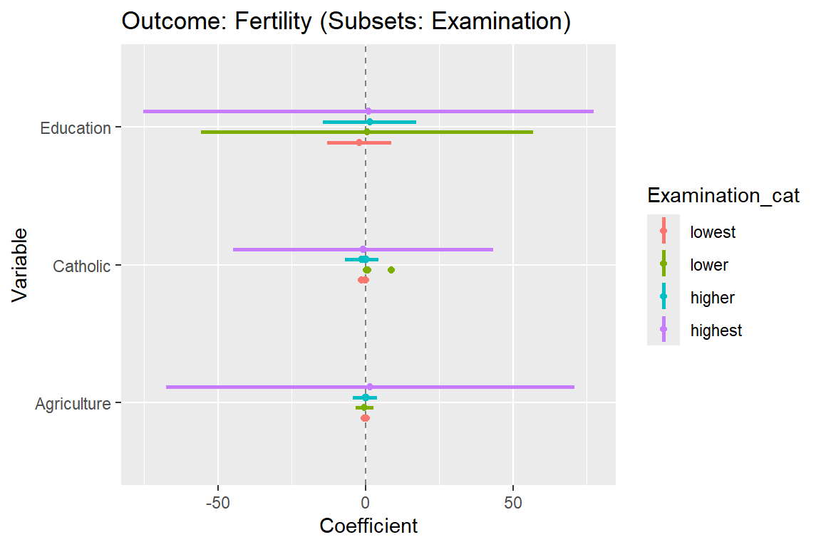
- Figure 5 below provides a coefficient plot and colors estimations for subsets.
6.1 Lab: Data & code
The code to estimate the models and extracting the coefficients is the same as in Section 5.
Plotting the data to obtain Figure 5 is straightforward again. We use the same code as above but now instead of facetting we simply specify colour = Examination_cat within aes().
  # GGPLOT
   ggplot(data_plot, aes(x = Variable, y = Coefficient, colour = Examination_cat)) +
        geom_hline(yintercept = 0, colour = gray(1/2), lty = 2) +
        geom_point(aes(x = Variable,
                    y = Coefficient), position=position_dodge(width=0.3)) +
        geom_linerange(aes(x = Variable,
                     ymin = conf.low,
                     ymax = conf.high),
                   lwd = 1, position=position_dodge(width=0.3)) +
        ggtitle("Outcome: Fertility (Subsets: Examination)") +
        coord_flip()
7 Coefficient plots with facetting and coloring (skip!)
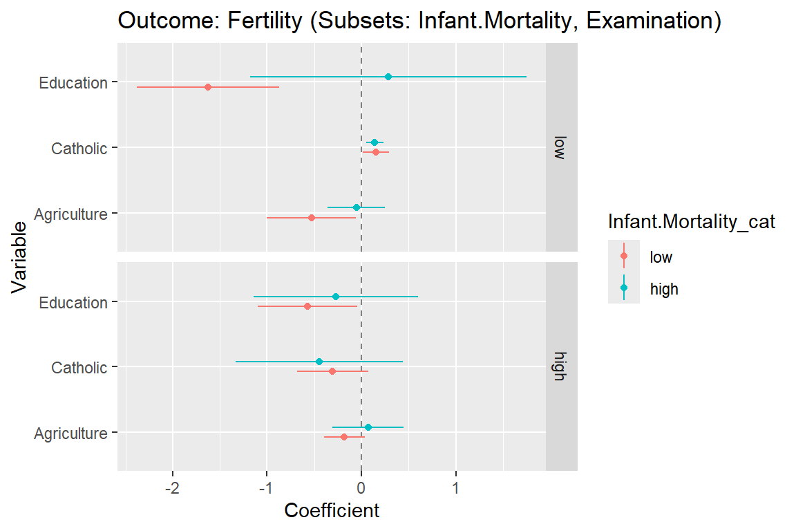
- Figure 6 below provides a combination of facetting and coloring since models have been estimated in subsets of the data defined by two variables:
Infant.Mortality_catandExamination_cat. - Questions:
- What does the graph show? What are the underlying variables (and data)?
- How many scales/mappings does it use? Could we reduce them?
- What do you like, what do you dislike about the figure? What is good, what is bad?
- What kind of information could we add to the graph (if any)?
- How would you approach a replication of the graph?
7.1 Lab: Data & code
Data preparations are somewhat more complicated when we want to show facets and colors, i.e., in other words we want to produce coefficient plots for subsets defined by two variables. Again we work with nested dataframes, as well as model results that are nested in a dataframe.
We proceed in several steps:
- We split the dataset into subsets according to
Examination_catANDInfant.Mortality_cat. - We estimate the linear models in those subsets (see
map(..lm(...))). - We tidy the estimations as to obtain a nice dataframe.
- We estimate confidence intervals also obtaining nice dataframes (see
map(fit, conf.level = 0.95, confint_tidy)). - We rename the vars in the confidence intervals dataframes (see
rename_all(...)). - We
unnest()the data obtaining one dataframe that contains the estimates and intervals across all subsets defined byExamination_catANDInfant.Mortality_cat.- Here we add to delete the results for two subsets because they didn’t contain enough observations
- see e.g.,
filter(!(Examination_cat == "higher" & Infant.Mortality_cat == "high"))
- Finally, we filter the intercepts in those estimations.
swiss <- swiss %>%
         mutate(Infant.Mortality_cat = cut(Infant.Mortality,
                                  breaks = quantile(Infant.Mortality, probs = seq(0, 1, 0.5)),
                                  labels = c("low", "high")))

swiss <- swiss %>%
         mutate(Examination_cat = cut(Examination,
                                  breaks = quantile(Examination,
                                                    probs = seq(0, 1, 0.5)),
                                  labels = c("low", "high")))


data_plot <- swiss %>%
  filter(!is.na(Infant.Mortality_cat), !is.na(Examination_cat)) %>%
  select(Examination_cat, Infant.Mortality_cat, Fertility, Agriculture, Education, Catholic) %>%
  nest(data = c(Fertility, Agriculture, Education, Catholic)) %>%
  mutate(fit = map(data, ~ lm(Fertility ~ Catholic + Agriculture + Education, data = .)),
         data_coefs = map(fit, ~tidy(.x, conf.int = TRUE, conf.level = 0.95))) %>%
  unnest(c(data_coefs)) %>%
  rename(Variable = term,
                  Coefficient = estimate,
                  SE = std.error) %>%
  filter(Variable != "(Intercept)")  %>%
  select(
    Examination_cat,
    Infant.Mortality_cat,
    Variable,
    Coefficient,
    conf.low:conf.high
  )

data_plot %>%
    kable("html") %>%
kable_styling(font_size = 11)| Examination_cat | Infant.Mortality_cat | Variable | Coefficient | conf.low | conf.high |
|---|---|---|---|---|---|
| low | high | Catholic | 0.1393931 | 0.0482192 | 0.2305670 |
| low | high | Agriculture | -0.0540658 | -0.3582447 | 0.2501132 |
| low | high | Education | 0.2850385 | -1.1783226 | 1.7483997 |
| high | high | Catholic | -0.4467226 | -1.3331392 | 0.4396939 |
| high | high | Agriculture | 0.0710211 | -0.3069120 | 0.4489542 |
| high | high | Education | -0.2726475 | -1.1437719 | 0.5984770 |
| high | low | Catholic | -0.3046756 | -0.6845060 | 0.0751548 |
| high | low | Agriculture | -0.1800822 | -0.3958094 | 0.0356451 |
| high | low | Education | -0.5728250 | -1.0978119 | -0.0478381 |
| low | low | Catholic | 0.1562665 | 0.0172678 | 0.2952652 |
| low | low | Agriculture | -0.5300158 | -1.0041751 | -0.0558564 |
| low | low | Education | -1.6249107 | -2.3813772 | -0.8684442 |
Plotting the data is straightforward again. We use the same code as above but now we combine facetting and coloring: * facet_grid(Examination_cat ~ .) * colour = Infant.Mortality_cat within aes()
 ggplot(data_plot,
        aes(x = Variable, y = Coefficient, colour = Infant.Mortality_cat)) +
        geom_hline(yintercept = 0, colour = gray(1/2), lty = 2) +
        geom_point(aes(x = Variable,
                    y = Coefficient), position=position_dodge(width=0.3)) +
        geom_linerange(aes(x = Variable,
                     ymin = conf.low,
                     ymax = conf.high),
                   lwd = 0.5, position=position_dodge(width=0.3)) +
        ggtitle("Outcome: Fertility (Subsets: Infant.Mortality, Examination)") +
        coord_flip() +
facet_grid(Examination_cat ~ .) 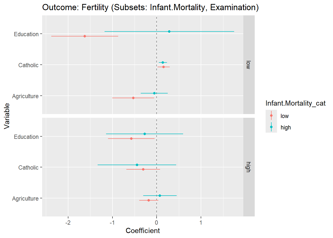
8 Predicted values
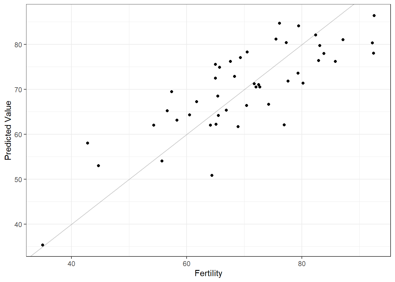
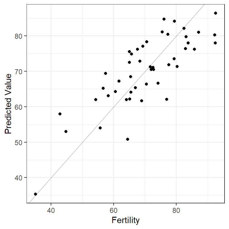
- Figure 7 plots the variable
Fertility(the actual values) against those predictd by the model (predicted values). - Questions:
- What does the graph show? What are the underlying variables (and data)?
- How many scales/mappings does it use? Could we reduce them?
- What do you like, what do you dislike about the figure? What is good, what is bad?
- What kind of information could we add to the graph (if any)?
- How would you approach a replication of the graph?
8.1 Lab: Data & code
The underlying functions are very simple. First we fit the model
Then we augment the original data with the predicted values for each observed unit (they are called .fitted in the dataframe below).
| .rownames | Fertility | Catholic | Agriculture | Education | .fitted | .resid | .hat | .sigma | .cooksd | .std.resid |
|---|---|---|---|---|---|---|---|---|---|---|
| Courtelary | 80.2 | 9.96 | 17.0 | 12 | 71.35382 | 8.846177 | 0.0950817 | 7.686424 | 0.0380384 | 1.2033653 |
| Delemont | 83.1 | 84.84 | 45.1 | 9 | 79.73758 | 3.362419 | 0.0660897 | 7.800760 | 0.0035864 | 0.4502418 |
| Franches-Mnt | 92.5 | 93.40 | 39.7 | 5 | 86.36550 | 6.134505 | 0.1266332 | 7.753333 | 0.0261545 | 0.8494302 |
| Moutier | 85.8 | 33.77 | 36.5 | 7 | 76.21257 | 9.587434 | 0.0552259 | 7.669656 | 0.0238081 | 1.2763945 |
| Neuveville | 76.9 | 5.16 | 43.5 | 15 | 62.05992 | 14.840083 | 0.0410200 | 7.461386 | 0.0411227 | 1.9610021 |
| Porrentruy | 76.1 | 90.57 | 35.3 | 7 | 84.70365 | -8.603647 | 0.1256133 | 7.689243 | 0.0509128 | -1.1906315 |
Then we can plot the real outcome values of the variable Fertility against the predictions made by our model .fitted in Figure 9. Importantly, the gray line in the figure below is no the regression line!
8.2 Exercise
Below you find the code that we used above to obtain and visualize predicted values for a model that predicts Fertility using the variables Catholic + Agriculture + Education.
- Please adapt the code and predict the outcome
Catholicusing the variablesAgricultureandFertility.
9 Marginal effects
9.1 What are marginal effects?
- ‘There is no common language across fields regarding a unique meaning of “marginal effects”. Thus, the wording throughout this package may vary.’ (Lüdecke on ggeffects package)
- Marginal effect of a given variable: “the slope of the regression surface with respect to a given covariate […] the rate at which \(y\) changes at a given point in covariate space, with respect to one covariate dimension and holding all covariate values constant” (Leeper 2021, 7)
- Linear regression: marginal effects correspond to values of the regression coefficients (\(\beta\) values)
- Nonlinear regression models: marginal effects are not constant so different average effect indicators are used (MEMs, AMEs, MERs)
- Marginal effects at representative values (MERs)
- “calculate the marginal effect of each variable at a particular combination of \(X\) values that is theoretically interesting” (Leeper 2021, 7)
- Pick particular, representative covariate values (e.g., John aged 40, middle-income etc.) and calculate effect for those values
- Marginal Effects at Means (MEMs)
- “calculate the marginal effects of each variable at the means of the covariates” (Leeper 2021, 7)
- …the means may also correspond to particular individuals (that happen to have the mean value on all covariates)
- Average Marginal Effects (AMEs) (cf. Leeper 2021):
- “calculate marginal effects at every observed value of X and average across the resulting effect estimates” (Leeper 2021, 7)
- See Leeper’s margins package and the paper (Leeper 2021) as well as a blog post by Andew Heiss
9.2 Marginal effects in R
- Various packages, e.g., ggeffects or marginaleffects offering such functionalities
9.3 Lab: Data & Code
- Based on https://marginaleffects.com/
Our lab is based on Lee, Du, and Guerzhoy (2020) and on James et al. (2013, chap. 4.6.2) with various modifications. We will be using the dataset at LINK that is described by Angwin et al. (2016). + It’s data based on the COMPAS risk assessment tools (RAT). RATs are increasingly being used to assess a criminal defendant’s probability of re-offending. While COMPAS seemingly uses a larger number of features/variables for the prediction, Dressel and Farid (2018) showed that a model that includes only a defendant’s sex, age, and number of priors (prior offences) can be used to arrive at predictions of equivalent quality.
We first import the data into R:
We select a subset of variables and also order our variables differently.
| id | name | compas_screening_date | is_recid | age | priors_count | sex | race |
|---|---|---|---|---|---|---|---|
| 1 | miguel hernandez | 2013-08-14 | 0 | 69 | 0 | Male | Other |
| 3 | kevon dixon | 2013-01-27 | 1 | 34 | 0 | Male | African-American |
| 4 | ed philo | 2013-04-14 | 1 | 24 | 4 | Male | African-American |
| 5 | marcu brown | 2013-01-13 | 0 | 23 | 1 | Male | African-American |
| 6 | bouthy pierrelouis | 2013-03-26 | 0 | 43 | 2 | Male | Other |
| 7 | marsha miles | 2013-11-30 | 0 | 44 | 0 | Male | Other |
Install and load the marginaleffects package:
Estimate a logistic regression model in which we predict recidivism.
Use comparisons() to get predicted values for each observation/individual/row in the dataset that we used to fit the model. Here we get 7214 estimates of the difference between the probability of recidivating/reoffending between males and females.
| rowid | term | contrast | estimate | std.error |
|---|---|---|---|---|
| 1 | sex | Female - Male | -0.0234380 | 0.0048817 |
| 2 | sex | Female - Male | -0.0800209 | 0.0143704 |
| 3 | sex | Female - Male | -0.0825776 | 0.0156807 |
| 4 | sex | Female - Male | -0.0876982 | 0.0162264 |
| 5 | sex | Female - Male | -0.0687888 | 0.0125481 |
| 6 | sex | Female - Male | -0.0565665 | 0.0105231 |
If we are interested in the MER we can proceed as follows:
| rowid | term | contrast | estimate | std.error |
|---|---|---|---|---|
| 1 | sex | Female - Male | -0.081978 | 0.0155852 |
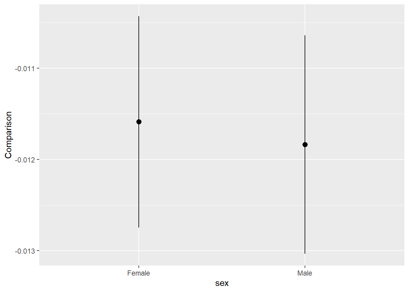
And we may be interested in the AME. By default comparisons() estimates quantities for all the actually observed units in our dataset. If we want to marginalize those conditional estimates, in order to obtain an ‘average contrast’ we can use the code below:
| term | contrast | estimate | std.error | statistic | p.value | s.value | conf.low | conf.high |
|---|---|---|---|---|---|---|---|---|
| sex | Female - Male | -0.0751052 | 0.0137965 | -5.443794 | 1e-07 | 24.19255 | -0.1021458 | -0.0480646 |
To visualize such comparisons we can use plot_comparisons() that plots the effects on the y-axis (variables =) against values of one or more predictors on the x-axis (condition =). Below we see how the effect of age differs for males and female (effect is more negative for males).
Check out the Titanic example in the vignette for more.
10 Useful graphs & resources
Below some interesting graphs/resources that contain visualizations that you might want to check out:
11 Appendix: Several confidence intervals
11.1 Coefficient plots (several CIs)
- Here we will work with the ‘famous’ swiss data set (
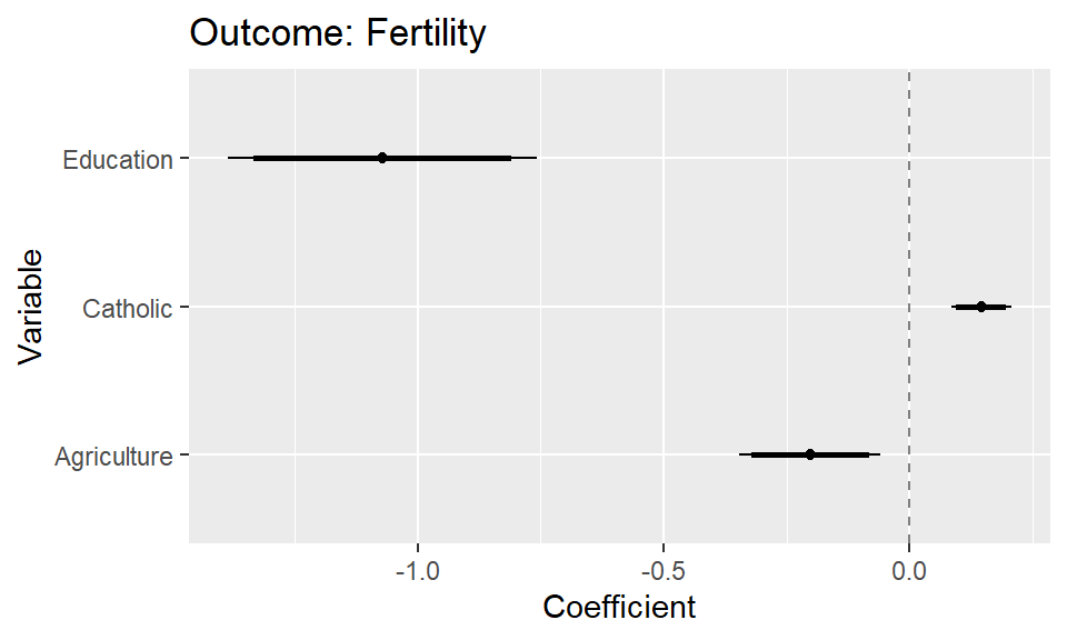
?swiss) - Figure 10 below provides a simple coefficient plot.
- Questions:
- What does the graph show? What are the underlying variables (and data)?
- How many scales/mappings does it use? Could we reduce them?
- What do you like, what do you dislike about the figure? What is good, what is bad?
- What kind of information could we add to the graph (if any)?
- How would you approach a replication of the graph?
11.1.1 Lab: Data & code
- Learning objectives
- How to plot the results of statistical models
- How to use the broom package/tidy function to extract coefficients
- How to plot different confidence intervals
We start by preparing the data, i.e., estimating the model and extracting the coefficients of interest. Importantly, the table you see below is all you need as a basis for the ggplot functions.
library(broom)
fit <- lm(Fertility ~ Catholic + Agriculture + Education, data = swiss) # see ?swiss


data_coefs <- tidy(fit)


fit_cis_95 <- confint(fit, level = 0.95) %>%
  data.frame() %>%
  rename("conf.low_95" = "X2.5..",
         "conf.high_95" = "X97.5..")
fit_cis_90 <- confint(fit, level = 0.90) %>%
  data.frame() %>%
  rename("conf.low_90" = "X5..",
         "conf.high_90" = "X95..")

data_coefs <- bind_cols(data_coefs,
                     fit_cis_95,
                     fit_cis_90) %>%
           rename(Variable = term,
                  Coefficient = estimate,
                  SE = std.error) %>%
           filter(Variable != "(Intercept)")
data_coefs <- data_coefs %>% select(-SE,
                              -statistic,
                              -p.value)

data_coefs %>% kable("html") %>% kable_styling(font_size = 10)| Variable | Coefficient | conf.low_95 | conf.high_95 | conf.low_90 | conf.high_90 |
|---|---|---|---|---|---|
| Catholic | 0.1452013 | 0.0844049 | 0.2059978 | 0.0945227 | 0.1958800 |
| Agriculture | -0.2030377 | -0.3465286 | -0.0595467 | -0.3226486 | -0.0834268 |
| Education | -1.0721468 | -1.3863512 | -0.7579425 | -1.3340607 | -0.8102329 |
Subsequently, we feed those estimates into the ggplot function.
geom_point(),geom_linerange(): Plot estimates and intervalsgeom_hline(): Plot 0 linecoord_flip(): Flip the plot
ggplot(data_coefs,
       aes(x = Variable, y = Coefficient)) +
        geom_hline(yintercept = 0,
                   colour = gray(1/2), lty = 2) +
        geom_point(aes(x = Variable,
                    y = Coefficient)) +
        geom_linerange(aes(x = Variable,
                     ymin = conf.low_90,
                     ymax = conf.high_90),
                   lwd = 1) +
        geom_linerange(aes(x = Variable,
                     ymin = conf.low_95,
                     ymax = conf.high_95),
                   lwd = 1/2) +
        ggtitle("Outcome: Fertility") +
        coord_flip()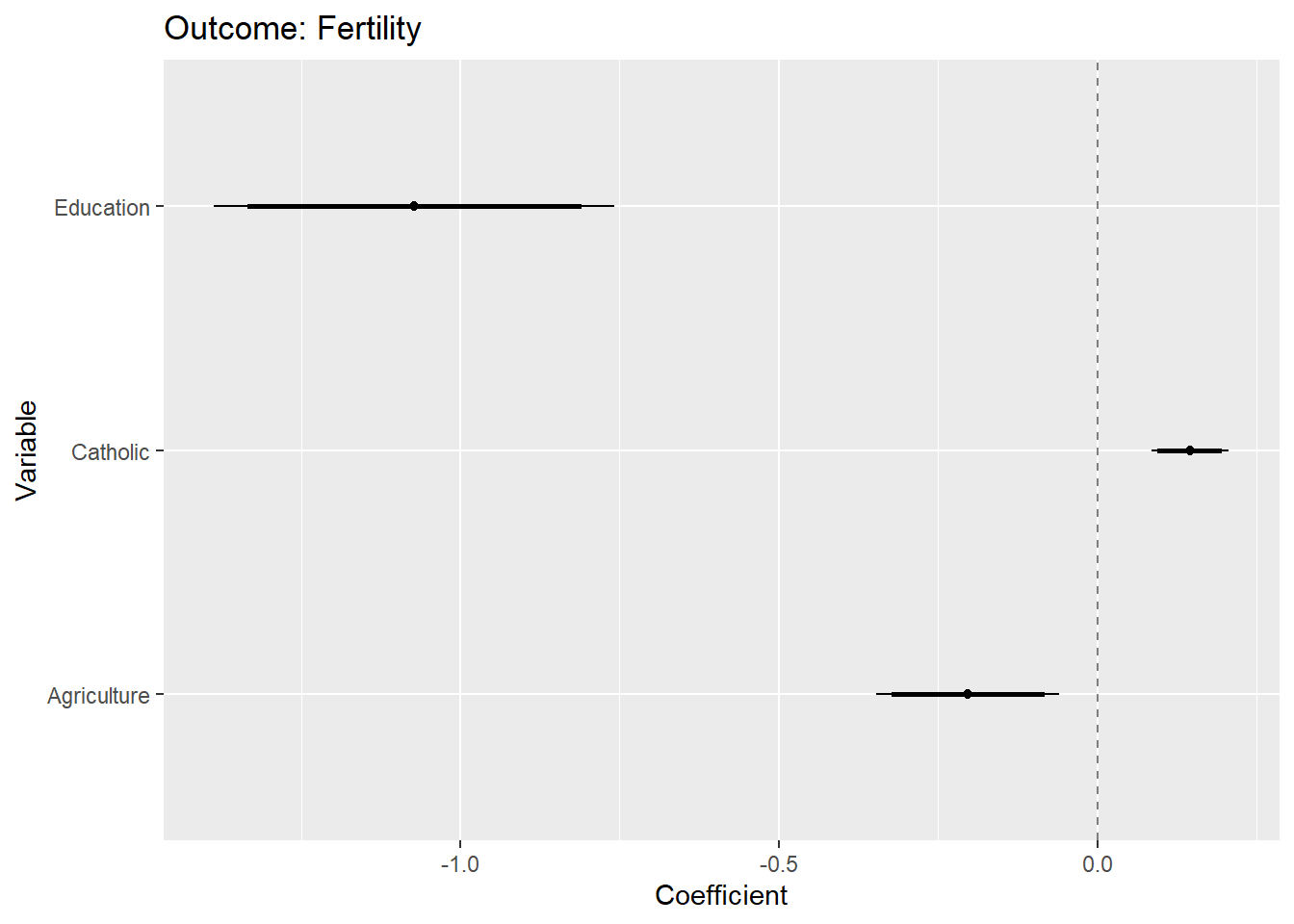
We can also add text (e.g., the coefficient estimates) in the graph. See below:
# With labels
data_coefs <- data_coefs %>%
    mutate(Model = paste0("Var ", 1:nrow(.))) # Q: ?

ggplot(data_coefs,
       aes(x = Variable, y = Coefficient)) +
        geom_hline(yintercept = 0,
                   colour = gray(1/2), lty = 2) +
        geom_point(aes(x = Variable,
                    y = Coefficient)) +
        geom_linerange(aes(x = Variable,
                     ymin = conf.low_90,
                     ymax = conf.high_90),
                   lwd = 1) +
        geom_linerange(aes(x = Variable,
                     ymin = conf.low_95,
                     ymax = conf.high_95),
                   lwd = 1/2) +
  geom_text(aes(x = Variable,
                y = Coefficient,
                label = round(Coefficient,2)),
            vjust = 2) +
  geom_text(aes(x = Variable,
                y = conf.high_95,
                label = Model),
            vjust = 0,
            hjust =0) +
        ggtitle("Outcome: Fertility") +
        coord_flip()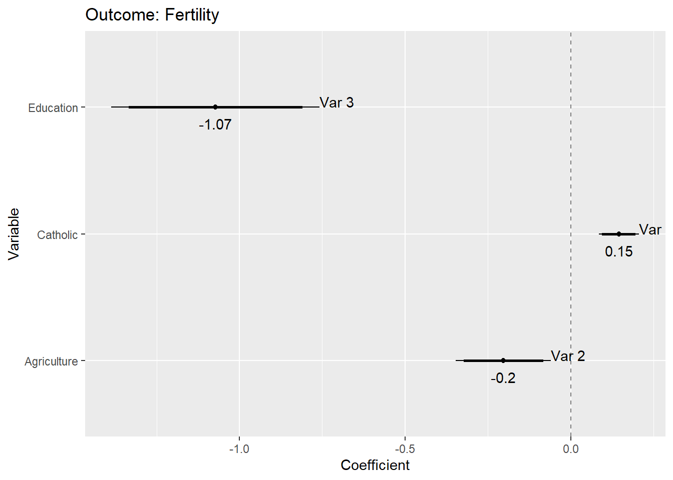
# Without flipping

# ggplot(data_coefs, aes(y = Variable, x = Coefficient)) +
#         geom_hline(yintercept = 0, colour = gray(1/2), lty = 2) +
#         geom_point(aes(y = Variable,
#                     x = Coefficient)) +
#         geom_linerange(aes(y = Variable,
#                      xmin = conf.low_90,
#                      xmax = conf.high_90),
#                    lwd = 1) +
#         geom_linerange(aes(y = Variable,
#                      xmin = conf.low_95,
#                      xmax = conf.high_95),
#                    lwd = 1/2) +
#         ggtitle("Outcome: Fertility") +
#         coord_flip()
11.1.2 Exercise
- Use the code from above but change the model for which you generate the coefficient plot.
- Visualize a coefficient plot in which the outcome variable is
Infant.Mortalityinstead ofFertility. - And add an additional explanatory variable, namely
Examination.
- Visualize a coefficient plot in which the outcome variable is
- Try to reduce the ink that is used in the plot above.
- Try to add a third set of confidence intervals (80%) to the plot.
11.2 Graph: Coefficient plots with facetting & nesting (several CIs)
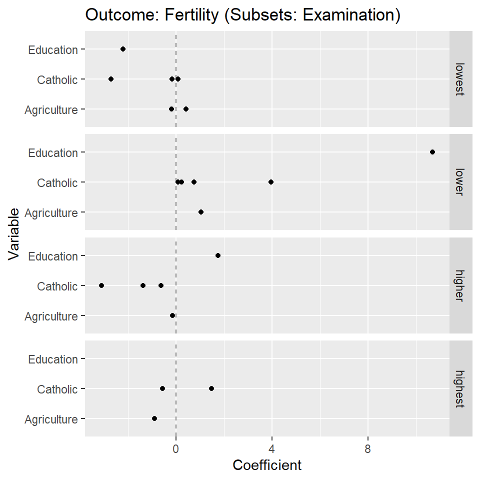
- Figure 11 below provides a coefficient plot for subsets/facets of the data.
- Questions:
- What does the graph show? What are the underlying variables (and data)?
- How many scales/mappings does it use? Could we reduce them?
- What do you like, what do you dislike about the figure? What is good, what is bad?
- What kind of information could we add to the graph (if any)?
- How would you approach a replication of the graph?
11.2.1 Lab: Data & code (several CIs)
- Learning objectives
- How to plot the results of statistical models accross datasubsets (using faceting)
- How to categorize a continuous variable
- Work with nested dataframes: How to estimate models in subsets using
nest()andmap() - How to use the broom package/tidy function to extract coefficients
- How to plot different confidence intervals
Data preparations are somewhat more complicated when we want to show facets. We work with nested dataframes, as well as model results that are nested in a dataframe.
We proceed in several steps:
- We split the dataset into subsets according to values of
Examination_catusing thenest()function. - We estimate the linear models in those subsets (see
map(..lm(...))). - We tidy the estimations as to obtain a nice dataframe.
- We estimate confidence intervals also obtaining nice dataframes (see
map(fit, conf.level = 0.90, confint_tidy)). - We rename the vars in the confidence intervals dataframes (see
rename_all(...)). - We
unnest()the data obtaining one dataframe that contains the estimates and intervals across all subsets. - Finally, we filter the intercepts in those estimations and the result is shown in Table @ref(tab:code-coefficient-plot-facetting1).
# Create categorical examination variable
swiss <- swiss %>%
         mutate(Examination_cat = cut(Examination,
                                  breaks = quantile(Examination,
                                                    probs = seq(0, 1, 0.25)),
                                  labels = c("lowest", "lower",
                                             "higher", "highest")))


#table(swiss$Examination, swiss$Examination_cat)
data_plot <- swiss %>%
  filter(!is.na(Examination_cat)) %>%
  nest(data = c(Fertility, Agriculture, Examination, Education, Catholic, Infant.Mortality)) %>%
  mutate(fit = map(data, ~ lm(Fertility ~ Catholic + Agriculture + Education, data = .)),
         data_coefs = map(fit, tidy),
         data_coefs_90 = map(fit, level = 0.90, confint),
         data_coefs_95 = map(fit, level = 0.95, confint)) %>%
       mutate(data_coefs_90 = map(data_coefs_90, ~ data.frame(.)),
            data_coefs_95 = map(data_coefs_95, ~ data.frame(.))) %>%
  unnest(c(data_coefs, data_coefs_90, data_coefs_95)) %>%
  rename(Variable = term,
                  Coefficient = estimate,
                  SE = std.error) %>%
  filter(Variable != "(Intercept)") %>%
  rename("conf.low_95" = "X2.5..",
         "conf.high_95" = "X97.5..",
         "conf.low_90" = "X5..",
         "conf.high_90" = "X95..")

data_plot %>%
    select(-data, -fit, -statistic, -p.value, -SE) %>%
    kable("html") %>%
kable_styling(font_size = 11)| Examination_cat | Education_cat | Infant.Mortality_cat | Variable | Coefficient | conf.low_90 | conf.high_90 | conf.low_95 | conf.high_95 |
|---|---|---|---|---|---|---|---|---|
| lower | higher | high | Catholic | NA | NA | NA | NA | NA |
| lower | higher | high | Agriculture | NA | NA | NA | NA | NA |
| lower | higher | high | Education | NA | NA | NA | NA | NA |
| lowest | higher | high | Catholic | NA | NA | NA | NA | NA |
| lowest | higher | high | Agriculture | NA | NA | NA | NA | NA |
| lowest | higher | high | Education | NA | NA | NA | NA | NA |
| lowest | lowest | high | Catholic | -2.7178423 | NaN | NaN | NaN | NaN |
| lowest | lowest | high | Agriculture | NA | NA | NA | NA | NA |
| lowest | lowest | high | Education | NA | NA | NA | NA | NA |
| lowest | lower | high | Catholic | -0.1620300 | NaN | NaN | NaN | NaN |
| lowest | lower | high | Agriculture | 0.4139118 | NaN | NaN | NaN | NaN |
| lowest | lower | high | Education | NA | NA | NA | NA | NA |
| higher | highest | high | Catholic | NA | NA | NA | NA | NA |
| higher | highest | high | Agriculture | NA | NA | NA | NA | NA |
| higher | highest | high | Education | NA | NA | NA | NA | NA |
| lower | lower | high | Catholic | 0.0890572 | NaN | NaN | NaN | NaN |
| lower | lower | high | Agriculture | 1.0322651 | NaN | NaN | NaN | NaN |
| lower | lower | high | Education | 10.6935997 | NaN | NaN | NaN | NaN |
| lower | highest | high | Catholic | NA | NA | NA | NA | NA |
| lower | highest | high | Agriculture | NA | NA | NA | NA | NA |
| lower | highest | high | Education | NA | NA | NA | NA | NA |
| lower | lowest | high | Catholic | 0.2348815 | NaN | NaN | NaN | NaN |
| lower | lowest | high | Agriculture | NA | NA | NA | NA | NA |
| lower | lowest | high | Education | NA | NA | NA | NA | NA |
| higher | higher | low | Catholic | -1.3826949 | NaN | NaN | NaN | NaN |
| higher | higher | low | Agriculture | -0.1489586 | NaN | NaN | NaN | NaN |
| higher | higher | low | Education | 1.7383876 | NaN | NaN | NaN | NaN |
| lower | lower | low | Catholic | 3.9629630 | NaN | NaN | NaN | NaN |
| lower | lower | low | Agriculture | NA | NA | NA | NA | NA |
| lower | lower | low | Education | NA | NA | NA | NA | NA |
| higher | higher | high | Catholic | NA | NA | NA | NA | NA |
| higher | higher | high | Agriculture | NA | NA | NA | NA | NA |
| higher | higher | high | Education | NA | NA | NA | NA | NA |
| higher | lowest | low | Catholic | -3.1159420 | NaN | NaN | NaN | NaN |
| higher | lowest | low | Agriculture | NA | NA | NA | NA | NA |
| higher | lowest | low | Education | NA | NA | NA | NA | NA |
| higher | lowest | high | Catholic | NA | NA | NA | NA | NA |
| higher | lowest | high | Agriculture | NA | NA | NA | NA | NA |
| higher | lowest | high | Education | NA | NA | NA | NA | NA |
| higher | lower | low | Catholic | NA | NA | NA | NA | NA |
| higher | lower | low | Agriculture | NA | NA | NA | NA | NA |
| higher | lower | low | Education | NA | NA | NA | NA | NA |
| highest | highest | high | Catholic | 1.4686118 | NaN | NaN | NaN | NaN |
| highest | highest | high | Agriculture | -0.9088763 | NaN | NaN | NaN | NaN |
| highest | highest | high | Education | NA | NA | NA | NA | NA |
| highest | highest | NA | Catholic | NA | NA | NA | NA | NA |
| highest | highest | NA | Agriculture | NA | NA | NA | NA | NA |
| highest | highest | NA | Education | NA | NA | NA | NA | NA |
| lowest | NA | high | Catholic | NA | NA | NA | NA | NA |
| lowest | NA | high | Agriculture | NA | NA | NA | NA | NA |
| lowest | NA | high | Education | NA | NA | NA | NA | NA |
| lowest | lowest | low | Catholic | 0.0821520 | NaN | NaN | NaN | NaN |
| lowest | lowest | low | Agriculture | -0.1879328 | NaN | NaN | NaN | NaN |
| lowest | lowest | low | Education | -2.2189471 | NaN | NaN | NaN | NaN |
| lower | higher | low | Catholic | NA | NA | NA | NA | NA |
| lower | higher | low | Agriculture | NA | NA | NA | NA | NA |
| lower | higher | low | Education | NA | NA | NA | NA | NA |
| lowest | higher | low | Catholic | NA | NA | NA | NA | NA |
| lowest | higher | low | Agriculture | NA | NA | NA | NA | NA |
| lowest | higher | low | Education | NA | NA | NA | NA | NA |
| lower | highest | low | Catholic | 0.7456897 | NaN | NaN | NaN | NaN |
| lower | highest | low | Agriculture | NA | NA | NA | NA | NA |
| lower | highest | low | Education | NA | NA | NA | NA | NA |
| highest | higher | high | Catholic | -0.5752754 | NaN | NaN | NaN | NaN |
| highest | higher | high | Agriculture | NA | NA | NA | NA | NA |
| highest | higher | high | Education | NA | NA | NA | NA | NA |
| higher | highest | low | Catholic | -0.6346848 | NaN | NaN | NaN | NaN |
| higher | highest | low | Agriculture | NA | NA | NA | NA | NA |
| higher | highest | low | Education | NA | NA | NA | NA | NA |
| highest | lower | low | Catholic | NA | NA | NA | NA | NA |
| highest | lower | low | Agriculture | NA | NA | NA | NA | NA |
| highest | lower | low | Education | NA | NA | NA | NA | NA |
| highest | highest | low | Catholic | NA | NA | NA | NA | NA |
| highest | highest | low | Agriculture | NA | NA | NA | NA | NA |
| highest | highest | low | Education | NA | NA | NA | NA | NA |
Plotting the data is straightforward again. We use the same code as above but now specify the facetting with facet_grid(Examination_cat ~ .).
  # GGPLOT
  ggplot(data_plot, aes(x = Variable, y = Coefficient)) +
        geom_hline(yintercept = 0, colour = gray(1/2), lty = 2) +
        geom_point(aes(x = Variable,
                    y = Coefficient)) +
        geom_linerange(aes(x = Variable,
                     ymin = conf.low_90,
                     ymax = conf.high_90),
                   lwd = 1) +
        geom_linerange(aes(x = Variable,
                     ymin = conf.low_95,
                     ymax = conf.high_95),
                   lwd = 1/2) +
        ggtitle("Outcome: Fertility (Subsets: Examination)") +
        coord_flip() +
facet_grid(Examination_cat ~ .) 