| country_name | av_fulltime_salary | av_age_fac | population |
|---|---|---|---|
| Austria | 50849 | High (42.8,45.2] | 8955797 |
| Belgium | 52466 | Low (40.4,42.8] | 11586195 |
| Bulgaria | 11850 | High (42.8,45.2] | 6877743 |
| Cyprus | 23129 | Lowest [38,40.4] | 900356 |
| Czechia | 20434 | High (42.8,45.2] | 10505772 |
Grammar of graphics & Ggplot
Chapter last updated: 09 December 2025
- Learning outcomes: Learn…
- …about the grammar of graphics.
- …about the various components of a graph.
- …how to built graphs departing from these components.
- …about logic of mapping data dimensions/variables onto visual scales.
Sources: Original material; Wickham (2010)
1 Grammar
- Grammar answers question: What is a statistical graphic?
- “The Grammar of Graphics” (Wilkinson 2013)1
- “A Layered Grammar of Graphics” (Wickham 2010)2
- Good grammar (Wickham 2010, 3)
- provides insights into the composition of complicated graphics
- reveals unexpected connections between seemingly different graphics
- is just the first step in creating a good sentence
- Grammar tells us that (Wickham 2016)
- a statistical graphic is a mapping from data to aesthetic attributes (color, shape, size) of geometric objects (points, lines, bars)
- Plot may contain statistical transformations/is drawn on specific coordinate system
- Faceting used to generate the same plot for different subsets of the dataset.
- Combination of these independent components that make up a graphic
- Possibility of grammatically correct but nonsensical graph
- Grammar = conceptually useful even if you don’t use Ggplot2 (e.g., if you use Plotly)
2 Grammar components & ggplot2
2.1 Grammar components & ggplot2 (1)
- Let’s go into detail (Wickham 2016, 4–5)
- Data & mappings
- data: Information you want to visualize
- mappings: describe how data’s variables are mapped to aesthetic attributes (e.g., x-axis) that you can perceive
- There are five mapping components
- (1) Layers
- Geometric objects (geoms): what you actually see on the plot: points, lines, etc.
- Statistical transformations (stats): Summarize data in many useful ways (e.g., LM)
- (2) Scales: map values in the data space to values in an aesthetic space
- e.g., color, size or shape
- Scales draw legend or axes (allow us to decode graph)
- (3) Coordinate system (coord): describes how data coordinates are mapped to plane of graphic3
- Provides axes/gridlines to make it possible to read the graph
- (4) Faceting specification (facet): how to break up data and visualize subsets
- (5) Theme: Control finer points of display (e.g., font, background color etc.)
- (1) Layers
2.2 Grammar components & ggplot2 (2): Exercise
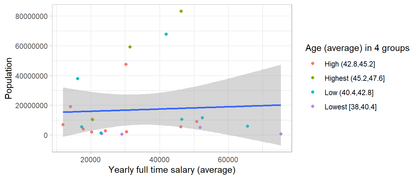
- See some of the components in Figure 1 below that visualizes the data in Table 1.4
- Q: How many/which variables are mapped to which/how many aesthetic scales, i.e., x, y, color in Figure 1?
- Q: Where do the components – Layers (Geometric objects, stat. transformations), Scales (axes, legend: color, size, shape), Coordinate sytem, Theme, Faceting – turn up in the graph below?
2.3 Grammar components & ggplot2 (3): Exercise
- See some of the components in Figure 2 below.
Code:
ggplot(data, aes(x = av_fulltime_salary, y = population)) +
       geom_point(aes(color = factor(av_age_fac))) + # Point layer
       stat_smooth(method = "lm") + # Statistical transformation layer
       theme_light() + # Theme
       xlab("Yearly full time salary (average)") + # Lab
       ylab("Population") + # Lab
       guides(color = guide_legend(title = "Age (average) in 4 groups")) # Legend
2.4 Grammar doesn’t
- Grammar doesn’t… (Wickham 2016, 5)
- …suggest what graphics you should use to answer the research questions
- …specify what a graphic should look like (cf. theming system)
- …specify how to make an attractive graphic (cf. defaults should be sensible)
- …describe interaction (only static graphs)9
2.5 Steps of ggplot visualizing
- Healy (2018, chap. 3.4) summarizes it in the following steps:
data = ...step: Tell theggplot()function what our data ismapping = aes(...)step: Tellggplot()what relationships we want to see- Choose a
geomstep: Tellggplothow we want to see the relationships in our data - Layer on
geomsas needed, by adding them one at a time - Use The
scale_, family,labs()andguides()functions.
- We can either store plot object and add things (
p <- p + ...) or concatenate everything with+.
2.6 Explore ggplot2 object: Exercise (skip)
- Once stored we can explore our ggplot2 object (check class with
class(p)) p$...: Explore different elements of plot object- e.g.,
p$data,p$layers,p$mapping,p$labelsetc.
- e.g.,
# data_eurostat.csv
# data <- read_csv(sprintf("https://docs.google.com/uc?id=%s&export=download",
#                                 "1Sv7QqkLRAUEspM58dL-kZF2nrr6pl3PH"),
#                         col_types = cols())

data <- read_csv("data/data_eurostat.csv",
                 col_types = cols())


p <- ggplot(data, aes(x = av_fulltime_salary, y = population)) +
       geom_point(aes(color = factor(av_age_fac))) + # Point layer
stat_smooth(method = "lm")- Q: What can you decipher from the summary below?
data: country_name, country, av_fulltime_salary, av_age_fac, population
  [24x5]
mapping:  x = ~av_fulltime_salary, y = ~population
faceting:  <empty>
-----------------------------------
mapping: colour = ~factor(av_age_fac)
geom_point: na.rm = FALSE
stat_identity: na.rm = FALSE
position_identity

geom_smooth: na.rm = FALSE, orientation = NA, se = TRUE
stat_smooth: na.rm = FALSE, orientation = NA, method = lm, formula = NULL, se = TRUE, n = 80, span = 0.75, fullrange = FALSE, xseq = NULL, level = 0.95, method.args = list()
position_identity - Important: When we layer on a ggplot2 plot object
p <- p + ...we simply change these elements- e.g., we could change the axes of an existing plot that is stored in
p
- e.g., we could change the axes of an existing plot that is stored in
And we can also access sub elements:
$geom_point
mapping: colour = ~factor(av_age_fac)
geom_point: na.rm = FALSE
stat_identity: na.rm = FALSE
position_identity

$stat_smooth
geom_smooth: na.rm = FALSE, orientation = NA, se = TRUE
stat_smooth: na.rm = FALSE, orientation = NA, method = lm, formula = NULL, se = TRUE, n = 80, span = 0.75, fullrange = FALSE, xseq = NULL, level = 0.95, method.args = list()
position_identity Aesthetic mapping:
* `x` -> `av_fulltime_salary`
* `y` -> `population`<ggplot2::labels> Named list()3 Data and mappings
3.1 Data: raw vs. processed
- Data could be “raw”10 or processed
- Processed data is, for instance, …
- …aggregated data
- …data summarized through a statistical model (e.g., coefficients from a model)
- Distinction is important: Software (like
ggplot) has processing abilities - Decision: (1) Do all the processing ourselves OR (2) let ggplot do some of the processing
- means more control but also more work (and (2) vice versa)
- Always ask: Which parts in the graph have been computed by ggplot (graphics software)?
Ggplot2has the argumentstat ="identity": Q: Does anyone know what that does?11- Recommendation:
- Try to automatize everything (reproducability!)
- Do most processing yourself for better control (create
data_plot), i.e., reduce distance between data and graph (e.g., labels = variable names etc.)
- Q: Have you already visualized highly processed data? Examples?
3.2 Data, aesthetics mappings and layers: Exercise (skip!)
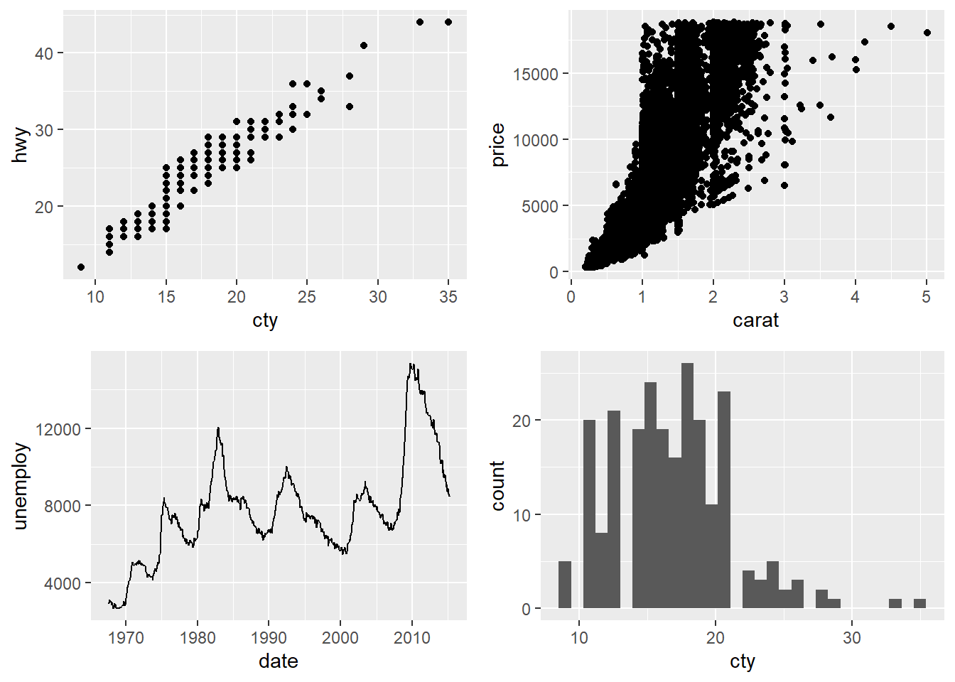
- See the three ggplot2 statements below. Please describe the data, aesthetic mappings and layers used for each of the following plots (Wickham 2016, 14).
- You might need to guess if you haven’t seen all the datasets and functions yet, but use your common sense! See if you can predict what the plot will look like before running the code.
ggplot(mpg, aes(cty, hwy)) + geom_point()12ggplot(diamonds, aes(carat, price)) + geom_point()13ggplot(economics, aes(date, unemploy)) + geom_line()14ggplot(mpg, aes(cty)) + geom_histogram()15
- The fact that we can guess the outcome from the code attests to its readability!
- Lesson: Choose readable variable names (e.g.,
cty= bad!)!
3.3 Data, aesthetics mappings and layers: Exercise Reveal (skip!)
- Figure 3 visualizes the four different statements.
4 Geoms
4.1 Geoms (1)
- Geoms = geometric objects!
geom_area()draws an area plot, which is a line plot filled to the y-axis (filled lines)geom_bar(stat = "identity")makes a bar chart (default = count the data,stat = "identity"to leave data unchanged)geom_line()makes a line plot (groupaesthetic determines which observations are connected)geom_line()connects points from left to right;geom_path()is similar but connects points in the order they appear in the data
geom_point()produces a scatterplotgeom_polygon()draws polygons, which are filled pathsgeom_rect(),geom_tile()andgeom_raster()draw rectanglesgeom_text()adds text to a plot (requires alabelaesthetic that provides the text to display)- These are probably not all geoms!
- Important
- If
aes()is set withinggplot(), they are inherited by other geoms that are added afterwards. - If
aes()is set withingeom_*()it will only used within that geom.
- If
4.2 Geoms (2): Individual vs. collective I
| Subject | age | height | Occasion |
|---|---|---|---|
| 1 | -1.0000 | 140.5 | 1 |
| 1 | -0.7479 | 143.4 | 2 |
| 1 | -0.4630 | 144.8 | 3 |
| 1 | -0.1643 | 147.1 | 4 |
| 1 | -0.0027 | 147.7 | 5 |
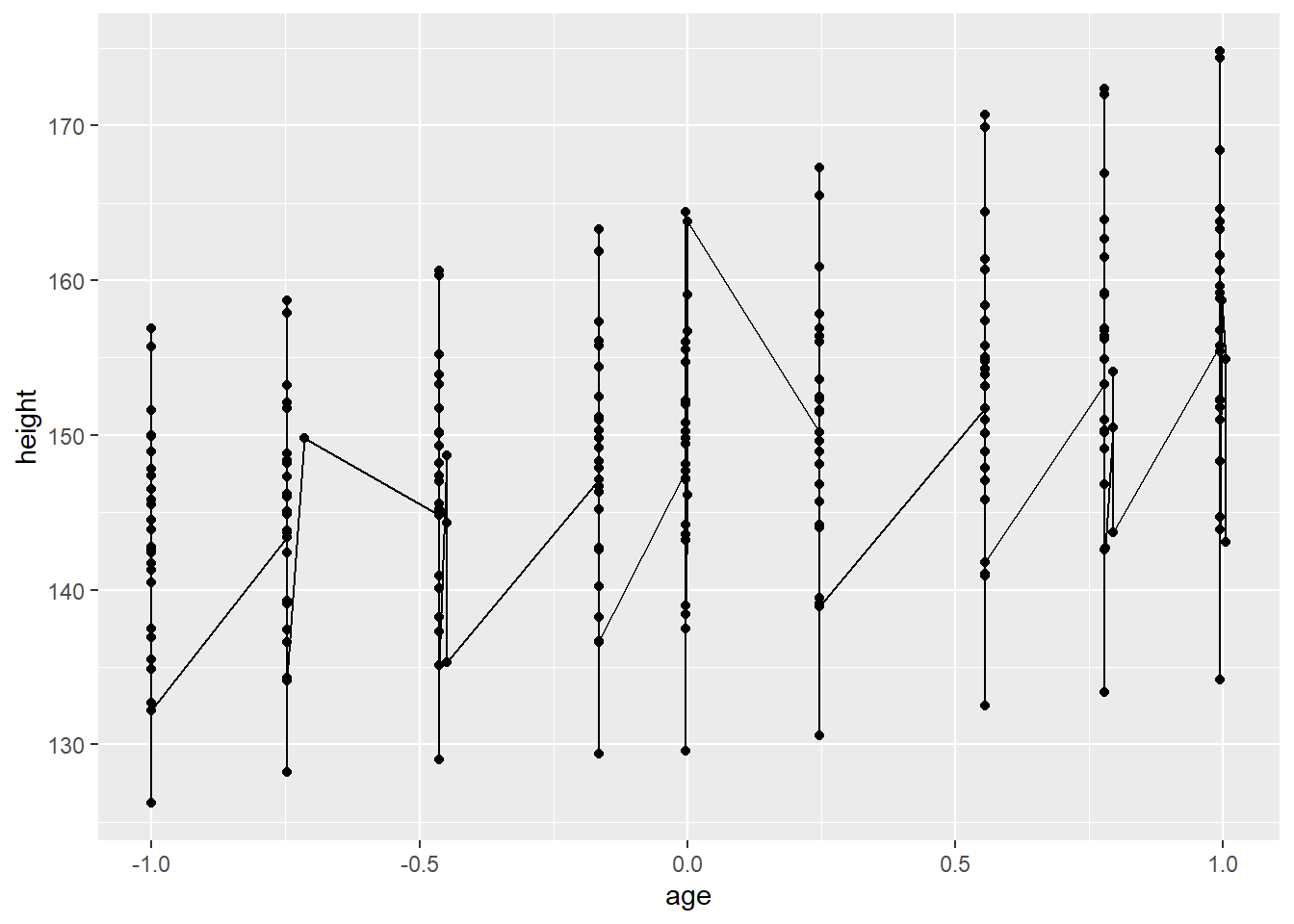
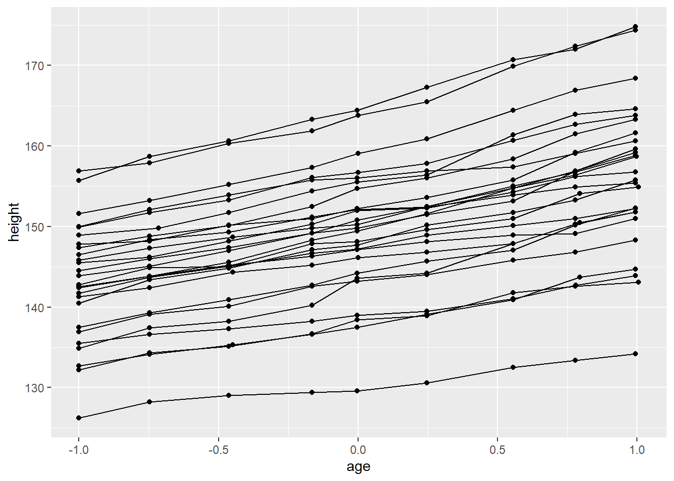
4.3 Geoms (2): Individual vs. collective II
- 3rd edition of ggplot2 book contrasts individual geoms with collective geoms
- Individual geom draws a distinct graphical object for each observation (row), e.g., one point per row
- Collective geom displays multiple observations with one geometric object
- Lines and paths fall in between: each line is composed of a set of straight segments, but each segment represents two points
- How to control this? Use
groupaesthetic!
5 Scales
- Scales control the mapping from data to aesthetics
- Turn data into something that you can see, like size, colour, position or shape
- Provide tools to interpret plot: the axes and legends
- Ggplot2 automatically produces guides based on the layers in your plot
- Scales toolbox divides scales into three main groups
- 1 Position scales and axes
- 2 Colour scales and legends
- Pick colours wisely, e.g., no red/green (see ColorBrewer)
- 3 Scales for other aesthetics, e.g., size, shape, line width, line type etc.
5.1 Axes
- We can modify axes using various functions as depicted in Figure 5. The data is shown in Table 3.
xlab()andylab(): Set axis labelsscale_x_continuous(): Manually set a numeric scale (same for y)scale_x_discrete(): Manually set categorical scalescale_x_*()/scale_y_*(): Various other options
xlim()andylim(): Set limitsseq(): helper function to create breaks, e.g.,seq(0, 10, 2)
| screen_name | n_retweets | followers_count | party | party_color | first_name | account_created_at | account_age_months | account_age_years | last_name | female |
|---|---|---|---|---|---|---|---|---|---|---|
| MartinSchulz | 250 | 693125 | SPD | red | Martin | 2008-11-27 11:49:00 | 137.15303 | 11.427730 | Schulz | 0 |
| SWagenknecht | 3178 | 430367 | DieLinke | deeppink | Sahra | 2009-06-15 18:33:09 | 130.54368 | 10.877897 | Wagenknecht | 1 |
| c_lindner | 2182 | 397943 | FDP | gold | Christian | 2010-03-11 17:11:51 | 121.67889 | 10.140617 | Lindner | 0 |
| HeikoMaas | 3942 | 372902 | SPD | red | Heiko | 2009-03-13 12:37:00 | 133.61859 | 11.135660 | Maas | 0 |
| GregorGysi | 1974 | 362697 | DieLinke | deeppink | Gregor | 2012-10-18 09:20:12 | 90.45648 | 7.537416 | Gysi | 0 |
| peteraltmaier | 103 | 268181 | CDU_CSU | black | Peter | 2011-09-23 19:00:07 | 103.27639 | 8.604622 | Altmaier | 0 |
data <- data %>%
    filter(followers_count<50000)
ggplot(data,
       aes(x = account_age_years,
           y = followers_count,
           color = factor(female))) +
           geom_point(alpha =0.9) +
  ylab("Number of followers") +
  xlab("Account age (in years)") +
  scale_x_continuous(breaks = c(0, 5, 10), limits = c(0,10)) +
  xlim(0,5) # Replaces x-scale characteristics before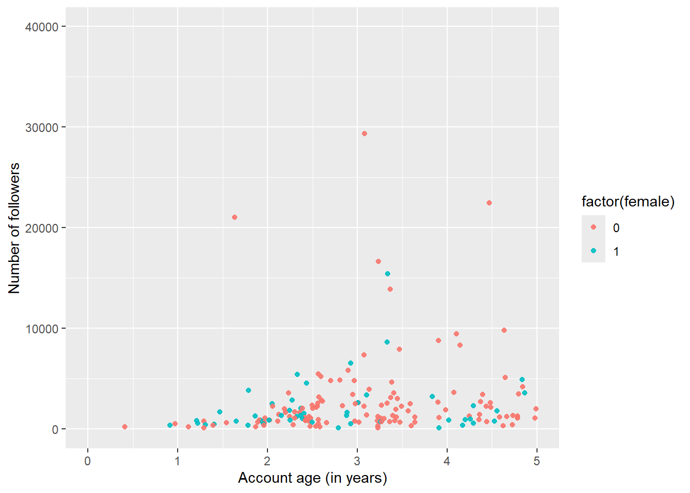
5.2 Axes: Exercise
- Use the above code from Figure 5, try to recreate Figure 6 below. Among other things you have to modify
scale_x_continuous()andscale_y_continuous().
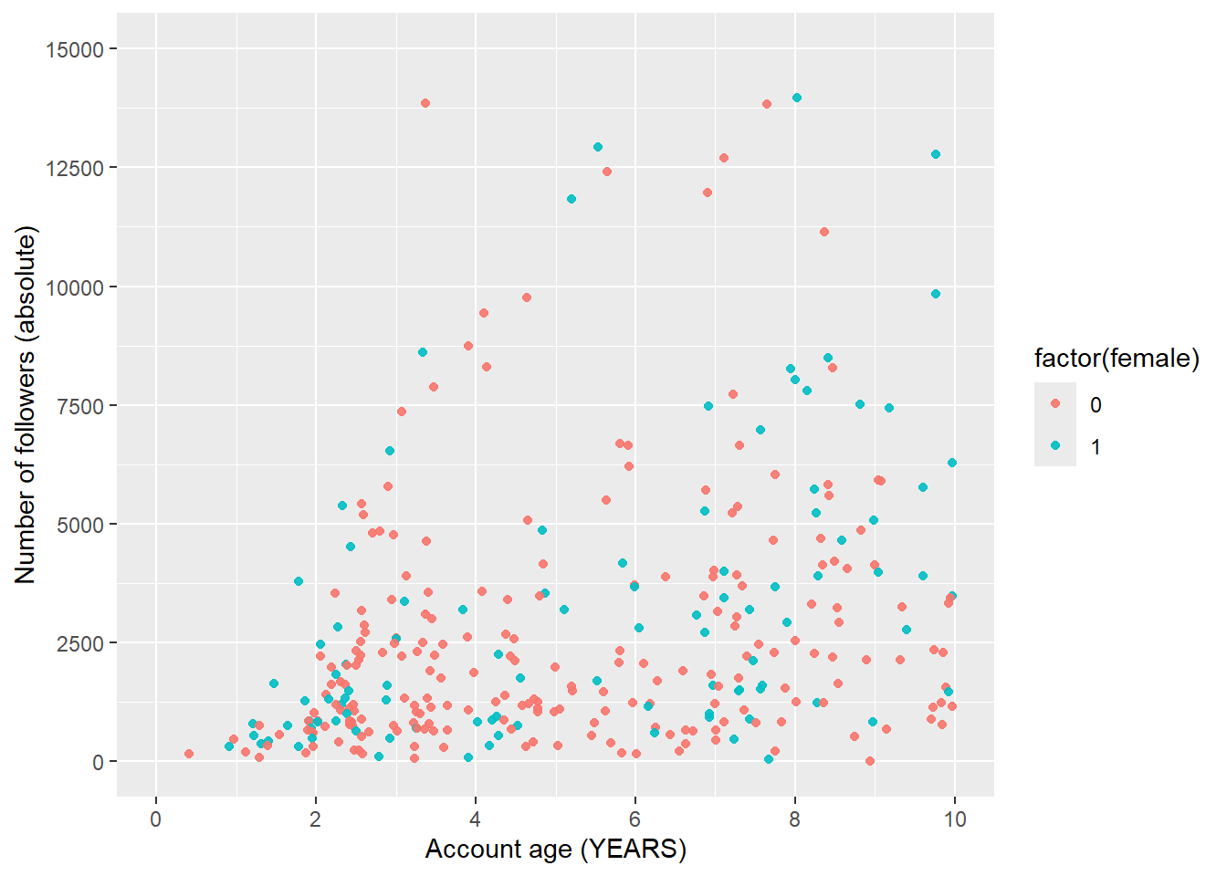
Exercise solution
ggplot(data %>% filter(followers_count<50000),
       aes(x = account_age_years,
           y = followers_count,
           color = factor(female))) +
           geom_point(alpha =0.9) +
  ylab("Number of followers (absolute)") +
  xlab("Account age (YEARS)") +
  scale_x_continuous(breaks = seq(0,10, 2), limits = c(0,10))  +
  scale_y_continuous(breaks = seq(0,15000, 2500), limits = c(0,15000))
5.3 Scales (1): Color, Size, Shape
colour,sizeandshape: Additional aesthetics that can be specified inaes(...)- Ggplot2 takes care of mapping data to aesthetic scale
- 1 scale for each aesthetic mapping (i.e., for each variable)
- Scale creates a guide (axis or legend) for reading/decoding
- Decoding = Convert aesthetic values to data values
- Default scales vs. manual scales (…we’ll see later) + Use
scale_color_manual()to manually set the color scale (same logic for other scales) (see?scale_color_manual))
- Setting an aesthetic to fixed value is done outside of
aes(...). Compare…ggplot(economics, aes(date, unemploy)) + geom_point(aes(colour ="blue"))ggplot(economics, aes(date, unemploy)) + geom_point(colour ="blue")
5.4 Scales (2): Color, Size, Shape
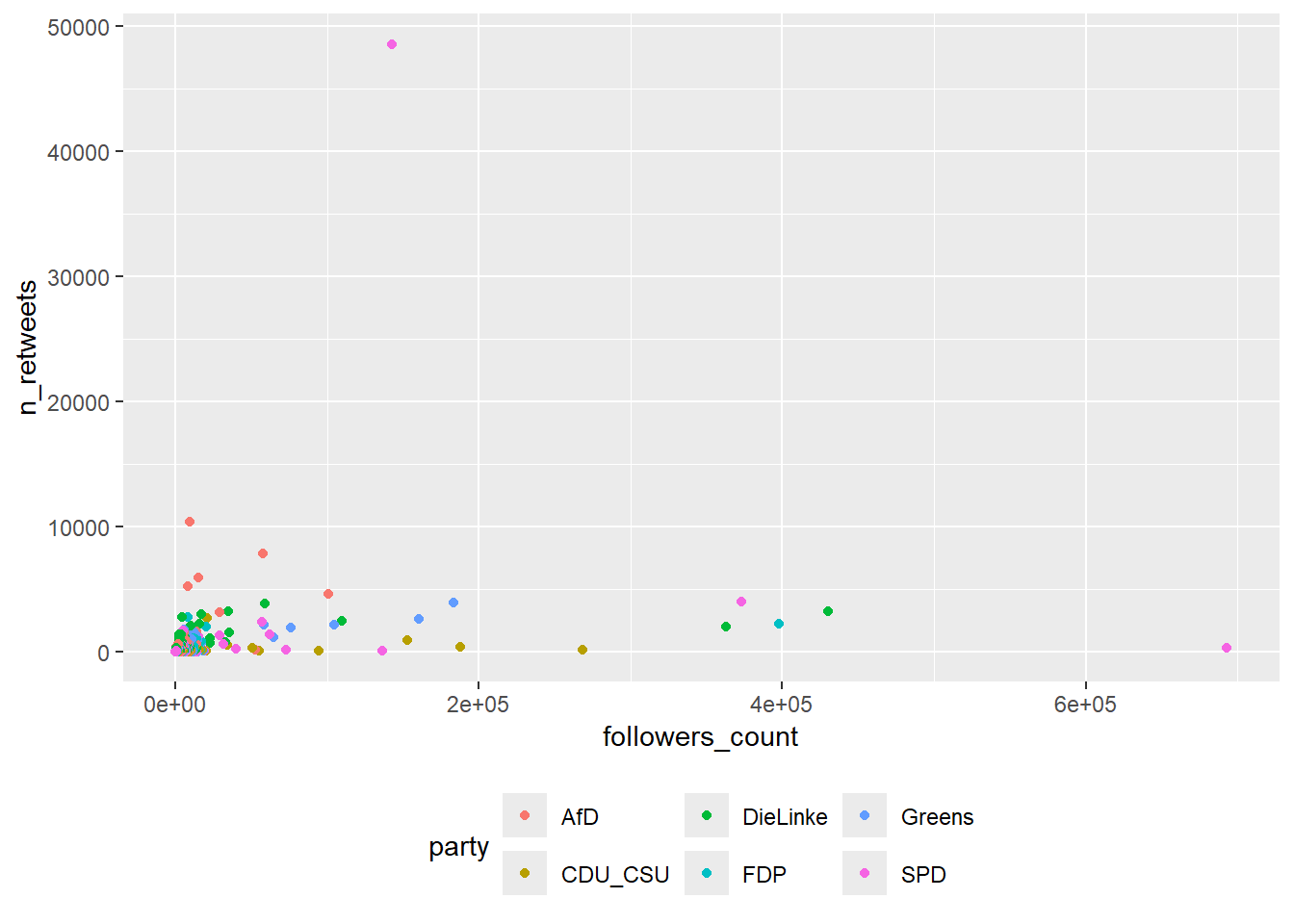
- Figure 7 visualizes data of German politicians’ twitter followers and retweets (April 2020) and provides a simple example of a color scale.18
data <- data %>%
        filter(n_retweets < mean(n_retweets), # What happens here?
        followers_count < mean(followers_count))

ggplot(data,
       aes(x = followers_count,
           y = n_retweets,
           colour = party)) +
       geom_point() +
             scale_colour_manual(name = "Partei",
                                 values = c("DieLinke" = "magenta",
                                                     "FDP" = "orange",
                                                     "CDU_CSU" = "black",
                                                     "SPD" = "red",
                                                     "Greens" = "darkgreen",
                                                     "AfD" = "blue")) # Good colors?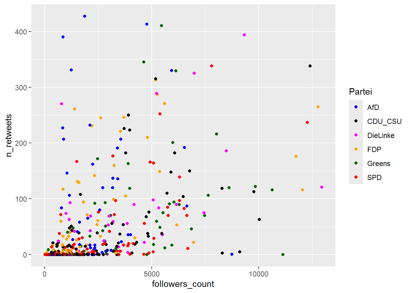
5.5 Scales (3): Change legend order
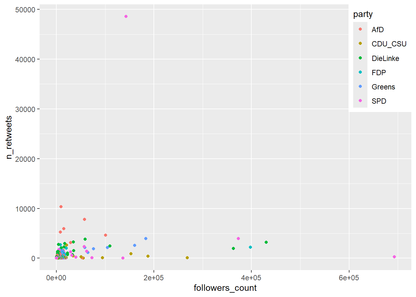
- If we want to change the order of the legend we have to convert the corresponding variable to a factor as shown for Figure 8.
# Change datatype of party to ordered factor
data <- data %>%
    mutate(party = factor(party, ordered = TRUE,
                        levels = c("DieLinke", "FDP",
                                           "CDU_CSU", "SPD",
                                           "Greens", "AfD")))


data <- data %>%
        filter(n_retweets < mean(n_retweets), # Whathappenshere?
        followers_count < mean(followers_count))

ggplot(data,
       aes(x = followers_count,
           y = n_retweets,
           colour = party)) +
       geom_point() +
             scale_colour_manual(name = "Partei",
                                 values = c("DieLinke" = "magenta",
                                                     "FDP" = "orange",
                                                     "CDU_CSU" = "black",
                                                     "SPD" = "red",
                                                     "Greens" = "darkgreen",
                                                     "AfD" = "blue")) # Good colors?
5.6 Scales (4): Exercise 1
- Q: Just looking at the code below (not running it!), what would Figure 7 look like if we additionally set
size = followers_countandshape = partywithinaes(...)as we do below?- How many variables/mappings are we dealing with now? (How many would we need?)
- How many legends are created?
Exercise solution
- How many variables/mappings are we dealing with now? (How many would we need?)
- 3 variables and 5 mappings. We would only need 3 mappings (= number of variables).
- How many legends are created?
- 2 legends are created.
5.7 Scales (4): Exercise 2
- Load the data on twitter influence with
data <- read_csv(sprintf("https://docs.google.com/uc?id=%s&export=download", "1f5Knb2Iywwaor30AWlvHZB6VICDxdqzS"))ordata <- read_csv("data_twitter_influence.csv"). - Inspect the dataset with
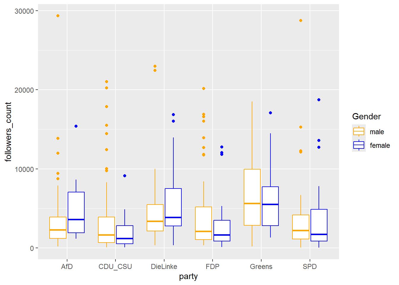
str(). - Please rebuilt Figure 9 below.
- Hint: You might need to create a factor variable with
factor()and it might be necessary to filter on the variablefollowers_count. Besides you might need the boxplot geom.
- Hint: You might need to create a factor variable with
- Pick three different variables (or more) out of
dataand map them to different (aesthetic) scales. Can you find anything interesting?
Exercise solution
# 1.
data <- read_csv("www/data/data_twitter_influence.csv", col_types = cols())

# 2.
str(data)

# 3.
ggplot(data,
       aes(x = party,
           y = followers_count,
           colour = party,
           shape = factor(female))) +
    geom_point()

# 4.
# The color scale because it is encoded in the x-axis (= x-scale)

# 5.
# Various solutions
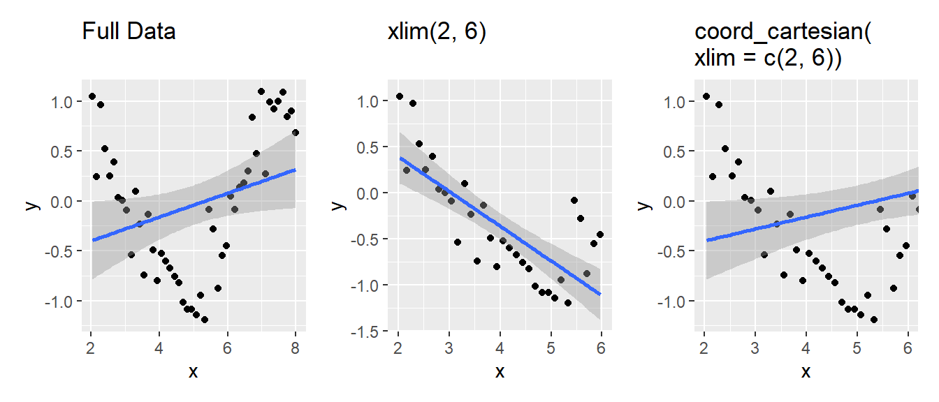
5.8 xlim/limits vs. coord_cartesian
xlim(),scale_x_continuous(limits = ...)- Data Filtering: Removes data points outside specified limits.
- Recalculates Statistics: Changes calculations (e.g., smooth lines).
- “Hard Clipping”: Data is permanently removed for the plot.
coord_cartesian(xlim = ...)- Viewing Window Adjustment: Zooms in on the plot.
- Preserves Data: Does not alter the underlying data or calculations.
- “Soft Clipping”: Data outside the view is still used for calculations.
6 Theme, titles and captions
6.1 Theme (1)
- Theme system allows for fine control over non-data elements of a plot
- Does not change rendering (geoms), i.e., perceptual properties
- Helps to make plot aesthetically pleasing.. control fonts, ticks etc.
- Separation between data and non-data parts
- Determine how data is displayed when creating plot
- Edit details of rendering using theming system
- Components (\(\times\) 4)
- Complete themes, e.g.,
theme_light()(check them out) theme()function: Can be used to override default theme elementstheme(plot.title = element_text(colour = "red"))
- Theme elements: Specify non-data elements to control, e.g.,
plot.title,axis.ticks.x,legend.key.height - Element functions: Describe visual properties of element, e.g.,
element_text()set font size, color etc. of text elements
- Complete themes, e.g.,
6.2 Theme (2): Exercise
- Q: Discuss with your neighbor: What do the different theme specifications (marked by
# ?) in the code change?
data <- data %>% filter(followers_count<50000)

ggplot(data,
       aes(x = account_age_years,
           y = followers_count,
           color = factor(female))) +
           geom_point(alpha =0.7) +
  scale_colour_manual(name = "Gender",
                     values = c("0" = "#d95f02", "1" = "#1f78b4"),
                     labels = c("0" = "male", "1" = "female")) +
  ylab("Number of followers") +
  xlab("Account age (in years)") +
  ggtitle("Twitter: Account age, follower numbers and gender") +
  theme_bw() +
  theme(
    plot.title = element_text(face = "bold", size = 12), # ?
    legend.background = element_rect(
      fill = "white", # ?
      size = 4, colour = "white"
    ),
    legend.justification = c(1, 1), # ?
    legend.position = c(1, 1), # ?
    axis.ticks = element_line(colour = "grey70", size = 0.2), # ?
    panel.grid.major = element_line(colour = "grey70", size = 0.2), # ?
    panel.grid.minor = element_blank() # ?
  ) #+
  #theme_light() # ?
6.3 Theme (3): Storing & re-using themes + fonts
- We may want to re-use a theme across our organization (e.g., the BKA)
- First we need to install the respective fonts (here: Times New Roman). This can take several minutes.
install.packages("extrafont")
#remotes::install_version("Rttf2pt1", version = "1.3.8")
library(extrafont) # load package
font_import(pattern = "times") # Import system fonts
# AFFIRM with y + enter

loadfonts(device="win") # Register fonts so they can be used for output devices
fonts() # show registered fonts- Below we store the theme with font Times New Roman and apply it to a graph.
data <- data %>% filter(followers_count<50000)


# Store the theme
bka_theme <- theme_light() + # use before theme()!
  theme(text=element_text(family="Times New Roman",
                                     face="bold",
                                     size=12))


# Store the plot and show it
p1 <- ggplot(data,
       aes(x = account_age_years,
           y = followers_count,
           color = factor(female))) +
           geom_point(alpha =0.7) +
  scale_colour_manual(name = "Gender",
                     values = c("0" = "#d95f02", "1" = "#1f78b4"),
                     labels = c("0" = "male", "1" = "female")) +
  ylab("Number of followers") +
  xlab("Account age (in years)") +
  ggtitle("Twitter: Account age, follower numbers and gender")

# Show the plot
p1

# Combine plot with stored theme
p1 + bka_theme


# Store them locally (working directory)
# TimesNewRoman only works when loaded like above
save(bka_theme, file = "bka_theme.RData")
load(file = "bka_theme.RData")
6.4 Theme (4): Legend position
- Specify position with
theme(legend.position="left")(see here)- Replace with one of
right,top,bottom,c(0.5, 0.5)(move into plot) legend.position=c(0.5, 0.5): Position coordinate on the plot, e.g., middle =c(0.5, 0.5)- lower-left =
c(0, 0), upper-right =c(1, 1), etc.
- lower-left =
- Replace with one of
legend.justification = c(0, 1): Legend justification from position coordinatec(0, 0)= Position coordinate is lower left corner,c(1, 1)= upper right corner,c(0, 1)= upper left corner,c(1, 0)= lower right corner
legend.box = "horizontal": Change legend to horizontal- Below a simple example:
6.5 Theme (5): Legend position exercise
- Exercise: Take the code from above. Do you manage to position the legend as below using the arguments
legend.positionandlegend.justification?

Exercise solution
6.6 Titles & Captions (1)
- Functions to add titles/captions
labs(title = "...", subtitle = "...", caption = "...", x = "...", y = "..."): Add title, subtitle and caption19
- Modyfying titles/captions in
theme()element_text(): Change appearance and position of textelement_textbox_simple()(ggtextpackage): Fold text to fit plot size- Q: How does the code below change title, subtitle and caption?
+ theme(
  plot.title = element_text(color = "black", size = 14, face = "bold"),
  plot.subtitle = element_text(color = "black", size = 12),
  plot.caption = element_textbox_simple(color = "black", face = "italic", hjust = 0, ,
                                              padding = unit(c(0.1, 0, 0, 0), "in")),
  plot.title.position = "plot",
  plot.subtitle.position = "plot",
  plot.caption.position =  "plot"
)- Important: If you add the figure notes (
caption = "...") directly in the plot it will travel with the plot once it is shared.
6.7 Titles & Captions (2): Exercise
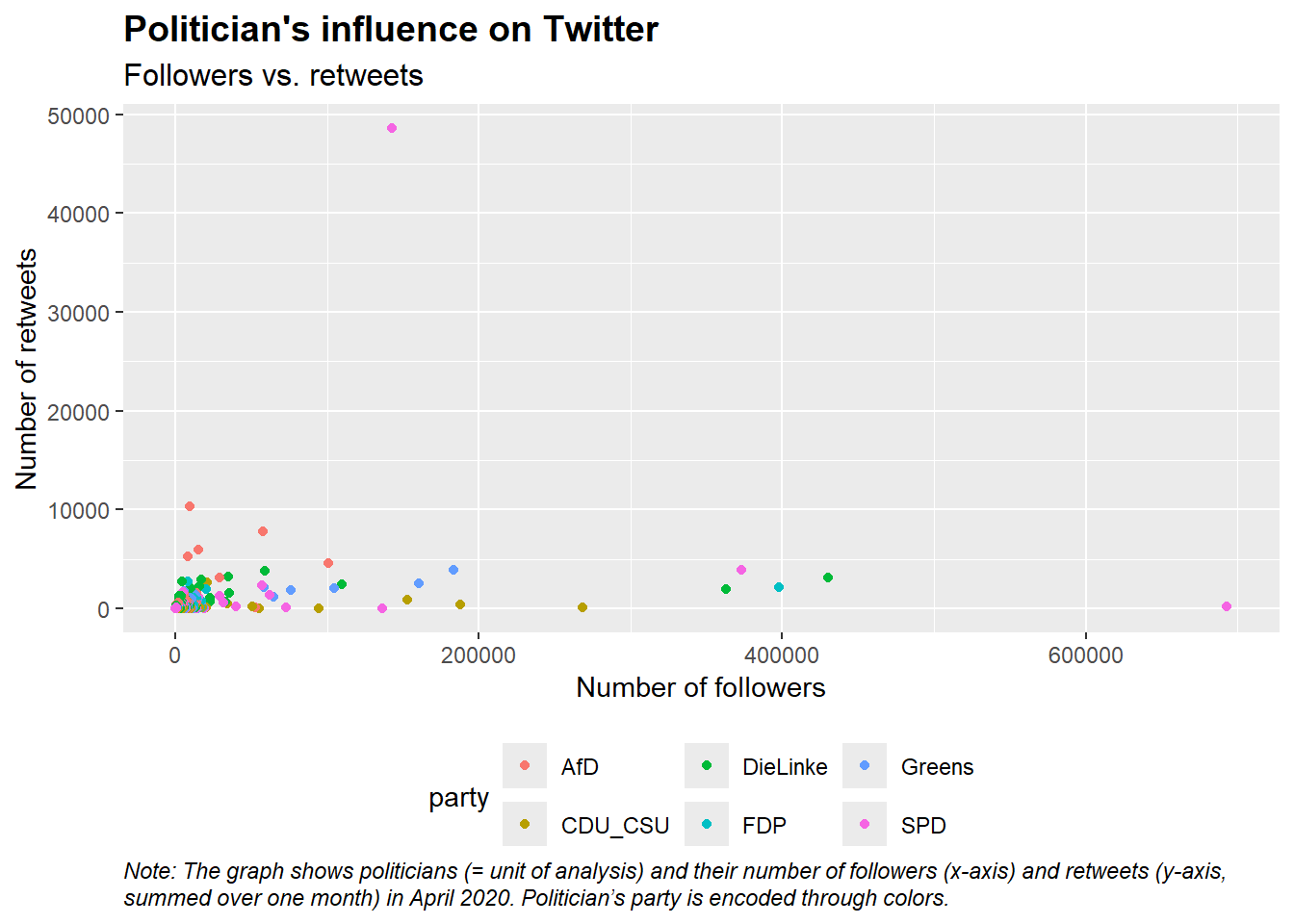
- Please modify and add to the code below to produce the graph shown in Figure 10.
options(scipen = 999) # ?
library(ggtext)

ggplot(data = data,
       aes(x = followers_count,
           y = n_retweets,
           colour = party)) +
    geom_point() +
      labs(title = ...,
                 subtitle = ...,
                 caption = ...,
                 x = "...",
                 y = "...") +
    theme(
    legend.position="bottom",
  plot.title = element_text(color = ..., size = 14, face = "bold"),
  plot.subtitle = element_text(color = ..., size = 12),
  plot.caption = element_textbox_simple(color = ..., face = "italic", hjust = 0),
    plot.title.position = "plot",
  plot.subtitle.position = "plot",
  plot.caption.position =  "plot"
    )
Exercise solution
options(scipen = 999) # ?
library(ggtext)
data <- read_csv("data/data_twitter_influence.csv",
                 col_types = cols())
ggplot(data = data,
       aes(x = followers_count,
           y = n_retweets,
           colour = party)) +
    geom_point() +
      labs(title = "Politician's influence on Twitter",
                 subtitle = "There is no clear relationship between followers and retweets",
                 caption = "Note: The graph shows politicians (unit of analysis) and their number of followers (x-axis, measured on 24th of April, 2020) and retweets (y-axis, summed over March 2020). Politician's party is encoded through colors.",
                 x = "Number of followers",
                 y = "Number of retweets") +
    theme_minimal() +
    theme(
    legend.position="right",
  plot.title = element_text(color = "black", size = 14, face = "bold"),
  plot.subtitle = element_text(color = "black", size = 12),
  plot.caption = element_textbox_simple(color = "black", face = "italic", hjust = 0, ,
                                              padding = unit(c(0.1, 0, 0, 0), "in")),
    plot.title.position = "plot",
  plot.subtitle.position = "plot",
  plot.caption.position =  "plot",
    plot.margin = margin(10, 5.5, 10, 5.5)
    )
7 Data labels & Annotations
7.1 Data labels & Annotations (1)
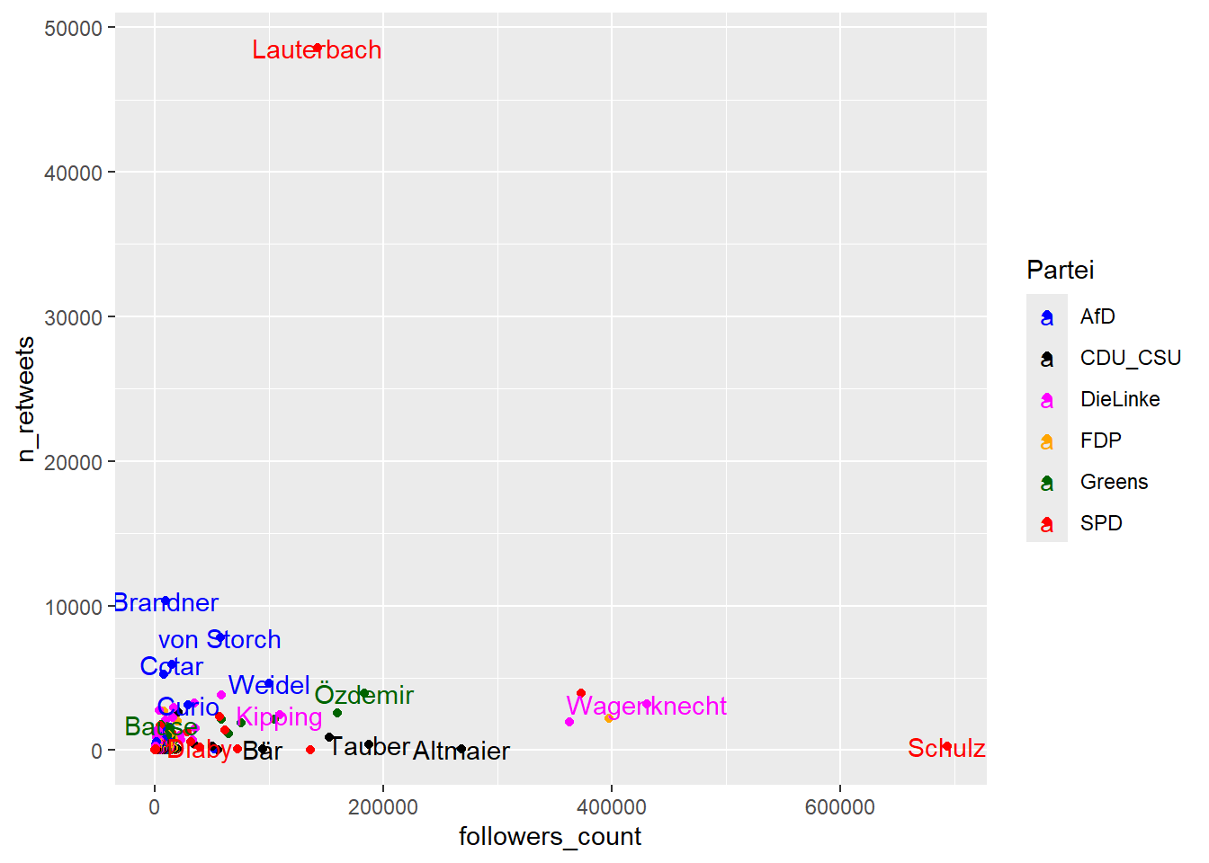
- Labels
geom_text(): Add text, e.g., labels as in Figure 11
- Annotations
geom_text(): Add text descriptions or to label points- Most plots won’t benefit from labelling every observation, but labeling outliers/important points is useful
geom_rect(): to highlight interesting rectangular regions of the plot- has aesthetics
xmin,xmax,yminandymax
- has aesthetics
geom_vline(),geom_hline()andgeom_abline(): Add reference linesannotate(): Annotate text in textbox
7.2 Data labels & Annotations (2)
- Figure 12 illustrates various geoms for labeling and annotations.
geom_text_repel(): Automatic label location available from theggrepelpackage (install.packages("ggrepel"))- See the ggrepel vignette
- Delete labels beforehand in the data (Q: Another solution?)
- The use of
hjustandvjustis explained in this wonderful answer.
# Modify data
data$last_name[data$followers_count<50000] <- NA # Explain! (delete labels)

# Visualize
ggplot(data = data,
       aes(x = followers_count,
           y = n_retweets,
           colour = party)) +
    geom_point() +
    geom_text_repel(aes(label = last_name, color = party),
                      segment.color = 'red',
                      size = 3) +
    geom_vline(aes(xintercept = mean(followers_count))) +
    geom_hline(aes(yintercept = mean(n_retweets))) +
    annotate("rect", xmin = 300000, xmax = 700000,
              ymin = 30000, ymax = 50000,
              color = "#386cb0",
              fill = "#386cb0",
             alpha = 0.1) +
  annotate("text",
           label = "No outliers\n in this area!",
           x = 500000, y = 40000,
           size = 5,
           colour = "#386cb0",
           hjust = 0.5,
           vjust = 0.5) +
             scale_colour_manual(name = "Partei",
                                 values = c("DieLinke" = "magenta",
                                                     "FDP" = "orange",
                                                     "CDU_CSU" = "black",
                                                     "SPD" = "red",
                                                     "Greens" = "darkgreen",
                                                     "AfD" = "blue"))

# + scale_x_continuous(breaks = seq(0,700000, 100000),
#                      labels = paste(seq(0,700, 100), "tsd", sep="")) + theme(axis.text.x = element_text(angle = 45, hjust = 1))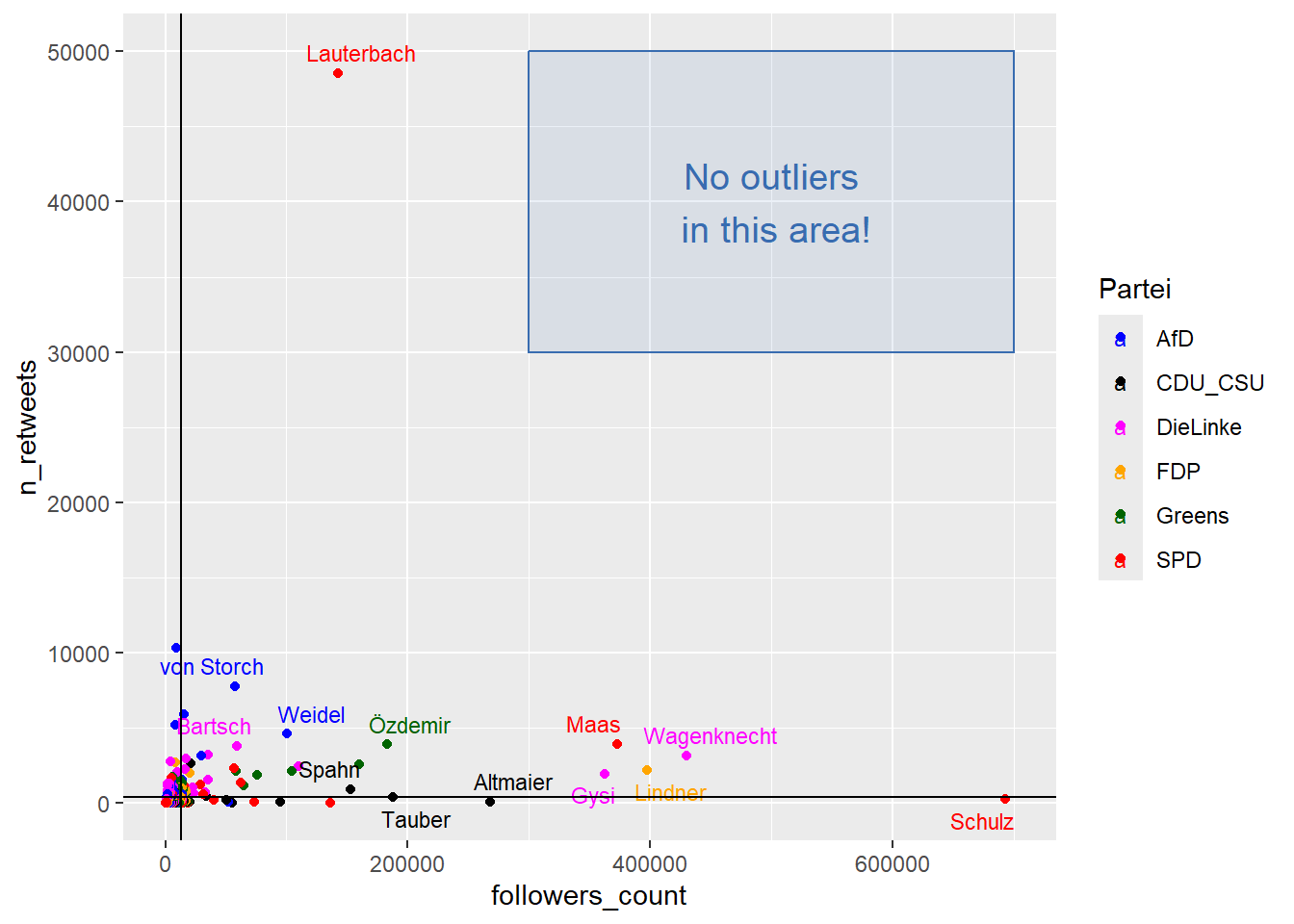
- See here for an explanation of hjust/vjust.
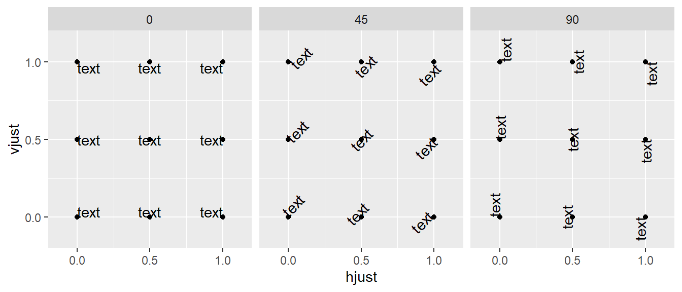
7.3 Data labels & Annotations: Illustration of hjust and vjust
- Table 4 shows variations of hjust, vjust and text angles that are then visualized in Figure 13 (Source).
| hjust | vjust | angle | text |
|---|---|---|---|
| 0.0 | 0.0 | 0 | text |
| 0.5 | 0.0 | 0 | text |
| 1.0 | 0.0 | 0 | text |
| 0.0 | 0.5 | 0 | text |
| 0.5 | 0.5 | 0 | text |
| 1.0 | 0.5 | 0 | text |
| 0.0 | 1.0 | 0 | text |
| 0.5 | 1.0 | 0 | text |
| 1.0 | 1.0 | 0 | text |
| 0.0 | 0.0 | 45 | text |
| 0.5 | 0.0 | 45 | text |
| 1.0 | 0.0 | 45 | text |
| 0.0 | 0.5 | 45 | text |
| 0.5 | 0.5 | 45 | text |
| 1.0 | 0.5 | 45 | text |
| 0.0 | 1.0 | 45 | text |
| 0.5 | 1.0 | 45 | text |
| 1.0 | 1.0 | 45 | text |
| 0.0 | 0.0 | 90 | text |
| 0.5 | 0.0 | 90 | text |
| 1.0 | 0.0 | 90 | text |
| 0.0 | 0.5 | 90 | text |
| 0.5 | 0.5 | 90 | text |
| 1.0 | 0.5 | 90 | text |
| 0.0 | 1.0 | 90 | text |
| 0.5 | 1.0 | 90 | text |
| 1.0 | 1.0 | 90 | text |
7.4 Data labels & Annotations (4): Exercise
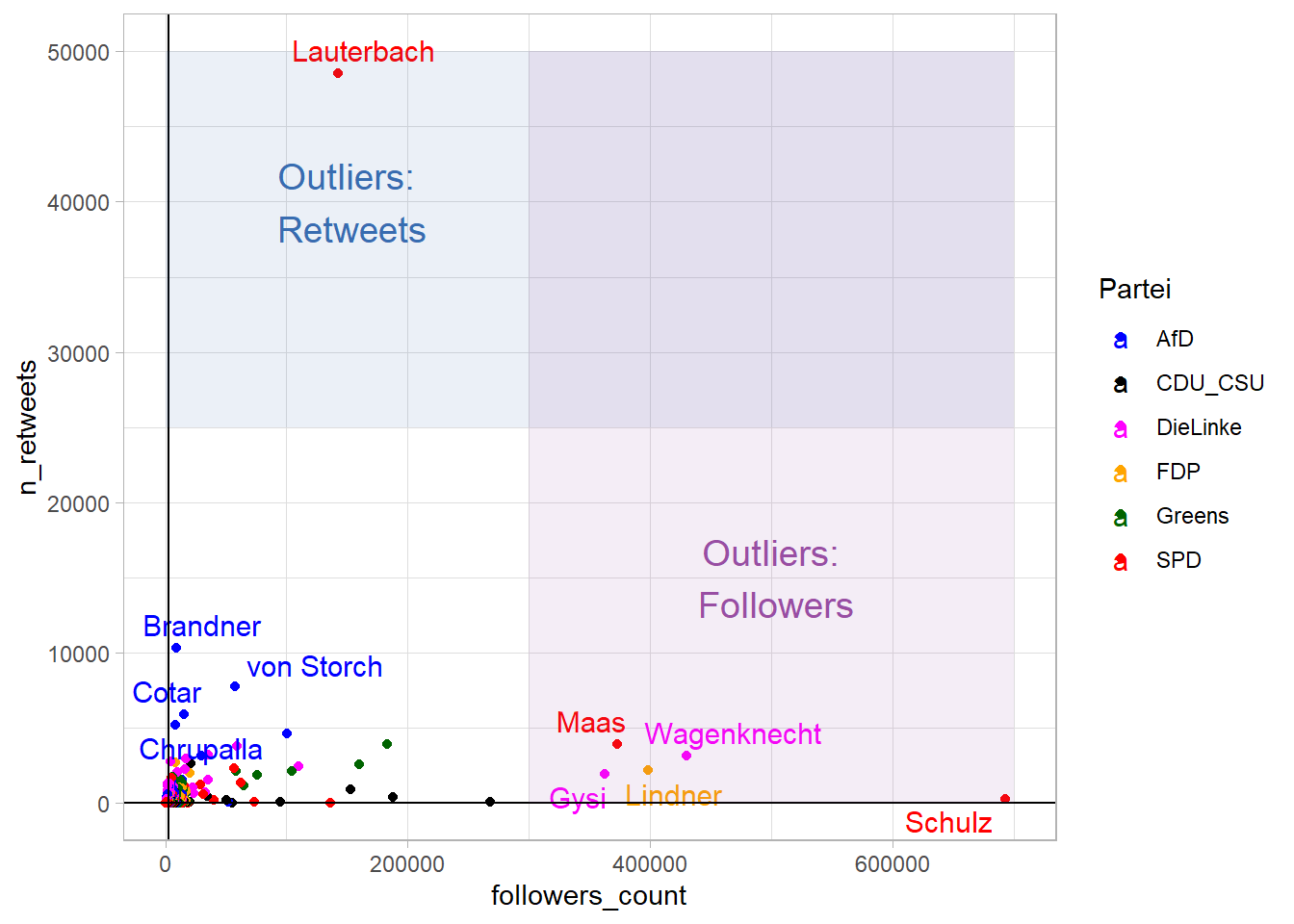
- Use the code from Figure 12 and try to built Figure 14 below.
- Hint: The graph only shows labels for persons that have high values on both axes (but not necessarily the other one). First, use the code below to keep last names for the respective persons (it creates a new variable
last_name2that is then used to replace the oldlast_name). - To change the background theme use
+ theme_light() - Also you will need both
annotate("rect",...)andannotate("text",...) - Beware: x-Scale is shown in scientific notation, e.g., the real value behind
4e+05is400000and you have to pickxmin,xmaxaccordingly. - The colors used for the boxes are #386cb0 and #984ea3.
- Hint: The graph only shows labels for persons that have high values on both axes (but not necessarily the other one). First, use the code below to keep last names for the respective persons (it creates a new variable
Exercise solution
data <- data %>%
    mutate(last_name1 = ifelse(followers_count < 300000, NA, last_name),
                 last_name2 = ifelse(n_retweets < 5000, NA, last_name),
                 last_name = coalesce(last_name1, last_name2))


ggplot(data = data,
       aes(x = followers_count,
           y = n_retweets,
           colour = party)) +
    geom_point() +
    geom_text_repel(aes(label = last_name),
                      segment.color = 'grey50',
                      size = 4) +
             scale_colour_manual(name = "Partei",
                                 values = c("DieLinke" = "magenta",
                                                     "FDP" = "orange",
                                                     "CDU_CSU" = "black",
                                                     "SPD" = "red",
                                                     "Greens" = "darkgreen",
                                                     "AfD" = "blue")) +
    geom_vline(aes(xintercept = median(followers_count))) +
    geom_hline(aes(yintercept = median(n_retweets))) +
    annotate("rect", xmin = 0, xmax = 700000,
              ymin = 25000, ymax = 50000,
              alpha = 0.1,
              fill="#386cb0") +
  annotate("text",
           label = "Outliers:\n Retweets",
           x = 150000, y = 40000,
           size = 5,
           colour = "#386cb0",
           hjust = 0.5,
           vjust = 0.5) +
    annotate("rect", xmin = 300000, xmax = 700000,
              ymin = 0, ymax = 50000,
              alpha = 0.1,
              fill="#984ea3") +
  annotate("text",
           label = "Outliers:\n Followers",
           x = 500000, y = 15000,
           size = 5,
           colour = "#984ea3",
           hjust = 0.5,
           vjust = 0.5) +
  theme_light()
8 Data visualization: All in one
- Tip: Screenshot graph and paste code to ask for improvements, e.g., Prompt: Find attached the graph and below the code: How can I make the legend nicer so that it only includes points (and not the letters).20
options(scipen = 999) # ?
library(ggtext)
library(ggrepel)

data <- data %>%
    filter(last_name!="Lauterbach") # Omit Lauterbach

# Modify data
data <- data %>%
    mutate(last_name1 = ifelse(followers_count < 150000, NA, last_name),
                 last_name2 = ifelse(n_retweets < 3000, NA, last_name),
                 last_name = coalesce(last_name1, last_name2))


ggplot(data = data,
       aes(x = followers_count,
           y = n_retweets,
           colour = party)) +
    geom_point() +
  geom_point(data=data %>% filter(party == "AfD", n_retweets >=3000),
                     aes(x =followers_count,
                            y = n_retweets),
                     pch=21,
             fill=NA, size=4,
             colour="blue", stroke=1) +
    geom_text_repel(aes(label = last_name,
                                            color = party),
                      segment.color = 'red',
                      size = 3,
                                      show.legend = FALSE) +
    scale_y_continuous(breaks = seq(0, 10000, 2000)) +
     scale_x_continuous(breaks = seq(0, 700000, 100000)) +
      labs(title = "German politician's influence on Twitter",
                 subtitle = "Despite having fewer followers, AfD top politicians have more influence in terms of retweets.",
                 caption = "Note: The graph shows politicians (unit of analysis) and their number of followers (x-axis, measured on 24th of April, 2020) and retweets (y-axis, summed over March 2020). Politician's party is encoded through colors. Lauterbach was omitted from the graph.",
                 x = "Number of followers",
                 y = "Number of retweets") +
    theme_light() +
    theme(
  plot.title = element_text(color = "black", size = 14, face = "bold"),
  plot.subtitle = element_text(color = "black", size = 12),
  plot.caption = element_textbox_simple(color = "black", face = "italic", hjust = 0, ,
                                        padding = unit(c(0.2, 0, 0, 0), "in")),
    plot.title.position = "plot",
  plot.subtitle.position = "plot",
  plot.caption.position =  "plot",
  legend.position=c(0.95, 0.95),
  legend.justification = c(0.95, 0.95),
  axis.text.x = element_text(angle = 20, hjust = 1, vjust = 1)) +
             scale_colour_manual(name = "Party",
                                 values = c("DieLinke" = "magenta",
                                                     "FDP" = "orange",
                                                     "CDU_CSU" = "black",
                                                     "SPD" = "red",
                                                     "Greens" = "darkgreen",
                                                     "AfD" = "blue"))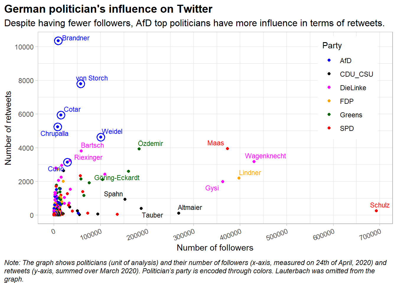
8.1 Exercise
The data visualization in Figure 15 tried to follow some of the advice on how to create better graphs, e.g., using titles that introduce the main topic and communicate the main message, adding informative figure notes, trying to highlight data the reflects the main message, etc.
9 Facetting (small multiples)
9.1 Facetting (1)
- Small multiples: Display a plot across values/categories of another variable
- Aim of facetting: Increase density while keeping readability
- Types of facetting: Grid (
facet_grid()) and wrapped (facet_wrap()) (Show Figure 14.1)- Q: According to which variable does Figure 16 split the data? (note the
~infacet_wrap(~variable)) What can we see in the graph? How many vars have been mapped to how many scales?
- Q: According to which variable does Figure 16 split the data? (note the
ggplot(data %>% filter(followers_count<50000), # Filter!
       aes(x = account_age_years,
           y = followers_count, color = party)) +
      geom_point() +
      facet_wrap(~party)  +
             scale_colour_manual(name = "Partei",
                                 values = c("DieLinke" = "magenta",
                                                     "FDP" = "orange",
                                                     "CDU_CSU" = "black",
                                                     "SPD" = "red",
                                                     "Greens" = "darkgreen",
                                                     "AfD" = "blue"))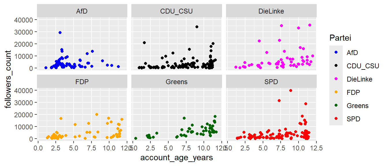
- If the aim is to plot several independent plots next to each other we have to resort to the package
patchworkor thegrid.arrange()function from thegridExtrapackage
9.2 Facetting: Exercise (2)
- Create a new R script and load the data:
- What do you think happens if you try to facet by a continuous variable like
followers_count? What aboutparty? What’s the key difference? - Take the subset of politicians that have less then 50000 followers (
data %>% filter(followers_count<50000)) and use the code from above and facetting (+ facet_grid(female ~ party)) to explore the four-way relationship betweenaccount_age_years,followers_count,female(0 = male) andparty. - Read the documentation for
facet_wrap()(?facet_wrap). What arguments can you use to control how many rows and columns appear in the output? - What does the scales argument in
facet_wrap()do? When might you use it?21
Exercise solution
# 3.
ggplot(data %>% filter(followers_count<50000),
       aes(x = account_age_years,
           y = followers_count)) +
  geom_point() +
  facet_grid(party ~ female)

ggplot(data %>% filter(followers_count<50000),
       aes(x = account_age_years,
           y = followers_count,
           color = factor(female))) +
  geom_point() +
  facet_wrap(~party)
10 Output & saving
print(): Render it on screen (inside a loop or function, you’ll need to do it yourself)ggsave(): Save it to diskplot =: By default the last plot or provide ggplot objectwidth =,height =: Default size in inches- DINA4 paper 8.27 * 11.69 inches, e.g., use
width = 7 - For other unit use:
units = "cm"
- DINA4 paper 8.27 * 11.69 inches, e.g., use
device =: Output format, e.g.,"eps","pdf","jpeg","tiff","png","bmp","svg"dpi =: Set plot print resolution (dots per inch vs. ppi = pixels per inch)- PDF are vector grapics: Preferable!
saveRDS(): Save a cached copy of it to disk- Saves complete copy of plot object (you can easily recreate it)
- Use
walk()in combination withggsave()to store several formats
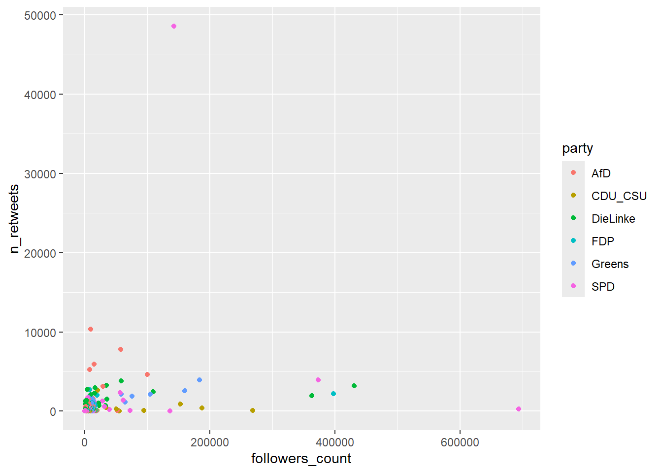
Saving a plot object directly to the hard disk as .RData file:
Saving a plot in several formats at once:
11 Add interactivity (ggplot + plotly)
- ggplot objects can be converted to plotly objects
- Work more or less well (see below)
- See Chapter 9.
Interactivity with small multiples in Figure 18:
References
Footnotes
Objective: Describe all features underlying statistical graphs↩︎
Focuses on the primacy of layers and adapts it for R↩︎
Normally Cartesian.↩︎
The data was extracted from the 1974 Motor Trend US magazine, and comprises fuel consumption and 10 aspects of automobile design and performance for 32 automobiles (1973–74 models).↩︎
From the inside of brackets to the outside. Then from line(+) to line(+).↩︎
Execute it line by line (or from inside to outside)! Same is true for dplyr code!↩︎
Either by its name directly.. often by knowing what an abbreviation stands for.↩︎
Use line breaks, spaces etc. Check out the tidyverse styleguide.↩︎
See
plotlyand other packages.↩︎Here raw entails that we didn’t summarized the data, e.g., we didn’t aggregate it or summarize it using statistical models.↩︎
Tells the ggplot function to visualize the data “as is”, e.g., we could use
geom_bar()and either feed it data that is then summarized/aggregated by thegeom_bar()function or we feed it data that we summarized ourselves beforehand and tellgeom_bar()not to summarize it.↩︎This dataset contains a subset of the fuel economy data that the EPA makes available.
cty= city miles per gallon.hwy= highway miles per gallon↩︎A dataset containing the prices and other attributes of almost 54,000 diamonds.
carat= weight of the diamond (0.2–5.01).price= price in US dollars.↩︎This dataset was produced from US economic time series data available.
date= Month of data collection.unemploy= number of unemployed in thousands.↩︎When using
geom_histogram(), ggplot produces/calculates values for the y-axis itself. This dataset contains a subset of the fuel economy data that the EPA makes available.cty= city miles per gallon↩︎?Oxboys: These data are described in Goldstein (1987) as data on the height of a selection of boys from Oxford, England versus a standardized age.↩︎?Oxboys: These data are described in Goldstein (1987) as data on the height of a selection of boys from Oxford, England versus a standardized age.↩︎Data includes German MPs that have a Twitter account (not complete). The number of retweets refers to all retweets in March 2020. The number of followers was measured on 24th of April 2020.↩︎
Alternatively,
ggtitle(title = "...", subtitle = "...")to add title and subtitle.↩︎Here is the fix: Add
show.legend = FALSEinside yourgeom_text_repel()function.↩︎Determines whether scales are fixed across all plots or not.↩︎
