Self-learning material: Exploring datasets & recipes
Chapter last updated: 10 Februar 2025
1 Introduction
Welcome to the self-learning phase of the workshop Applied Machine Learning (with R)!
The self-learning phase has the following objectives:
- Get to know the datasets we use in this workshop (e.g., ESS data, COMPAS data).
- Why? As a consequence we can then spend more time on machine learning questions during the workshop.
- Learn how to explore a dataset visually and descriptively (using newer R packages)
- Why? To built a predictive ML model we need to understand both the data generally and how various potential predictors/features (independent variables) are related to our outcome variable (dependent variable). R offers some nice tools to achieve such insights. Moreover, missing matter and we will explore them to.
- Understand the logic of recipes to preprocess data before building predictive models
- Why?
tidymodelsintroduces the elegant concept ofrecipesto prepare data for predictive modelling. During the self-learning phase you will see first examples of what recipes entail.
- Why?
Below we will explore the datasets step-by-step. Code example will be given for one dataset and can then be practiced using the other dataset. Please copy the code examples, do the exercises and answer the questions in a single R script so that we can discuss them in class. Please also collect all the questions that come up during the self-learning exercise so that we can discuss them next week.
2 R packages
In order to do the self-learning exercise we will rely on a set of R packages that you can install using the code below. Importantly, you need to install the pacman package first. If you have trouble installing the packages let me know!
3 Exercise 1: First overview of the datasets
Researchers are increasingly exploring how we can predict social outcomes such as life satisfaction (Collins et al. 2015; Prati 2022; Pan and Cutumisu 2023; Çiftci and Yıldız 2023), relationship quality (Großmann, Hottung, and Krohn-Grimberghe 2019), voter turnout (Moses and Box-Steffensmeier 2021), voting behavior (Bach et al. 2019), personality (Stachl et al. 2020), armed conflict (Cederman and Weidmann 2017).
One important distinction is to be made between predictions of individual-level outcomes such as life satisfaction and aggregate-level outcomes such as armed conflict. In our workshop we will (mainly) rely on two datasets that contain individuals. And the objective of this exercise is to get a better understanding of those datasets through readings & videos.
3.1 COMPAS dataset
“Across the nation[s], judges, probation and parole officers are increasingly using algorithms to assess a criminal defendant’s likelihood of becoming a recidivist – a term used to describe criminals who re-offend” (Larson et al. 2016).
During the workshop we will built models to predict whether someone recidivates or not (reoffends or not), i.e., whether prisoners that get out of prison commit further crimes, using the Compas dataset. So-called risk assessment tools (RATs) such as Compas are increasingly used to assess a criminal defendant’s probability of re-offending. Our outcome of interest – re-offending or not – is binary which is also called a classification problem. Classification problems are common in ML applications and we can also use the data to explore questions of bias & fairness.1
Please start by reading the background story of the Compas dataset: Machine Bias - There’s software used across the country to predict future criminals. And it’s biased against blacks.
The software tool Compas was developed by Northpointe. Larson et al. (2016) describe how they set out to analyze the Compas data. Please skim read their overview: How We Analyzed the COMPAS Recidivism Algorithm
Finally, while Compas uses a larger number of features/variables for the prediction, Dressel and Farid (2018) showed that a model that includes only a defendant’s sex, age, and number of priors (prior offences) can be used to arrive at predictions of equivalent quality. Please quickly skim read their research paper: https://www.science.org/doi/full/10.1126/sciadv.aao5580
Below you find a description of the variables in the dataset:
id: ID of prisoner, numericname: Name of prisoner, factorcompas_screening_date: Date of compass screening, datedecile_score: the decile of the COMPAS score, numericreoffend: whether someone reoffended/recidivated (=1) or not (=0), numericreoffend_factor: same but factor variableage: a continuous variable containing the age (in years) of the person, numericage_cat: age categorizedpriors_count: number of prior crimes committed, numericsex: gender with levels “Female” and “Male”, factorrace: race of the person, factorjuv_fel_count: number of juvenile felonies, numericjuv_misd_count: number of juvenile misdemeanors, numericjuv_other_count: number of prior juvenile convictions that are not considered either felonies or misdemeanors, numeric
3.2 ESS data
The second dataset we use is the European Social Survey (ESS) [Round 10 - 2020. Democracy, Digital social contacts]. We use this dataset to tackle regression problems that is prediction problems that have a continuous outcome. The ESS (prepared by myself2) contains different outcomes amenable to both classification and regression as well as a lot of variables that could be used as features (~380 variables). We are interested in predicting the outcome life_satisfaction using different potential predictors. Below a few variables that are in the dataset (newname = original name):
life_satisfaction = stflife: measures life satisfaction (How satisfied with life as a whole?).unemployed = uempla: measures unemployment (Doing last 7 days: unemployed, actively looking for job).education = eisced: measures education (Highest level of education, ES - ISCED).age: measures age etc.country = cntry: measures a respondent’s country of origin (here held constant for France).- etc.
Please start by watching this short video and reading the short Wikipedia article.
In addition, please skim read the different documents: https://ess.sikt.no/en/study/172ac431-2a06-41df-9dab-c1fd8f3877e7. We focus on predicting life satisfaction during the workshop. A good overview of research is provided by the wikipedia article.
Finally, can you find the question that is used to measure life satisfaction in the ESS10 questionnaire?
4 Why data exploration?
Why do we need to explore the data?
Exploring the data is necessary to fully understand it. A few questions that interest us are:
- How many observations (rows) and variables (columns) does the data contain?
- What types of variables are there? (numerical, categorical)
- Are the missing values? If yes, which variables, units or observations are missing? Are those missings systematic?
- How are the variables distributed? Are there outliers?
- Is our data representative of the target population we are interested in?3
Please take a few minutes to think about the following question: For what reason are variable types, variable distributions, missing values/outliers and representativeness important for building a machine learning model? How might these aspects matter?
Answer
We will dive into the details later. Please find a few general answers below that will become more concrete during the workshop.
- Variable Types (Different Kinds of Data)
- Data can be numerical (e.g., age, income) or categorical (e.g., colors, job titles). Machine learning models handle these differently—some require numerical encoding for categorical data. Also, certain models, like decision trees, handle categorical data naturally, while others, like linear regression, require numerical inputs.
- Example: A model predicting house prices might use numerical features like square footage and categorical features like neighborhood. If the neighborhood is not converted into a numerical form (e.g., one-hot encoding), some models won’t be able to process it.
- Missing Values & Outliers (Incomplete or Unusual Data)
- Missing values can distort model predictions if not handled properly, and extreme values (outliers) can skew model learning. Depending on the situation, missing data can be imputed (e.g., mean, median, mode) or removed, while outliers can be transformed, capped, or ignored based on domain knowledge.
- Example: In a medical dataset, if 20% of patients are missing blood pressure readings, simply dropping those rows could remove valuable patterns. Instead, imputing missing values based on similar patients might be a better choice.
- Variable Distributions (How Data is Spread Affects Learning)
- The way data is distributed (e.g., normal, skewed, imbalanced) influences model performance. Skewed distributions can lead to biased predictions, and imbalanced classes in classification problems can cause the model to favor the majority class. Normalization or transformation techniques can help address these issues.
- Example: If a fraud detection model is trained on 99% non-fraud transactions and 1% fraud cases, it may predict “no fraud” almost always. Techniques like oversampling or adjusting class weights can help balance learning.
- Representativeness (Does the Data Reflect Reality?)
- If the training data (data used to built the model) doesn’t reflect the real-world population, the model may perform poorly in practice. Bias in the dataset (e.g., underrepresentation of certain groups) can lead to unfair or inaccurate predictions. Ensuring diverse, well-balanced data helps build a robust model.
- Example: A resume screening AI trained only on past hires from a tech company might unintentionally favor male candidates if the historical data had gender bias. Ensuring a representative dataset can reduce such biases.
5 Data Exploration Techniques
Generally, we have different tools and techniques at our disposal to explore data. A broad distinction can be made between:
- Statistical summaries
- Calculate various descriptive statistics (mean, median, mode, standard deviation) to get a better feeling for the distributions
- Correlation analysis: Analyze outcome-predictors correlations to explore what might predict the outcome as well as predictor-predictor correlations to explore which predictors are similar.
- Visualization tools
- Use visualizations to explore distributions such as histograms/barplots for distributions, box plots for outliers and scatter plots for relationships. And visualize missing data with specialized graphs.4
6 Exercise 2: Initial data exploration
Below we will start with some initial data exploration. Please read and do the exercises below. Generally, you should copy the code from the R chunks into your own script and try to run them. Please work in a single R-script so that you have all R-code available later on.
6.1 Compas dataset: Code examples
Below you find various functions to get a first quick overview of a dataset. We will start with the Compas data. Subsequently, you will be asked to answer a few questions and run the same functions for the ESS dataset.
Start by loading the dataset (the dataset is loaded from a URL and the object generated is called data):
library(tidyverse) # Load tidyverse functions

# 1.
# Load the .RData file into R
load(url(sprintf("https://docs.google.com/uc?id=%s&export=download",
                         "1gryEUVDd2qp9Gbgq8G0PDutK_YKKWWIk")))
data_compas <- data # Create new object to store data


# 2.
# install.packages(pacman)
pacman::p_load(skimr,
               modelsummary,
               DataExplorer,
               visdat,
               naniar,
               tidyverse,
               patchwork)
Please run the different functions below (in your R script) and explore what they do by examining the output as well as the corresponding help files, e.g., ?str or ?ncol. What can we use them for?
[1] 7214[1] 14tibble [7,214 × 14] (S3: tbl_df/tbl/data.frame)
$ id : num [1:7214] 1 3 4 5 6 7 8 9 10 13 ...
$ name : Factor w/ 7158 levels "aajah herrington",..: 4922 4016 1989 4474 690 4597 2035 6345 2091 680 ...
$ compas_screening_date: Date[1:7214], format: "2013-08-14" "2013-01-27" ...
$ decile_score : num [1:7214] 1 3 4 8 1 1 6 4 1 3 ...
$ reoffend : num [1:7214] 0 1 1 0 0 0 1 NA 0 1 ...
$ reoffend_factor : Factor w/ 2 levels "no","yes": 1 2 2 1 1 1 2 NA 1 2 ...
$ age : num [1:7214] 69 34 24 23 43 44 41 43 39 21 ...
$ age_cat : Factor w/ 3 levels "25 - 45","Greater than 45",..: 2 1 3 3 1 1 1 1 1 3 ...
$ priors_count : num [1:7214] 0 0 4 1 2 0 14 3 0 1 ...
$ sex : Factor w/ 2 levels "Female","Male": 2 2 2 2 2 2 2 2 1 2 ...
$ race : Factor w/ 6 levels "African-American",..: 6 1 1 1 6 6 3 6 3 3 ...
$ juv_fel_count : num [1:7214] 0 0 0 0 0 0 0 0 0 0 ...
$ juv_misd_count : num [1:7214] 0 0 0 1 0 0 0 0 0 0 ...
$ juv_other_count : num [1:7214] 0 0 1 0 0 0 0 0 0 0 ...
We also want to calculate some summary statistics. Our outcome variable is reoffend. The two functions skim() and datasummary_skim() are very helpful functions for that. What can we read from the output? Can you guess what the different variables measure?
| Name | data_compas |
| Number of rows | 7214 |
| Number of columns | 14 |
| _______________________ | |
| Column type frequency: | |
| Date | 1 |
| factor | 5 |
| numeric | 8 |
| ________________________ | |
| Group variables | None |
Variable type: Date
| skim_variable | n_missing | complete_rate | min | max | median | n_unique |
|---|---|---|---|---|---|---|
| compas_screening_date | 0 | 1 | 2013-01-01 | 2014-12-31 | 2013-09-11 | 690 |
Variable type: factor
| skim_variable | n_missing | complete_rate | ordered | n_unique | top_counts |
|---|---|---|---|---|---|
| name | 0 | 1.00 | FALSE | 7158 | ant: 3, ang: 2, ant: 2, ant: 2 |
| reoffend_factor | 614 | 0.91 | FALSE | 2 | no: 3422, yes: 3178 |
| age_cat | 0 | 1.00 | FALSE | 3 | 25 : 4109, Gre: 1576, Les: 1529 |
| sex | 0 | 1.00 | FALSE | 2 | Mal: 5819, Fem: 1395 |
| race | 0 | 1.00 | FALSE | 6 | Afr: 3696, Cau: 2454, His: 637, Oth: 377 |
Variable type: numeric
| skim_variable | n_missing | complete_rate | mean | sd | p0 | p25 | p50 | p75 | p100 | hist |
|---|---|---|---|---|---|---|---|---|---|---|
| id | 0 | 1.00 | 5501.26 | 3175.71 | 1 | 2735.25 | 5509.5 | 8246.5 | 11001 | ▇▇▇▇▇ |
| decile_score | 0 | 1.00 | 4.51 | 2.86 | 1 | 2.00 | 4.0 | 7.0 | 10 | ▇▅▅▃▃ |
| reoffend | 614 | 0.91 | 0.48 | 0.50 | 0 | 0.00 | 0.0 | 1.0 | 1 | ▇▁▁▁▇ |
| age | 0 | 1.00 | 34.82 | 11.89 | 18 | 25.00 | 31.0 | 42.0 | 96 | ▇▅▂▁▁ |
| priors_count | 0 | 1.00 | 3.47 | 4.88 | 0 | 0.00 | 2.0 | 5.0 | 38 | ▇▁▁▁▁ |
| juv_fel_count | 0 | 1.00 | 0.07 | 0.47 | 0 | 0.00 | 0.0 | 0.0 | 20 | ▇▁▁▁▁ |
| juv_misd_count | 0 | 1.00 | 0.09 | 0.49 | 0 | 0.00 | 0.0 | 0.0 | 13 | ▇▁▁▁▁ |
| juv_other_count | 0 | 1.00 | 0.11 | 0.50 | 0 | 0.00 | 0.0 | 0.0 | 17 | ▇▁▁▁▁ |
| Unique | Missing Pct. | Mean | SD | Min | Median | Max | Histogram | |
|---|---|---|---|---|---|---|---|---|
| id | 7214 | 0 | 5501.3 | 3175.7 | 1.0 | 5509.5 | 11001.0 |  |
| decile_score | 10 | 0 | 4.5 | 2.9 | 1.0 | 4.0 | 10.0 |  |
| reoffend | 3 | 9 | 0.5 | 0.5 | 0.0 | 0.0 | 1.0 |  |
| age | 65 | 0 | 34.8 | 11.9 | 18.0 | 31.0 | 96.0 |  |
| priors_count | 37 | 0 | 3.5 | 4.9 | 0.0 | 2.0 | 38.0 |  |
| juv_fel_count | 11 | 0 | 0.1 | 0.5 | 0.0 | 0.0 | 20.0 |  |
| juv_misd_count | 10 | 0 | 0.1 | 0.5 | 0.0 | 0.0 | 13.0 |  |
| juv_other_count | 10 | 0 | 0.1 | 0.5 | 0.0 | 0.0 | 17.0 |  |
| N | % | ||
|---|---|---|---|
| reoffend_factor | no | 3422 | 47.4 |
| yes | 3178 | 44.1 | |
| age_cat | 25 - 45 | 4109 | 57.0 |
| Greater than 45 | 1576 | 21.8 | |
| Less than 25 | 1529 | 21.2 | |
| sex | Female | 1395 | 19.3 |
| Male | 5819 | 80.7 | |
| race | African-American | 3696 | 51.2 |
| Asian | 32 | 0.4 | |
| Caucasian | 2454 | 34.0 | |
| Hispanic | 637 | 8.8 | |
| Native American | 18 | 0.2 | |
| Other | 377 | 5.2 |
6.2 ESS dataset: Exercise
Now that we have learned a few useful functions please apply them to explore the ESS dataset. You can load the data as follows:
- How many observations (rows) and how many variables (columns) does the ESS dataset have?
- How is the dataset structured, what variables types does it contain?
- Use
skim()anddatasummary_skim()to generate summary tables for numeric and categorical variables.- If there are too many variables pick a subset using
data %>% select(1:20).
- If there are too many variables pick a subset using
7 Exercise 3: Missingness
When building a predictive model we should always be interested in what is not there, i.e., do we have missing data on our outcome, predictors (= features = independent variables) or units (e.g., individuals). Missings affect what we can learn from our data and whether we are able to built an accurate predictive model. By now R provides a set of really useful functions to visually explore missingness through packages such as DataExplorer, naniar and visdat.
7.1 ESS dataset: Code examples
This time we start with the ESS dataset and re-load it first.
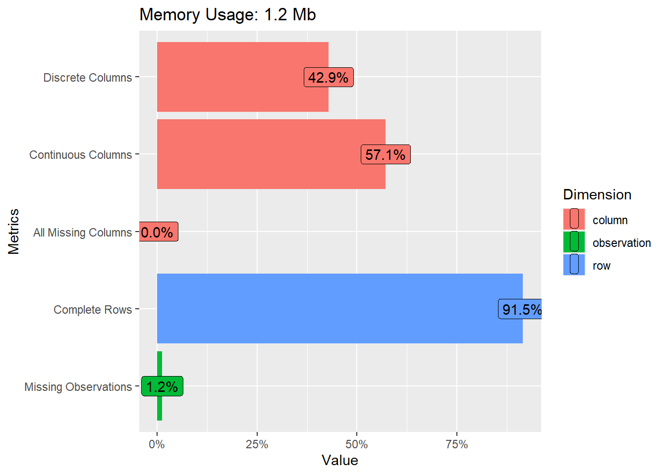
Then we use the plot_intro() function to get a quick overview.
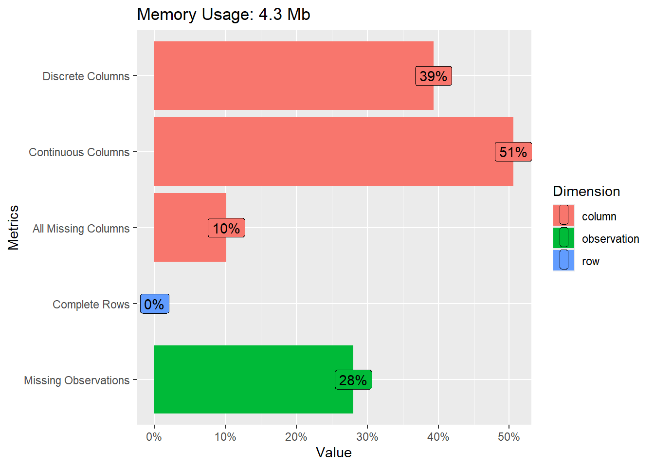
- What does Figure 1 show us? Can you guess what the different metrics contain?
Answer
The graph shows…
- …how much of your memory the data uses.
- …how many columns contain discrete (39%) or continuous (51%) variables.
- …how many columns/variables are missing (10%)
- …how many rows have complete data, i.e., no missings (0%).
- …how many observations that is cells in our data is missing (28%).
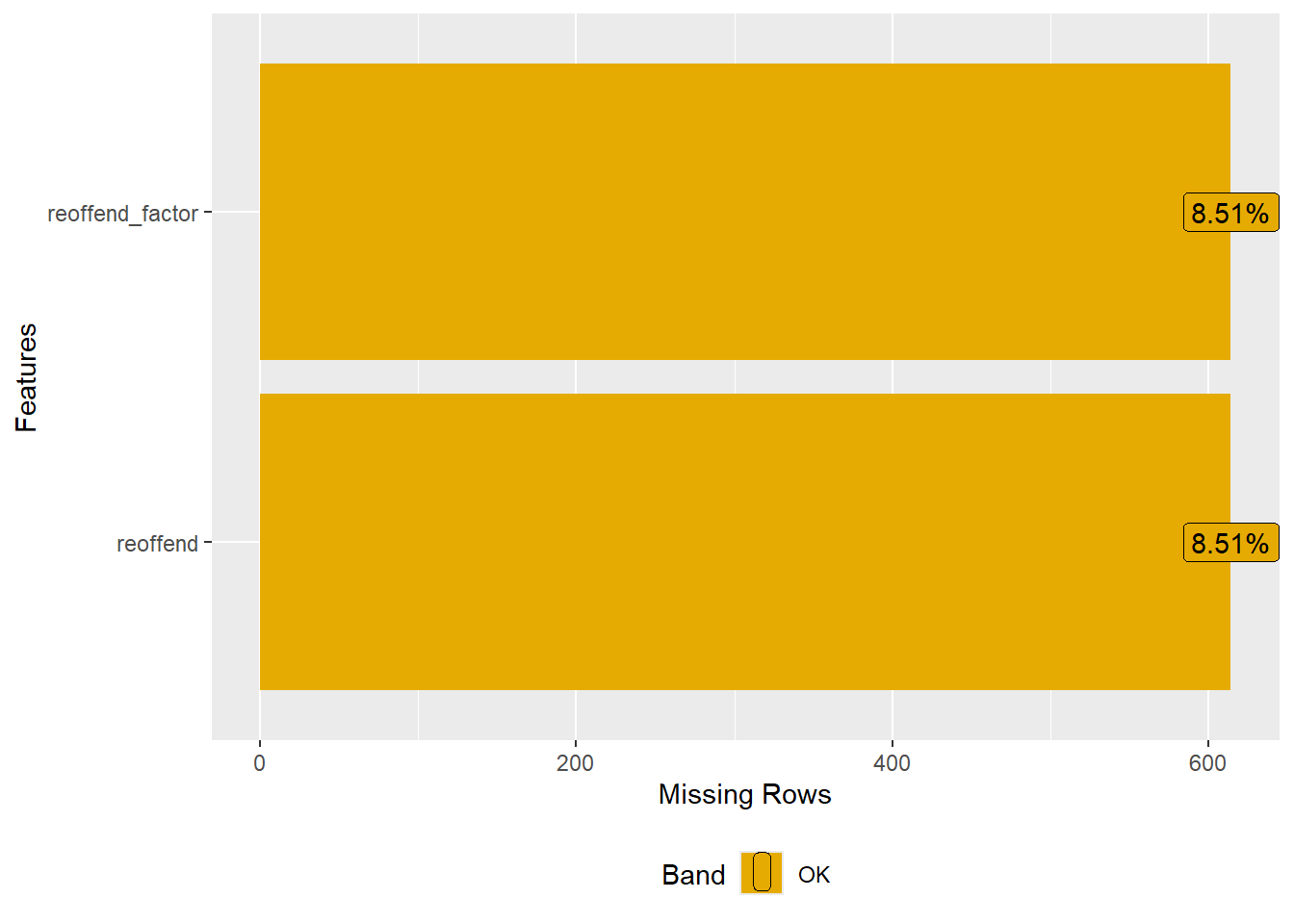
In addition, we are interested which variables contain the most missings and how many missings there are per variable. To create Figure 2 we use the function plot_missing() (package DataExplorer). With select(where(~mean(is.na(.)) > 0.5)) we can subset the data for the graph to show only variables with more than 50% missing.
# Missing value distribution
data_ess %>%
  dplyr::select(where(~mean(is.na(.)) > 0.5)) %>% # select features with more than X % missing
    plot_missing()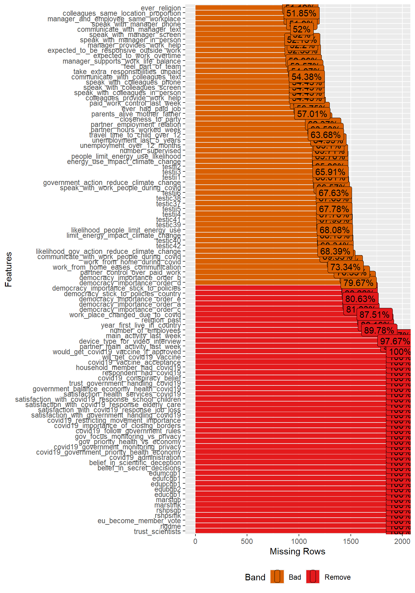
- What are the variables with the most missings? What might be the reasons for those missings?
- Can you guess what we should do with predictors/features that have a lot of missings when building ML models?
Answer(s)
- Please inspect Figure 2 to find the answer.
- Variables/features/predictors with a lot of missing data are generally not useful. Using them in our models would strongly decrease the size of our data. Consider deleting them from the dataset or imputing them. Also ask yourself why there are so many missings for some variables. Does it point to a bias of some kind or data errors?
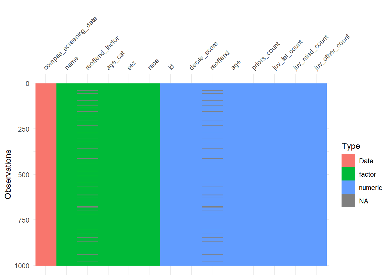
The vis_dat() function (visdat package) provides another nice graph for missings and variable types. Since we have so many variables in the dataset we select a subset (select(1:30)). In addition, we sample from the data to speed up the visualization (sample_n(1000)).
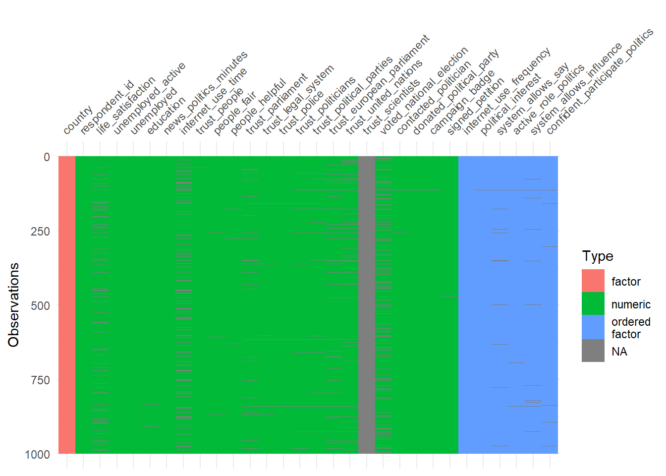
- How can we interpret Figure 3?
- Is it a problem that we sample data before visualizing it? Why not? Why yes?
- Are there any systematic patterns in the data?
Answer(s)
- Observations are shown on the y-axis. Variables are shown on the x-axis. Missings in cells are shown in gray color. Variable types are shown in red, green or blue. If a complete column is gray it means this variable is missing.
- Not a problem. The visual pattern should not change when we sample enough units and when it’s a random sample
- Most variables are numeric. Few variables are completely missing (at least among the first 30).
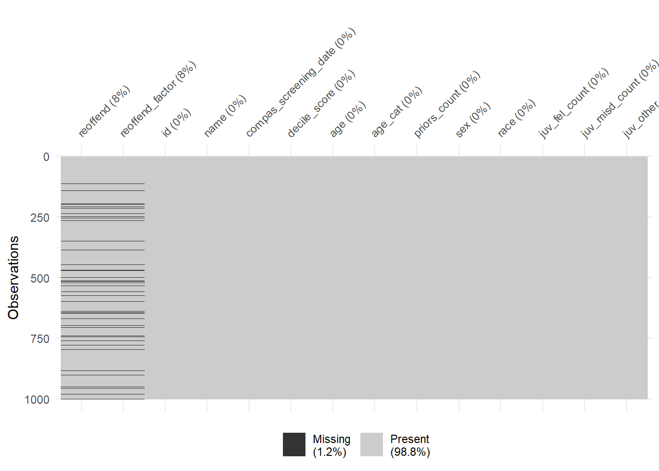
Finally, the vis_miss() function provides a graph that ignores the variable types. We can use the sort_miss = TRUE argument to visualize variables with the most missings on the left. In addition, percent missing is indicated for each variable.
# Visualize the missings across variable types
vis_miss(data_ess %>%
           select(1:30) %>%
           sample_n(1000),
           sort_miss = TRUE) # try argument "cluster = TRUE" or "sort_miss = TRUE"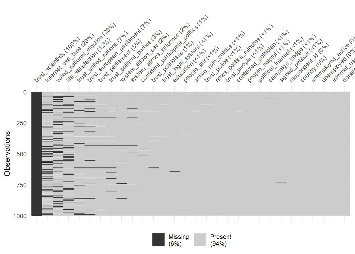
- What are the 5 variables with the most missings?
- What is shown in the legend? Why are high values problematic?
- Which types of missings are particularly bad for predictive modeling?
Answer(s)
- See 5 most-left variables in the graph.
- The legend in Figure 4 shows the overall amount of missings. High values would be problematic as only few features could be sensibly used for predictive modelling.
- Missings that are somehow systematic, e.g., systematically present for particular values of predictors/the outcome or groups of units.
Finally, gg_miss_upset() (naniar package) allows us to visualize co-occurrence of missings across variables using an UpSet plot as shown in Figure 5. For the plot we pick the variables with the most missings. We can see that most joint missings are on voted_national_election and internet_use_time.
# Visualize the missings across variable types
data_ess %>%
  select(life_satisfaction,
         internet_use_time,
        voted_national_election,
         trust_united_nations,
         trust_european_parliament,
        trust_parliament,
        trust_political_parties) %>%
  gg_miss_upset()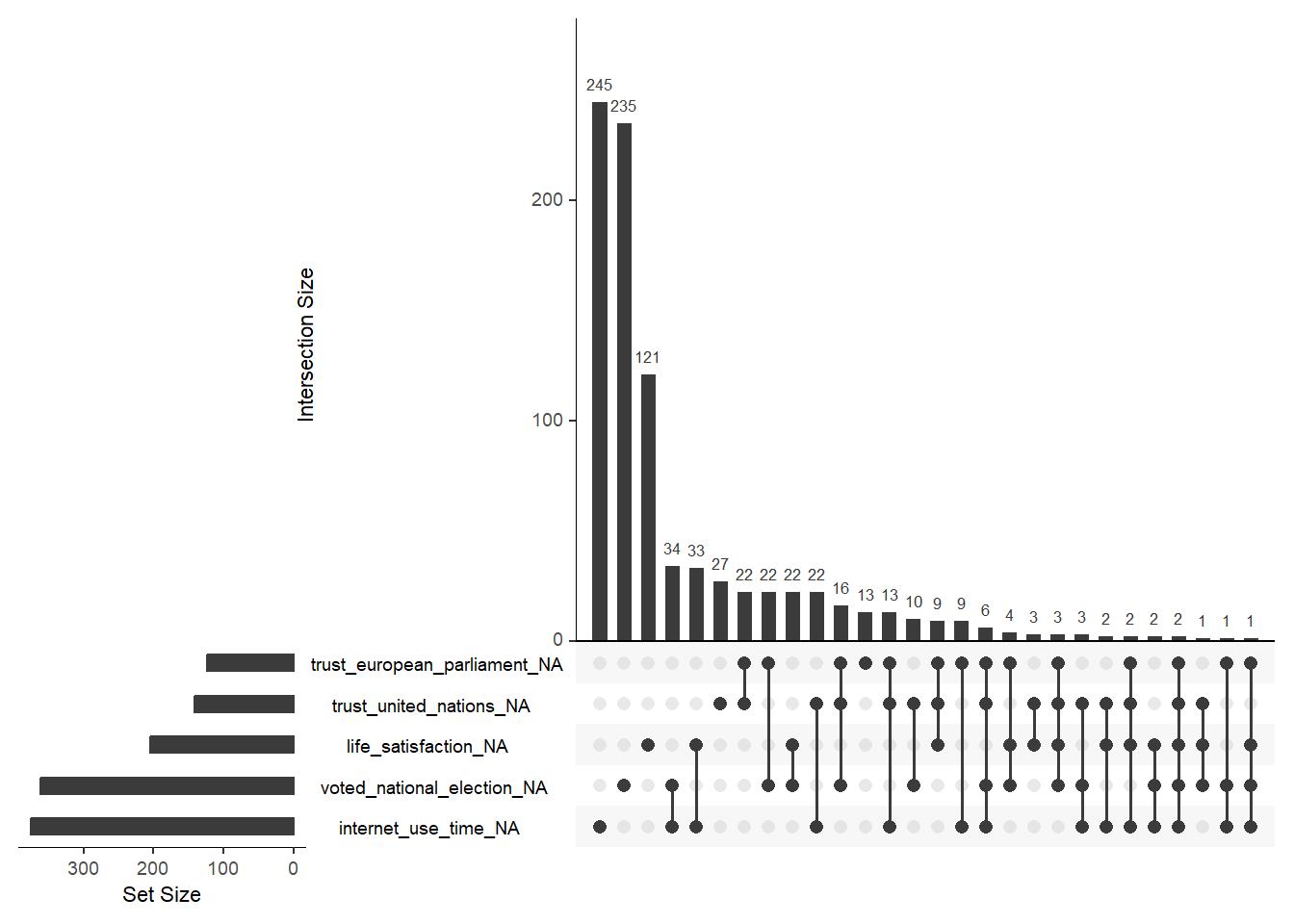
- Please inspect the graph and try to understand. Subsequently, try to explain to a (imaginary) friend how the graph works and what is shows.
- Below you find a joint-frequency table for the two variables
life_satisfactionandvoted_national_electionincluding the missings. Can you identify the missings values in the Figure 5? (to me it appears as ifgg_miss_upset()produces an error).- You can also try
data_ess %>% select(life_satisfaction, voted_national_election) %>% gg_miss_upset().
- You can also try
        FALSE TRUE
  FALSE  1445  327
  TRUE    170   35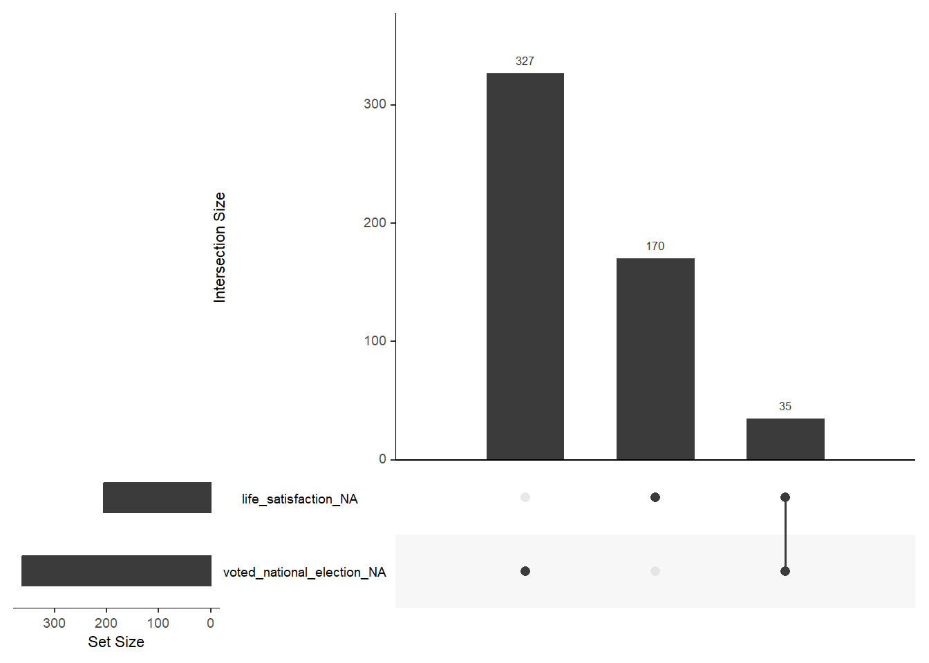
Answer(s)
- Bars display the amount of missings ordered by size. They can be both missings on a single variable (shown by a single dot below) or joint missings on 2+ variables. The latter is reflected by 2+ dots below that are connected by a line.
- Not sure what the issue is here. But the joint missings of
life_satisfactionandvoted_national_electiondo not seem to be correctly displayed in Figure 5. If that is a real error it’s a good reminder that we have to be careful using various R packages.
7.2 Compas dataset: Exercise
Now that we have learned a few useful functions to explore missings in our data we want to apply them to the Compas dataset. You can load the data using the code below. I also added the packages again:
library(tidyverse) # Load tidyverse functions

# 1.
# Load the .RData file into R
load(url(sprintf("https://docs.google.com/uc?id=%s&export=download",
                         "1gryEUVDd2qp9Gbgq8G0PDutK_YKKWWIk")))
data_compas <- data # Create new object to store data

# 2.
# install.packages(pacman)
pacman::p_load(skimr,
               modelsummary,
               DataExplorer,
               visdat,
               naniar,
               tidyverse,
               patchwork)
Please answer the following questions for the Compas dataset using functions such as plot_intro(), plot_missing(), vis_dat(), vis_miss() and gg_miss_upset():
- How many missings are there in total?
- What variables have the most missings?
- Are there any joint missings across variables? (intersectional missings)
Answer(s)
- Around 1.2%.
- The outcome variables (present in both numeric and factor format).
- Non it seems (because the outcome variables are one and the same).
8 Exercise 4: Distributions
In Section 7 we learned about functions to explore missings in datasets. Now we explore how our data is distributed.
8.1 Compas dataset: Code examples
You can load the data using the code below. I also added the packages again:
library(tidyverse) # Load tidyverse functions

# 1.
# Load the .RData file into R
load(url(sprintf("https://docs.google.com/uc?id=%s&export=download",
                         "1gryEUVDd2qp9Gbgq8G0PDutK_YKKWWIk")))
data_compas <- data # Create new object to store data

# 2.
# install.packages(pacman)
pacman::p_load(skimr,
               modelsummary,
               DataExplorer,
               visdat,
               naniar,
               tidyverse,
               patchwork)
8.1.1 The outcome: Reoffense/recidivism
For the Compas data our outcome of interest is reoffend (1 = person reoffended/recidivated, 0 = person did not reoffend/recidivate). A first step to get a better understanding of our outcome is to visualize its distribution. For a binary outcome variable we can either use a histogram or a barchart as shown in Figure 6.
library(ggplot2)
library(patchwork)
p1 <- ggplot(data = data_compas,
             aes(x = reoffend)) +
  geom_histogram(binwidth = 1) +
  scale_x_continuous(breaks = 0:1) +
  theme_light()
p2 <- ggplot(data = data_compas, aes(x = reoffend)) +
    geom_bar() +  # Keeps absolute counts on x-axis
    geom_text(aes(label = scales::percent(..prop..),
                  y = ..count..),  # Position labels above bars
              stat = "count",
              vjust = -0.5) +  # Moves text above the bars
    scale_x_continuous(breaks = 0:1) +
    ylim(0,3700) +
    theme_light() +
    labs(y = "Count")  # Keep y-axis as count


p1+p2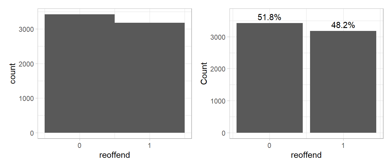
- Please summarize what you see and describe the distribution.
- Our objective is to predict whether people reoffend/recidivate. Do you think it is good/or bad that the outcome data is relatively balanced (similar amount of 0s and 1s)?
- Try using ChatGPT (or another LLM) to explain the different lines in the code underlying Figure 6.
Answer(s)
- The mass of the distribution lies in the upper half, i.e., most individuals have a life satisfaction above 5 and there is only few with values below 1. That also means we have less data/individuals with low levels of life satisfaction.
- It’s good because we have enough data samples from both categories that we can use to train our predictive model.
The great thing about ggplot2 is that we can easily create small multiples based on a third (categorical) variables simply adding, e.g., + facet_wrap(~race). In Figure 7 we visualize reoffenses across ethnic groups.
library(ggplot2)
library(patchwork)
ggplot(data = data_compas, aes(x = reoffend)) +
    geom_bar() +  # Keeps absolute counts on x-axis
    geom_text(aes(label = scales::percent(..prop.., accuracy = 0.1),
                  y = ..count..),  # Position labels above bars
              stat = "count",
              vjust = -0.5)  +  # Keep y-axis as count
  facet_wrap(~race) +  # Moves text above the bars
    scale_x_continuous(breaks = 0:1) +
    ylim(0, 2000) +
    theme_light() +
    labs(y = "Count")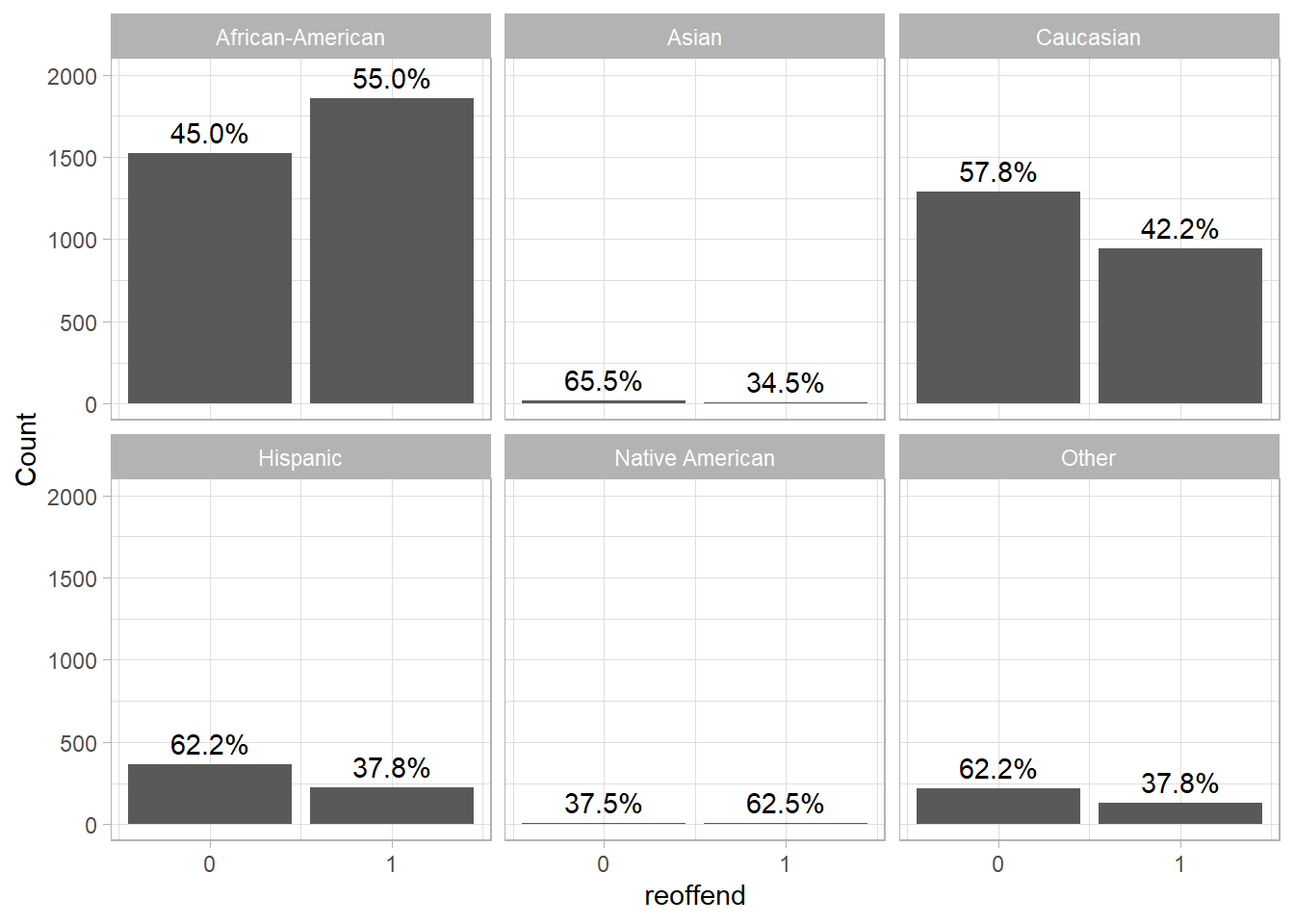
- How would you interpret Figure 7?
Answer(s)
- Generally, the rates of reoffense differ across ethnic groups. In the present data the reoffense rate is higher for African-American prisoners than for other ethnic groups.
8.1.2 The features/predictors
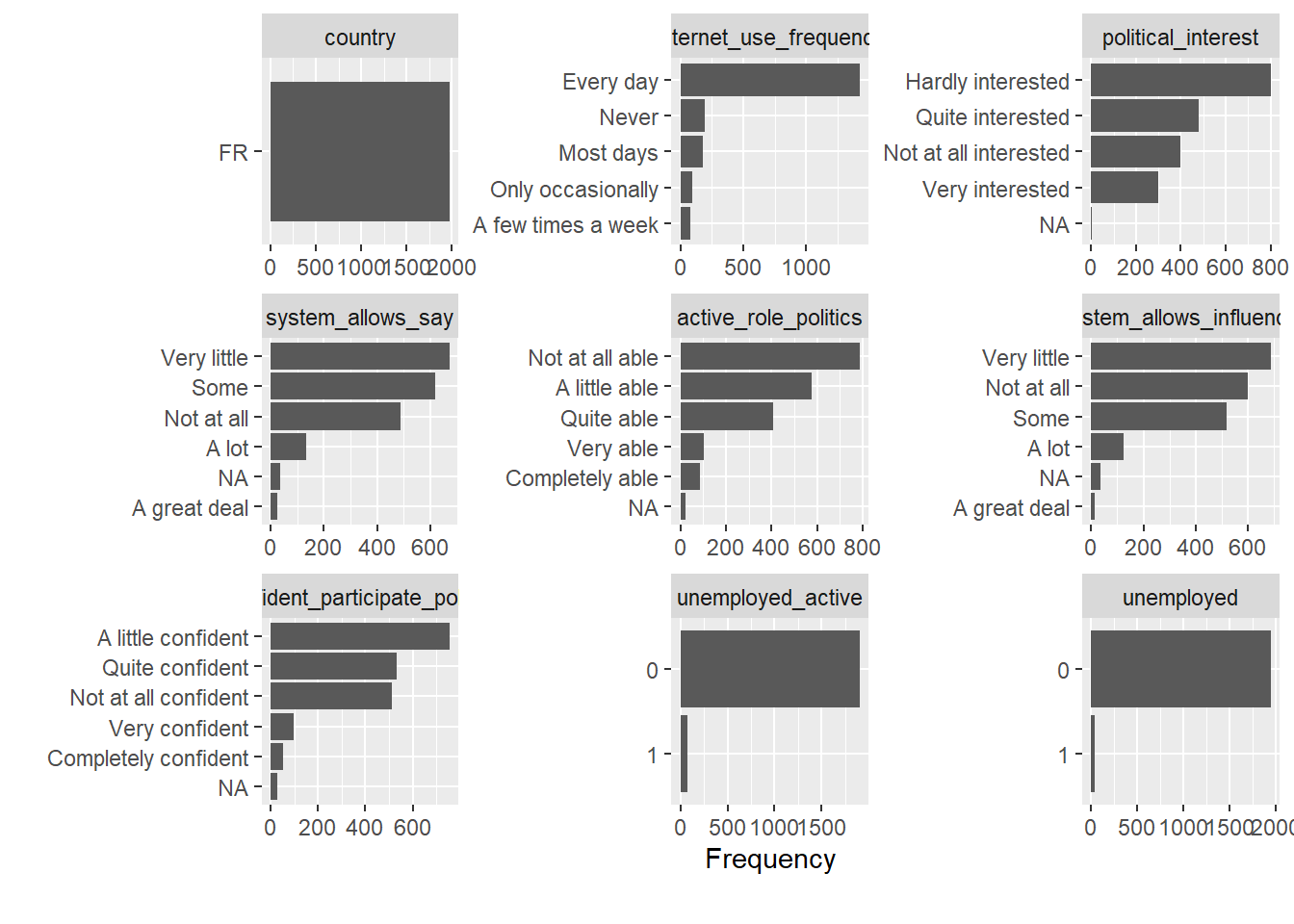
A nice little function is plot_bar() from the DataExplorer package. It identifies all the categorical/discrete variables in the dataset and creates barplots for them.
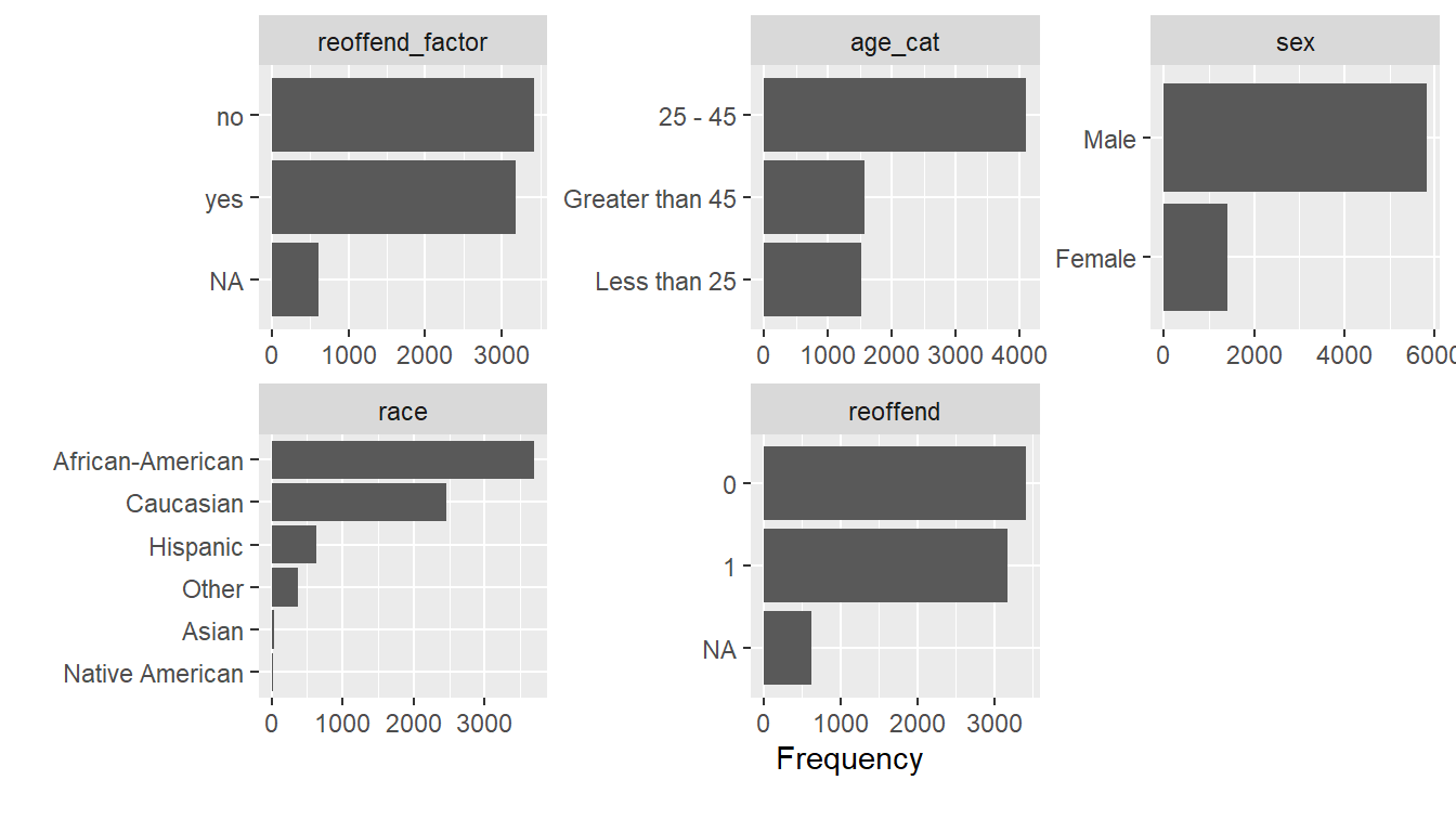
- What strikes you as interesting in Figure 8?
Answer(s)
- There are many more males, young people and African Americans in the data.
The plot_histogram() function from the DataExplorer package can then be used to visualize the continuous variables shown in Figure 9.
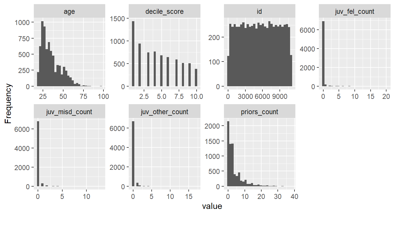
- What strikes you as interesting in Figure 9?
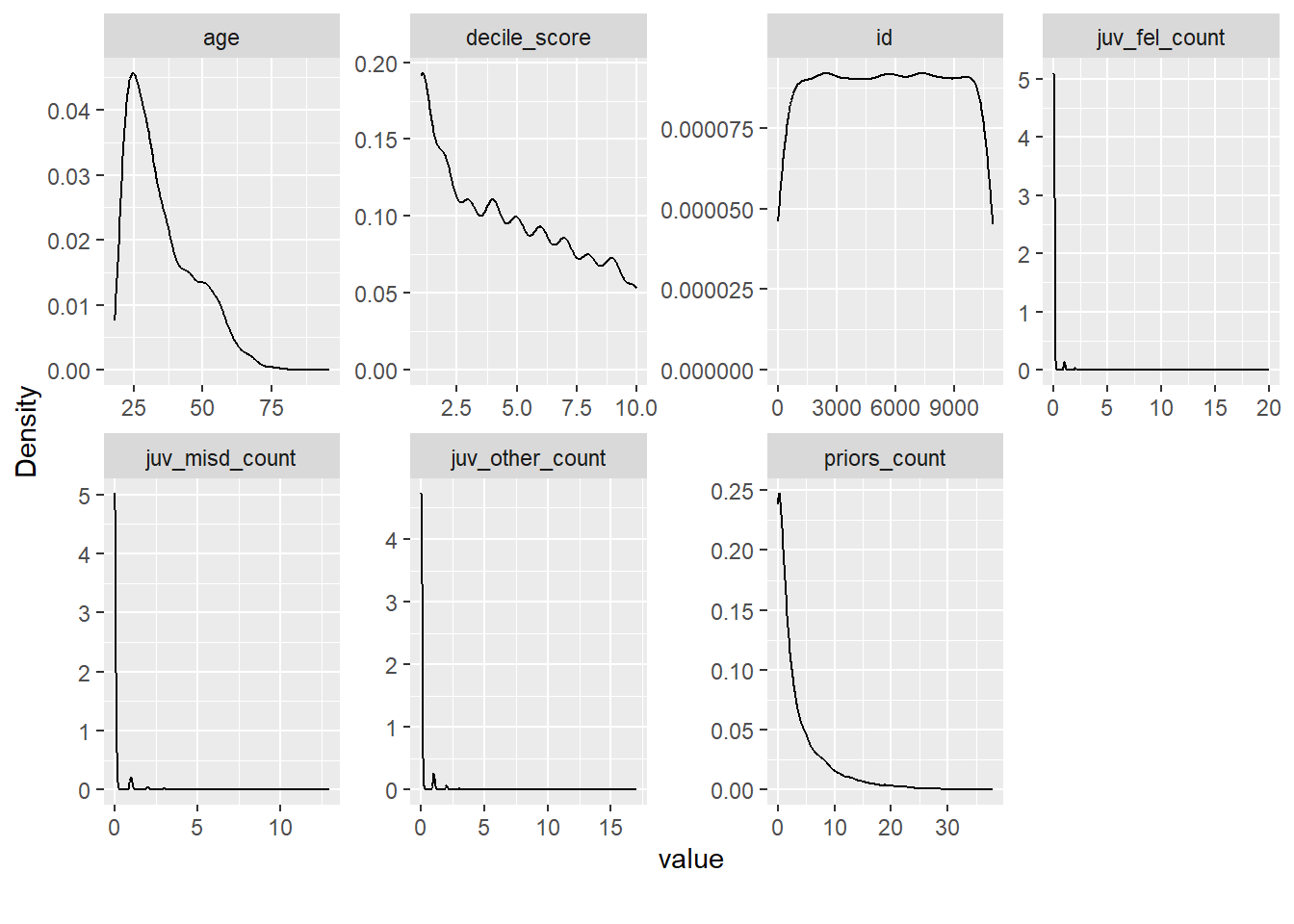
- Please also try out the alternative function
plot_density(). Which one do you prefer?
Answer(s)
There are many individuals that seemingly haven’t committed a crime before (individuals with
juv_fel_count,juv_misd_countandjuv_other_count= 0) and quite a few individuals that had a lot of prior offenses (priors_count> 5).
8.1.3 Outcome & features
So far we have focused on univariate distributions of our features (= independent variables = predictors) and the outcome. Since we want to predict reoffend we may want to explore its joint distribution with other variables, i.e., features in the dataset.
To do so we visualize distributions of features as a function of reoffend (and vice versa) for many variables, i.e., split the distributions for those that reoffended (reoffend = 1) and those that did not (reoffend = 0).
We are interested in how our outcome is distributed across continuous and categorical variables. Below we use plot_bar(by = "reoffend_factor") and plot_boxplot(by = "reoffend_factor") to generate Figure 10 and Figure 11. What can we learn from those graphs if anything?


And, Figure 12 was generated using plot_correlation() and allows us to explore how strongly our outcome (reoffend) correlates with others. Naturally, there is a strong correlation with its factor version.

Finally, there are more and more interactive tools & dashboards in R that you can use to explore data. The explore package will allow you to open an interactive application, specify a target variable (in our case reoffendresponse`) and explore other variables’ distribution as a function of its values. Please install and load the packages and try the command below.
Another option is the ExPanD() function from the ExPanDaR package. Please also try this one.
8.2 ESS dataset: Exercise
Now that we have learned a few useful functions please apply them to explore the ESS dataset and to answer the questions below. You can load the data as follows:
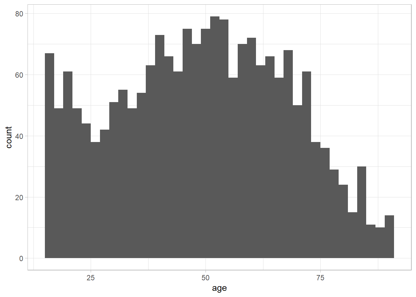
In the ESS data our outcome of interest is life_satisfaction. As a first step we visualize its distribution. Figure 13 shows both a histogram as well as a density plot.
library(ggplot2)
library(patchwork)
p1 <- ggplot(data = data_ess,
             aes(x = life_satisfaction)) +
  geom_histogram(binwidth = 1) +
  scale_x_continuous(breaks = 0:10) +
  theme_light()
p2 <- ggplot(data = data_ess,
             aes(x = life_satisfaction)) +
  geom_density(fill="gray", alpha=0.8) + # try bw = 0.4
  scale_x_continuous(breaks = 0:10) +
  theme_light()
p1+p2 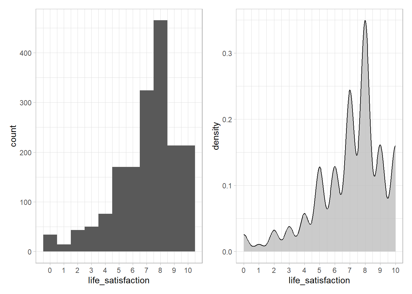
- Please summarize what you see and describe the distribution.
- Our objective is to predict life satisfaction. In how far might the distribution affect/interact with the model we can/will built and its predictions?
- Why is it a good idea to try different values for
binwidth, especially with fine-grained, continuous variables?
Answer(s)
- The mass of the distribution lies in the upper half, i.e., most individuals have a life satisfaction above 5 and there is only few with values below 1. That also means we have less data/individuals with low levels of life satisfaction.
- A predictive model will be affected by this distribution and probably learn to predict relatively high values of life satisfaction. There is less data on the lower values. Hence, any predictive model we built will also have less data to learn this data region and yield worse predictions for the corresponding individuals that have a low life satisfaction.
- Fine-grained patterns are only visible with lower binwidth, e.g., play around with the code below using
binwidthvalues of 1, 2, 5, 10, 20:
Now please use the functions we discussed Section 8.1 to explore the distributions in the ESS dataset (e.g., plot_bar(), plot_histogram(), plot_correlation()). Importantly, the ESS data contains many variables. Hence, it is recommended to generate the plots for a subset of the data by selecting variables either through their names or a numeric range as follows: data_ess %>% select(1:20) %>% plot_bar() as shown in Figure 15. Since, plot_bar() only picks out categorical variables it displays fewer than 20.
In addition, use the two interactive data explorers below to explore the relationship between life satisfaction and other variables to answer the following questions:
- How does life satisfaction depend on trust in people, satisfaction with democracy and subjective health?
- How is unemployment related to life satisfaction?
Answer(s)
- There seems to be a positive relationship with all three with subjective health mattering the most (see boxplots using
data_ess |> explore()andlife_satisfactionas a target). - There is a negative relationship between life satisfaction and unemployment.
9 Exercise 5: Recipes - Preprocessing data for predictive modeling
The objective of this exercise is to give a first quick introduction to tidymodels recipes (we will talk more extensively about them during the workshop).
What do we mean by preprocessing? Preprocessing comprises any steps that we use to transform the raw data into a format that can be used by our machine learning model. Such steps may comprise classic data management steps such as recoding variables. But they may also comprise steps that are lesser known in classic statistics and explanatory modelling.
Generally, the goal of preprocessing is to create features/predictors/variables that better capture underlying patterns and relationships in the data with the aim to provide more accurate/robust predictions. For instance, we might decide to convert a categorical variable into several dummy variables knowing that certain machine learning models can better deal with the latter. Or we might decide to create new features (e.g., a categorical age variable) from older features (e.g., age in years) because we are convinced that they work better in our prediction model (e.g., because age in years does not provide any predictive power beyond broader age categories).
Fortunately, tidymodel’s recipes provide pipeable data preprocessing steps to prepare data for modeling through socalled step_* functions. In other words, while we can data preprocessing steps “manually” ourselves, recipes provide us with an elegant way to do so efficiently across many variables.
To start, please explore the many many recipe step functions that exist in tidymodels.
- Which step function do we need to use to discretize numeric variables?
- Which step function do we need to use to center numeric variables?
- Which step function do we need to use to create dummies?
Answer(s)
step_discretize()step_center()step_dummy()
Recipes also allow us to define which types of features/predictors the transformation steps should be applied to. For instance, step_normalize(all_numeric_predictors()) identifies all numeric predictors in the dataset and normalizes them, i.e., puts them on the same scale.
- Recipes provide a set of functions to select the right variables in step functions. You can find them here as well: https://recipes.tidymodels.org/reference/index.html#basic-functions. Can you guess which variables/predictors are selected using the functions
all_factor(),all_ordered_predictors()andall_string_predictors()?
Answer(s)
all_factor()= all factor variables,all_ordered_predictors()= all predictors that are ordered factors,all_string_predictors()= all predictors that are character variables
We have learned that we can pipe different recipe steps together and specify the variables they should be applied to. Now, let’s define our recipe. We call it recipe1. Importantly, any recipe starts with the recipe() function.
Can you guess what the different step functions below do? (Hint: Try typing the object recipe1 into the console after you created it.)
library(tidymodels)
recipe1 <-
  recipe(life_satisfaction ~ ., data = data_ess) %>%
  update_role(respondent_id, new_role = "ID") %>%
  step_naomit(all_predictors()) %>%
  step_normalize(all_numeric_predictors()) %>%
  step_poly(all_numeric_predictors(), degree = 2,
            keep_original_cols = TRUE,
            options = list(raw = TRUE)) %>%
  step_dummy(all_nominal_predictors(), one_hot = TRUE)
Answer(s)
library(tidymodels)
recipe1 <- # Store recipe in object recipe 1

# Step 1: Define formula and data
    # "." -> all predictors
  recipe(life_satisfaction ~ .) %>% # Define formula; use "." to select all predictors in dataset

# Step 2: Define roles
  update_role(respondent_id, new_role = "ID") %>% # Define ID variable

# Step 3: Handle Missing Values
  step_naomit(all_predictors()) %>%

# Step 4: Feature Scaling (if applicable)
  # Assuming you have numerical features that need scaling
  step_normalize(all_numeric_predictors()) %>%

# Step 5: Add polynomials of degree 2 for all numeric predictors
  step_poly(all_numeric_predictors(), degree = 2,
            keep_original_cols = TRUE,
            options = list(raw = TRUE)) %>%

# Step 6: Encode Categorical Variables (AFTER TREATING OTHER NUMERIC VARIABLES)
  step_dummy(all_nominal_predictors(), one_hot = TRUE)
  # see also step_ordinalscore() to convert to numeric
Once we have defined a recipe we can apply it to a dataset and also inspect the result. Below we select the outcome and a few features from the ESS dataset to create a smaller dataset called data_ess_test. Then we prepare the data (prep() function) by applying the recipe to the dataset and inspect the result (we can access the results through data_ess_test$template). Please run the code below answer the following questions:
- How many variables does the dataset
data_ess_testhave before and after we apply the recipe? - How many observations does the dataset
data_ess_testhave before and after we apply the recipe? Would you say that is a good change? Can you identify the recipe step that is responsible for this change in observations? - Explore the new dataset
data_ess_test_processed$templatewithView()andstr()and compare it withdata_ess_test. What changed?
Answer(s)
- Before 5, after 22
- Before 1977, after 988; Not good because we lost around half of our observations through our preprossing steps. The step responsible is
step_naomit(all_predictors()). - All observations with missings on predictors were omitted, all numeric predictors were normalized, polynomials of degree were added for numeric predictors (age), all nominal predictors (political interest, religion) were converted to dummies.
# Create a smaller dataset
  data_ess_test <- data_ess %>%
    select(respondent_id, life_satisfaction, age, subjective_health, political_interest, religion)

# Inspect the resulting dataset
  dim(data_ess_test)
  head(data_ess_test)
  View(data_ess_test)
  str(data_ess_test)

# Define the recipe (specifying data = data_ess_test)
  recipe1 <-
    recipe(life_satisfaction ~ ., data = data_ess_test) %>%
    update_role(respondent_id, new_role = "ID") %>%
    step_naomit(all_predictors()) %>%
    step_normalize(all_numeric_predictors()) %>%
    step_poly(all_numeric_predictors(), degree = 2,
              keep_original_cols = TRUE,
              options = list(raw = TRUE)) %>%
    step_dummy(all_nominal_predictors(), one_hot = TRUE)

# Prepare the data using the recipe and assign to object data_ess_test_processed
  data_ess_test_processed <- prep(recipe1, data_ess_test)

# Access and inspect the preprocessed data with $template
  dim(data_ess_test_processed$template)
  head(data_ess_test_processed$template)
  View(data_ess_test_processed$template)
  str(data_ess_test_processed$template)
References
Footnotes
Our lab is based on Lee, Du, and Guerzhoy (2020) and on James et al. (2013, chap. 4.6.2) with various modifications. We will be using the dataset at LINK that is described by Angwin et al. (2016). We renamed the outcome variable from
is_recidtoreoffend. In addition, we delete the outcomes for some prisoners so that we can use them to test our predictions.↩︎I added some missings on the life satisfaction variable!↩︎
In the machine learning context the target population is the population is the set of units/individuals for which/whom our predictive/machine learning model should yield accurate predictions.↩︎
Various techniques can be used to handle missings and their impact on the data and accuracy of your predictive model such as imputations, deletion, etc.↩︎