| Type | Local | Global |
|---|---|---|
| Feature Effects |
|
|
| Feature Importance |
|
|
PDP + ICE + ALE
This chapter covers a family of powerful visual tools (see methods in bold in Table 1) that help us understand how a model’s predictions change as you vary a single feature.
1 Introduction: How Does One Feature Change the Outcome?
- Visualize how a feature affects the model’s prediction, not just its importance
- Strategy: isolate one feature’s effect while averaging out all others
- Analogy: A sociologist wants to know how education affects a person’s income
PDP: Shows the average effect of education on income across the entire populationICE: Shows how education affects each individual’s income trajectoryALE: more robust method that isolates the true effect of education, untangling it from confounding, correlated factors like family socioeconomic status
2 Partial Dependence Plots
2.1 Partial Dependence Plots (1)
- A global2 model-agnostic method
- PDP shows the marginal effect of a feature on model predictions (Friedman 2001)
- e.g., reveals whether relationship between outcome predictions and feature is linear, monotonic, or more complex
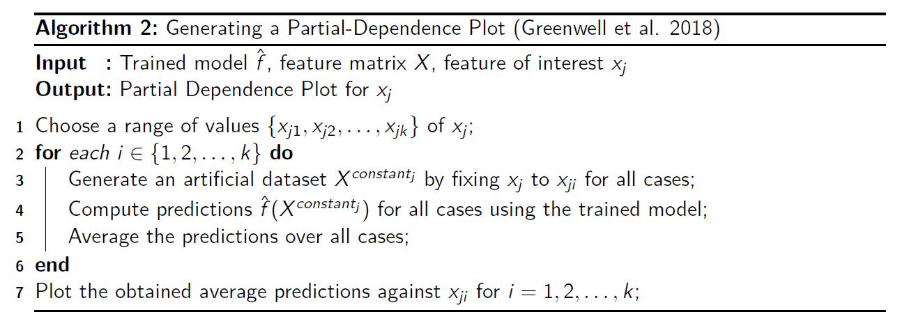
- How it works: Forces every instance in a dataset to have the same value for one feature (e.g., age = 30), averages all the predictions, and repeats this for many different values of that feature.
2.2 Partial Dependence Plots (2)
- Plotting feature effects for
black boxlearning methods (Friedman 2001)3
\[ \tilde{f}(x)=\dfrac{1}{n}\sum \limits_{i=1}^{n}f(x,x_{iC}) \]
- General idea
- Fix \(x\): PDPs isolate effect of \(x\) by fixing it at specific values across its range (e.g., a grid of values).
- Average over remaining predictors (\(x_C\)): effects of all other predictors (\(x_C\)) are marginalized out by averaging predictions across dataset
- Generate artificial datasets: Artificial datasets are created by replacing \(x\) in all observations with specific values from its range while keeping other predictors \(x_C\) unchanged
- Regression: Averaging over \(f(x,x_{iC})\) for each value of \(x\)
- Classification: Averaging over \(p\) or logit\((p)\) for each value of \(x\)
2.3 Partial Dependence Plots (3)
2.4 Partial Dependence Plots (4)
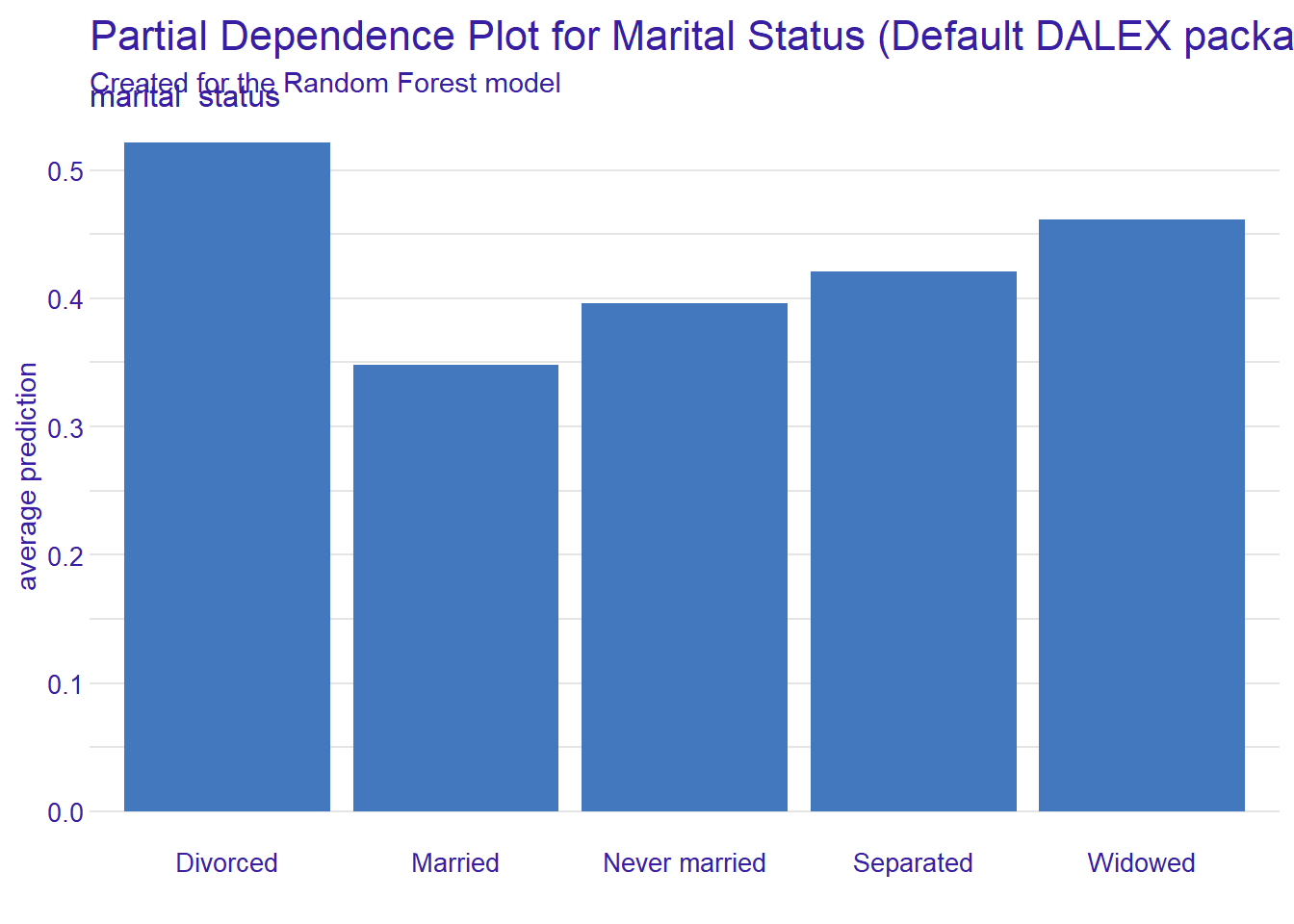
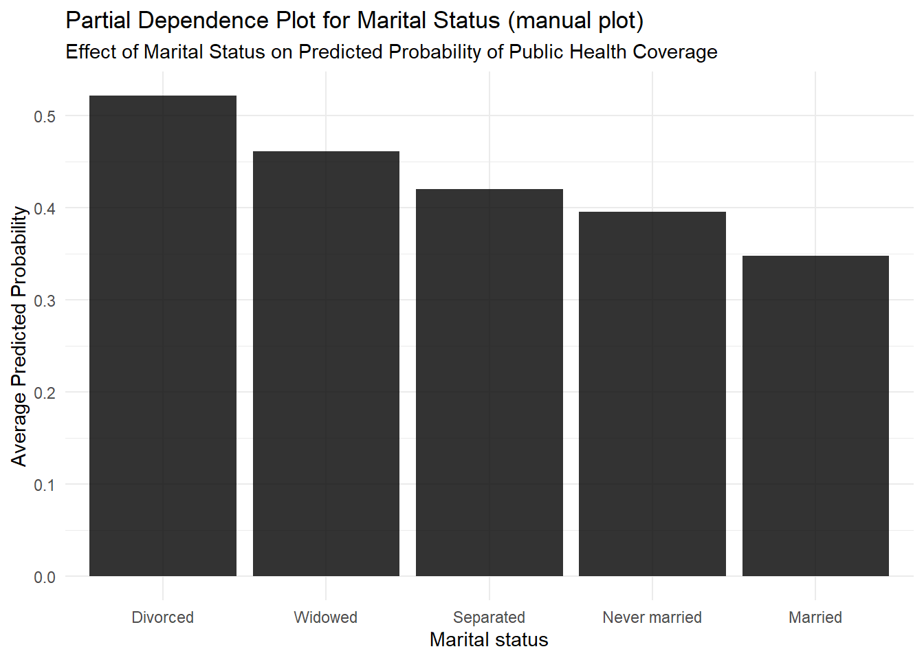
pdp_marital$agr_profiles %>%
  data.frame() %>%
  rename_with(~ str_replace_all(., "_|X", "")) %>%
  mutate(x = fct_reorder(x, yhat, .desc = TRUE))%>%
    # Now, pipe this clean, reordered data into ggplot
    ggplot(aes(x = x, y = yhat)) +
    # Create the bar plot
    geom_bar(stat = "identity", fill = "black", alpha = 0.8)  +
  theme_minimal() +
  labs(
    title = "Partial Dependence Plot for Marital Status (manual plot)",
    subtitle = "Effect of Marital Status on Predicted Probability of Public Health Coverage",
    y = "Average Predicted Probability",
    x = "Marital status"
  )
2.5 Strengths and Limitations: PDPs
3 Individual Conditional Expectation (ICE)
3.1 Individual Conditional Expectation (ICE) (1)
- ICE plots: Instead of showing one average line like PDPs, they show one line for each individual instance
- How it works: follow the same process as a PDP but doesn’t average the curves at the end
- Strength: reveal heterogeneity and hidden interaction effects
- The average effect (the PDP) might be flat, but the individual ICE lines might show that the feature has a strong positive effect for one subgroup and a strong negative effect for another
3.2 Individual Conditional Expectation (ICE) (2)
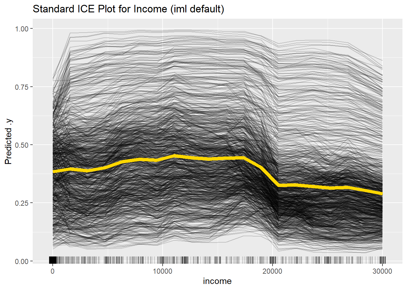
- ICE plots (Goldstein et al. 2015)
- Individual PDPs11 for all cases w/o final averaging
- One line represents the predictions for one case over the range of \(x\)
- Can uncover heterogeneous effects that are driven by interactions
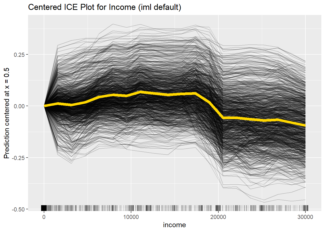
- Centered ICE plots
- Adjusts for different individual baselines
- Shows differences in prediction relative to anchor (e.g., \(x_{min}\))
3.3 ICE-Plots (3)
3.4 Strengths and Limitations: ICE (plots)
4 Accumulated Local Effects (ALE) Plots
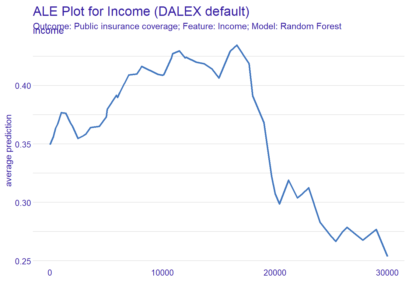
4.1 Accumulated Local Effects (ALE) Plots (1)
- With correlated features, PDPs can (artificially) construct very unlikely combinations
- ALE solution (e.g., Apley and Zhu 2016)18
- Use only cases with (similar) \(x\)-values within a given interval
- Calculate differences in predictions between upper and lower limit of this interval
\[ \hat{\tilde{f}}_{j,ALE}(x)=\sum_{k=1}^{k_j(x)}\frac{1}{n_j(k)}\sum_{i:x_{j}^{(i)}\in{}N_j(k)}\left[f(z_{k,j},x^{(i)}_{\setminus{}j})-f(z_{k-1,j},x^{(i)}_{\setminus{}j})\right] \]
\(\rightarrow\) Differences in predictions in interval \(z_{k,j}\), \(z_{k-1,j}\) for cases in neighborhood \(N_j(k)\) accumulated up to interval \(k_j\)
4.2 Accumulated Local Effects (ALE) Plots (2)
- Step 1: Slice the Feature (“Buckets”)
- First, we divide the
Incomefeature into many small, adjacent intervals (buckets). - Example: [$20k-$30k], [$30k-$40k], [$40k-$50k], [$50k-$60k], …
- First, we divide the
- Step 2: Calculate “Local Effect” (Per Bucket)
- We look at one bucket at a time, using only the real people from our data who fall into that bucket.
- Let’s use the [$30k - $40k] bucket:
- Filter: Find all people in the dataset who earn between $30k and $40k. These people have realistic combinations of other features (like age, job, etc.).
- Run “What-If”: For each of these people, we ask the model two questions, keeping all their other features the same:
- Prediction A: What’s their insurance coverage likelihood if their income was $30k?
- Prediction B: What’s their insurance coverage likelihood if their income was $40k?
- Find Difference: We calculate the change: (Prediction B - Prediction A).
- Average: We average this change across all the people in this bucket. This gives us the average “local effect” of increasing income from $30k to $40k.
- e.g., The average effect is a -0.05 drop in likelihood.
- Step 3: Accumulate the Effects (Chain the Buckets)
- Finally, we “chain” these average local effects together, one after another, to build the full plot.
- Effect at \(30k\): Avg. Effect of [$20k-$30k]
- Effect at \(40k\): (Effect at \(30k\)) + (Avg. Effect of [$30k-$40k])
- Effect at \(50k\): (Effect at \(40k\)) + (Avg. Effect of [$40k-$50k])
- …and so on.
- Finally, we “chain” these average local effects together, one after another, to build the full plot.
The result is a plot showing the total (accumulated) impact on the prediction as Income increases from its lowest value.
4.3 Accumulated Local Effects (ALE) Plots (3)
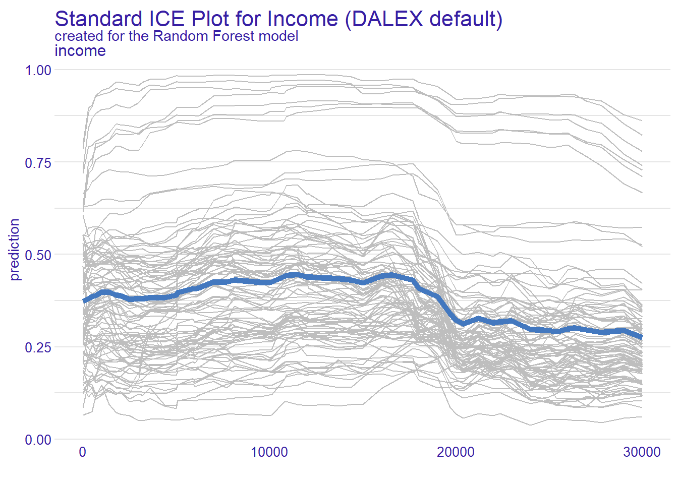
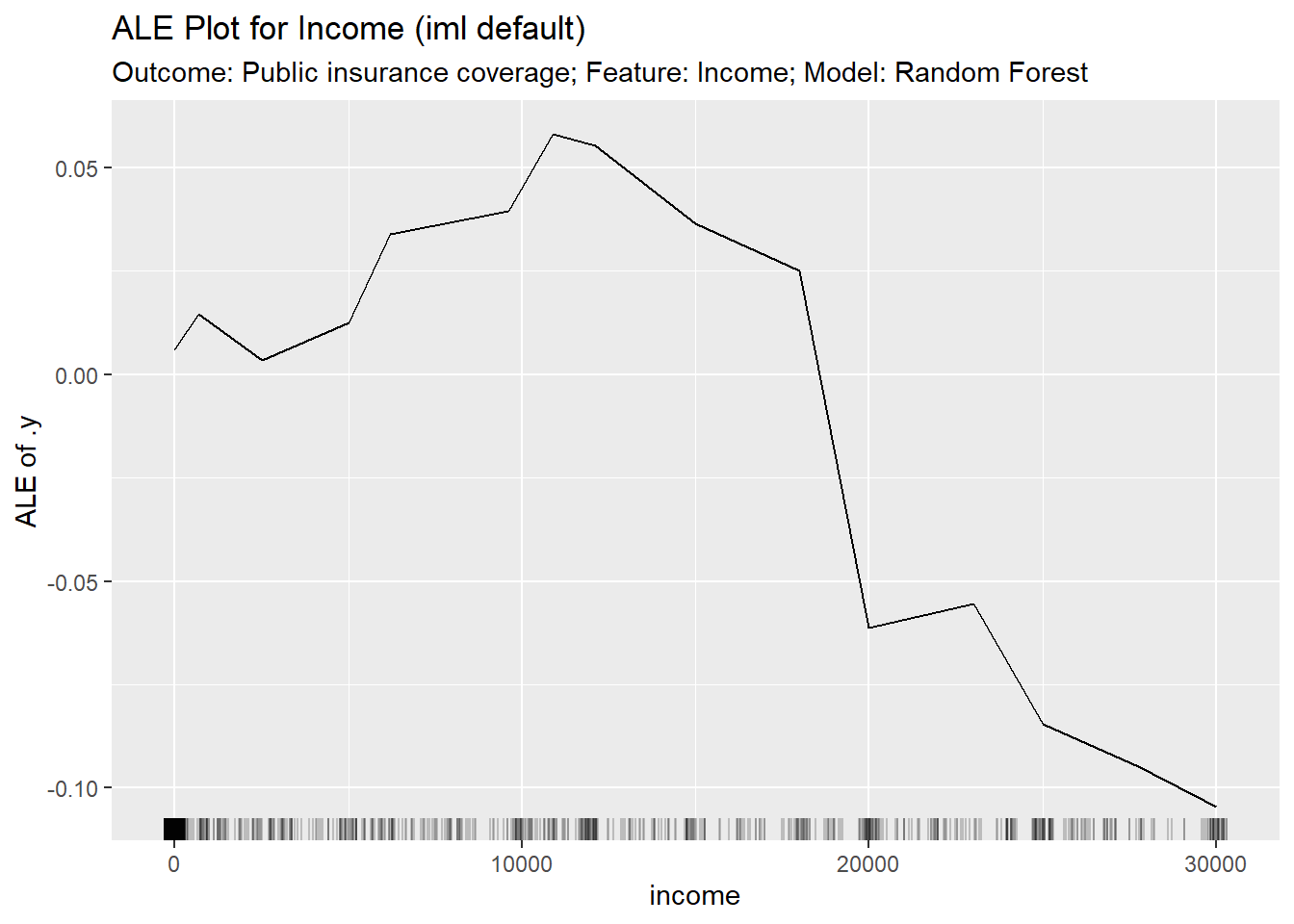
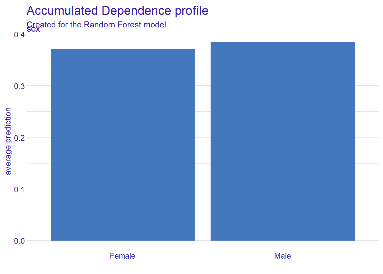
DALEXplot version in Figure 6 is uncentered by Default (how similar is it to Figure 1?)- Interpretation: shows the actual average predicted value for any given value of the feature (essentially the iml plot plus the dataset’s average prediction)19
imlcentered plot version in Figure 7- Interpretation: shows the main effect of the feature
- y-value represents the change a feature’s value introduces compared to the overall average prediction20
- Interpretation: shows the main effect of the feature
4.4 Strengths and Limitations: ALE
5 Fairness & visualizing PDP, ICE, ALE
The plots are excellent diagnostic tools for auditing a model for systemic bias
- PDP for Systemic Bias: can flag systemic bias for sensitive feature like
ageif it shows an unjustified trend, such as a sharp, adverse change in predictions for older applicants - ICE for Subgroup Fairness: reveal subgroup unfairness if the model behaves erratically for specific individuals within a protected group (average fairness \(\neq\) individual fairness)
- ALE for Unmasking Proxies: help unmask proxies
- e.g., isolate true effect of feature like
zip_codehelps to determine its role as proxy or not
- e.g., isolate true effect of feature like
6 Summary & Key Takeaways
- Methods help visualize how a feature influences model predictions
- PDP shows average effect but fails if features are correlated
- ICE shows individual effect for each instance, revealing heterogeneity
- ALE is robust alternative, showing average effect accurately even with correlated features
- Use progression (PDP → ICE → ALE) to move from a general to a more nuanced and accurate understanding of model’s behavior
7 Lab R: PDP + ICE + ALE
We will investigate a model trained to predict public health coverage to see how it uses key features to make its decisions.
- Goal: Generate, plot, and interpret PDP, ICE, and ALE plots for feasures such as age
- R Libraries:
tidymodels(for the model),DALEX(for explanations)
7.1 Prepare data and train model
Before we can explain a model, we need to build and train one using the tidymodels ecosystem.
# Load necessary libraries
library(tidyverse)
library(tidymodels)
library(DALEX)


#data <- read_csv(url(sprintf("https://docs.google.com/uc?id=%s&export=download",
#                         "1dnCK79T45Qa7RZrDg1qv6-EdGBoxCPjv")))

data <- read_csv("data/data_acspubliccoverage.csv")
data <- data %>% mutate(across(where(is.character), as.factor))

# Split the clean data
set.seed(123)
data_split <- initial_split(data, prop = 0.80, strata = public_coverage)
data_train <- training(data_split)
data_test  <- testing(data_split)

# Define the recipe and model spec
recipe_rf <- recipe(public_coverage ~ ., data = data_train) %>%
  step_impute_median(all_numeric_predictors()) %>% # Impute numeric NAs
  step_impute_mode(all_nominal_predictors())      # Impute categorical NAs
model_rf <- rand_forest(mode = "classification") %>% set_engine("ranger")

# Create and fit the workflow
workflow_rf <- workflow() %>%
  add_recipe(recipe_rf) %>%
  add_model(model_rf)
fit_rf <- fit(workflow_rf, data = data_train)
7.2 Create explainer
We’ll then create an explainer for it using the DALEX package.
# The predict function MUST match the outcome levels ("Yes", "No")
p_fun <- function(object, newdata) {
  predict(object, new_data = newdata, type = "prob")$.pred_Yes
}

# Create the explainer
explainer <- explain(
  model = fit_rf,
  data = select(data_test, -public_coverage),
  y = as.numeric(data_test$public_coverage == "Yes"),
  predict_function = p_fun,
  label = "Random Forest",
  type = "classification"
)
Preparation of a new explainer is initiated
-> model label : Random Forest
-> data : 1001 rows 18 cols
-> data : tibble converted into a data.frame
-> target variable : 1001 values
-> predict function : p_fun
-> predicted values : No value for predict function target column. ( default )
-> model_info : package Model of class: workflow package unrecognized , ver. Unknown , task regression ( default )
-> model_info : type set to classification
-> predicted values : numerical, min = 0.04400425 , mean = 0.3731088 , max = 0.9963941
-> residual function : difference between y and yhat ( default )
-> residuals : numerical, min = -0.9259466 , mean = -0.007474433 , max = 0.8980712
A new explainer has been created! 7.2.1 Task 1: The Average View (PDP)
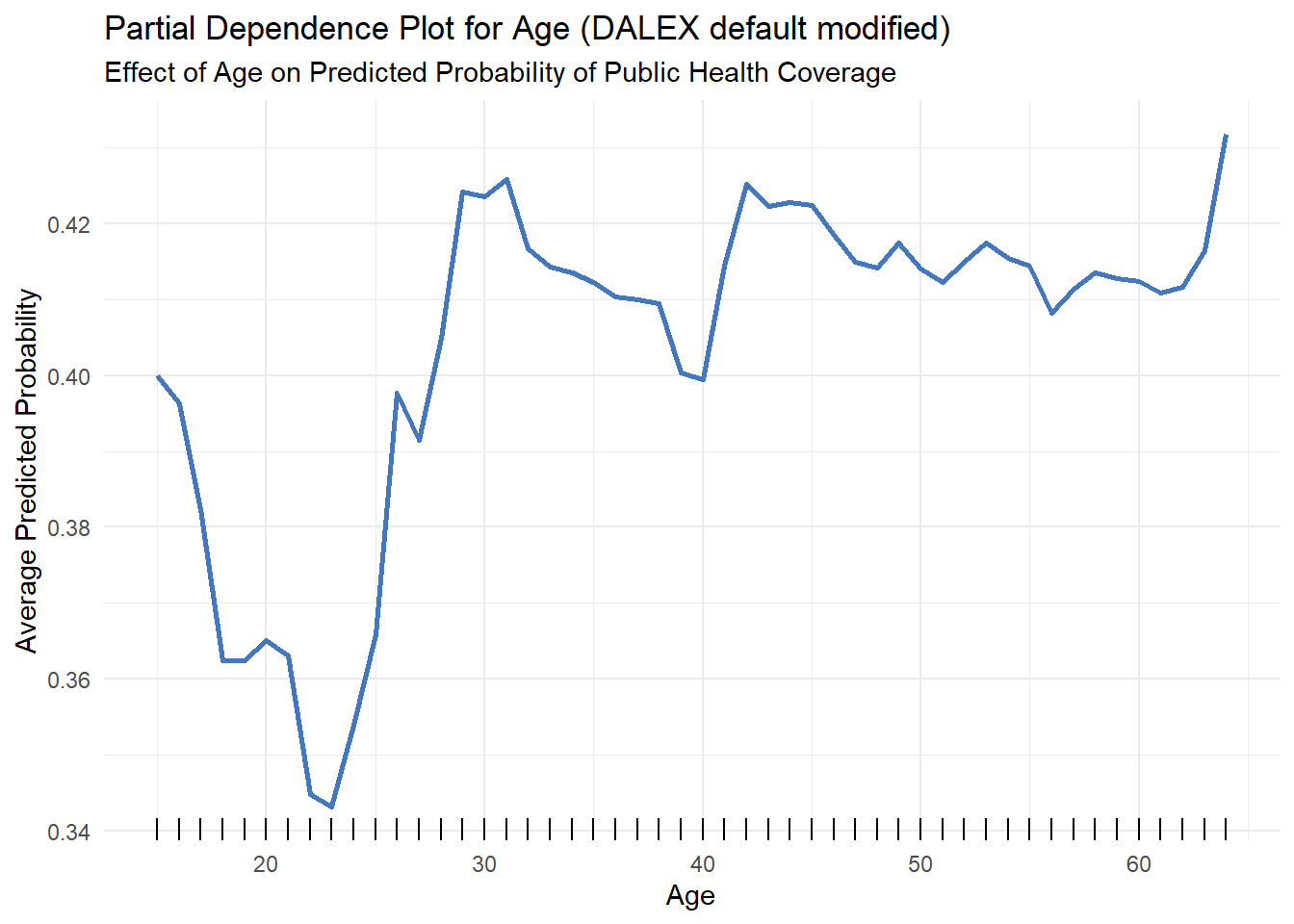
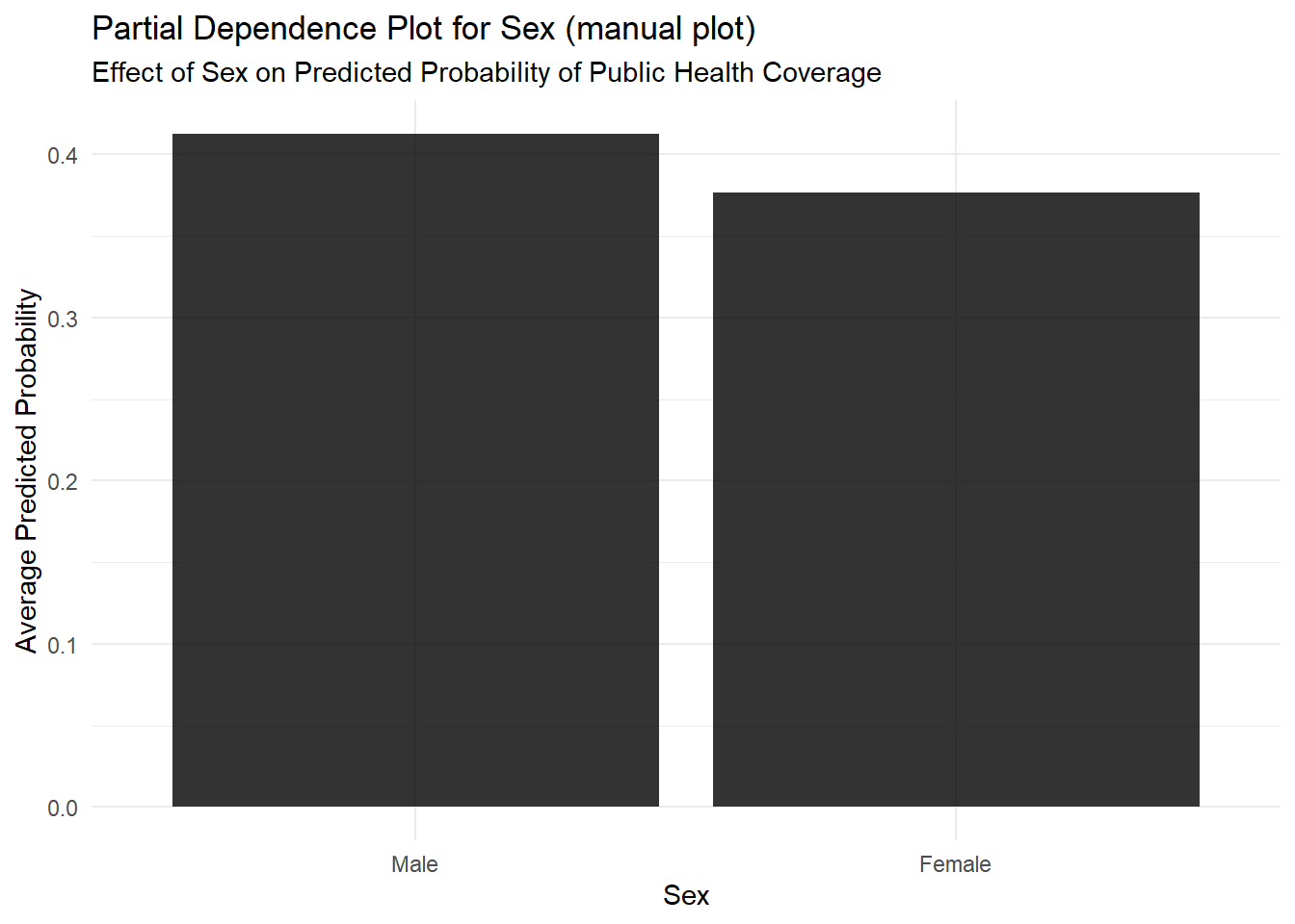
First, let’s look at the average effect of age and sex on the prediction using a Partial Dependence Plot.
- Instructions: Generate a PDP for the
agefeature. This shows its average effect on the probability of having public health coverage. - Discussion Question: Describe the relationship. At what age does the model, on average, predict the highest probability of having public coverage?
# Compute the Partial Dependence profile for the 'age' feature
model_profile(explainer, variables = "age") %>%
  plot() +
  geom_rug(data = explainer$data, aes(x = age), inherit.aes = FALSE, sides = "b") +
  theme_minimal() +
  labs(
    title = "Partial Dependence Plot for Age (DALEX default modified)",
    subtitle = "Effect of Age on Predicted Probability of Public Health Coverage",
    y = "Average Predicted Probability",
    x = "Age",
    label = ""
  ) +
  theme(
    strip.text = element_blank() # 💡 This line removes the label
  )
model_profile(explainer, variables = "sex")$agr_profiles %>%
  data.frame() %>%
  rename_with(~ str_replace_all(., "_|X", "")) %>%
  mutate(x = fct_reorder(x, yhat, .desc = TRUE))%>%
    # Now, pipe this clean, reordered data into ggplot
    ggplot(aes(x = x, y = yhat)) +
    # Create the bar plot
    geom_bar(stat = "identity", fill = "black", alpha = 0.8)  +
  theme_minimal() +
  labs(
    title = "Partial Dependence Plot for Sex (manual plot)",
    subtitle = "Effect of Sex on Predicted Probability of Public Health Coverage",
    y = "Average Predicted Probability",
    x = "Sex"
  )
7.2.2 Task 2: The Individual View (ICE)
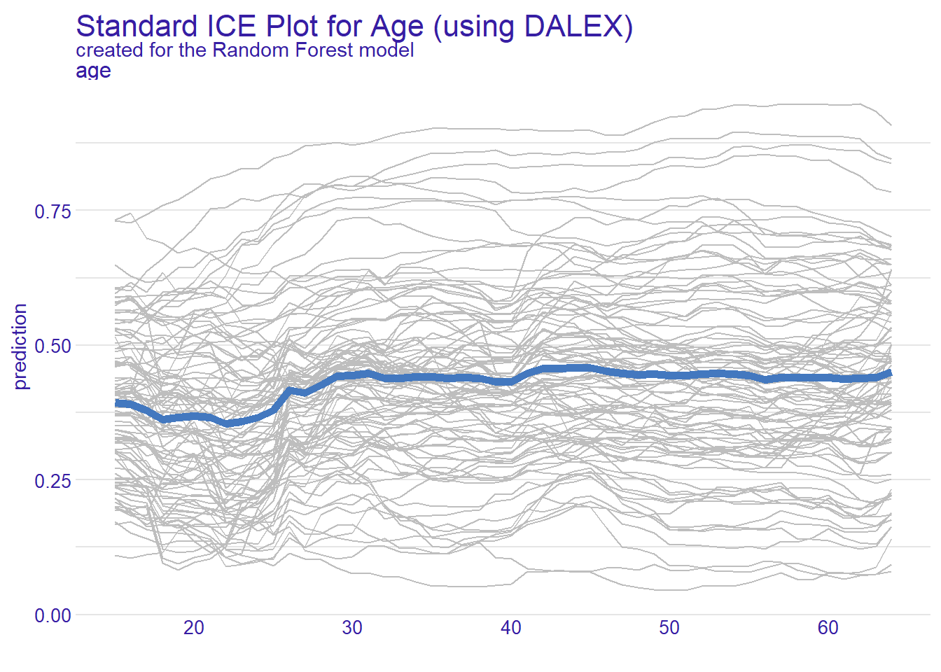
The average in Figure 8 doesn’t tell the whole story.
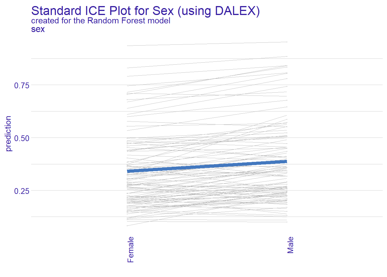
- Instructions: Look at the plot generated below (note the different y-scale). The thin grey lines are the Individual Conditional Expectation (ICE) curves, and the thick blue line is the PDP.
- Discussion Question: Do all the individual lines (ICE) follow the same trend as the average PDP line? If you see lines going in different directions, what does that suggest about the model’s behavior?
7.2.3 Task 3: The Unbiased View (ALE)
PDP can be misleading if features are correlated. Accumulated Local Effects (ALE) plots are a more robust alternative.
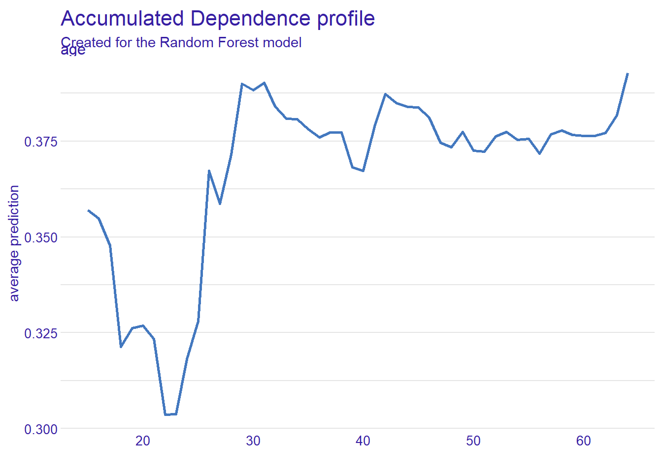
- Instructions: Generate an ALE plot for the
agefeature and compare it to the PDP from Task 1 in Figure 8. - Critical Thinking: Is the shape of the ALE plot significantly different from the PDP? If so, it suggests
ageis correlated with other features, and the PDP was likely showing a distorted picture. The ALE plot gives you a more reliable understanding of how the model truly uses a person’s age in its decision-making.
7.3 Exercise R
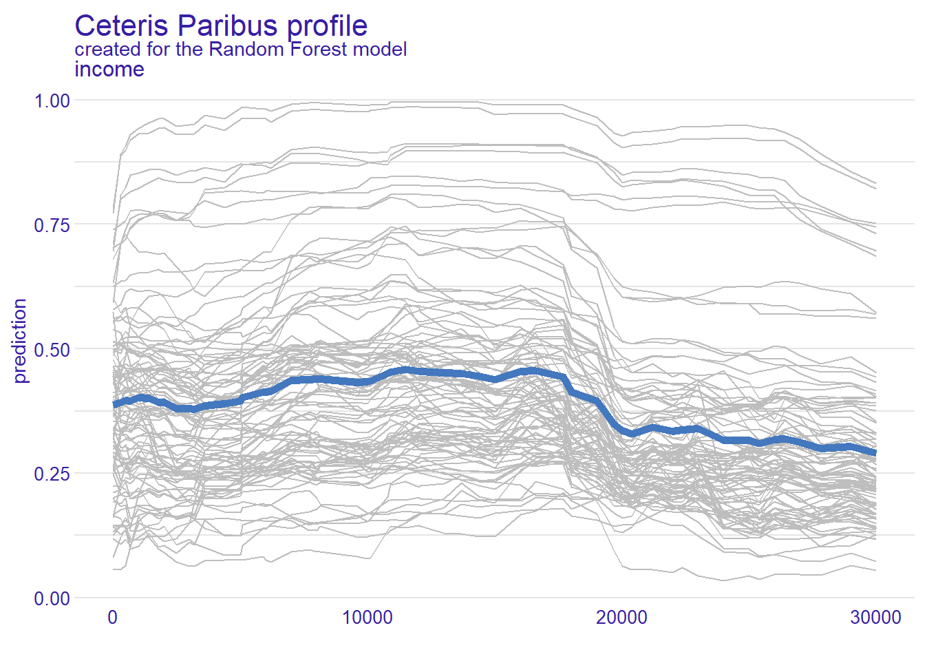
- Please use the code below but instead of exploring age now explore the
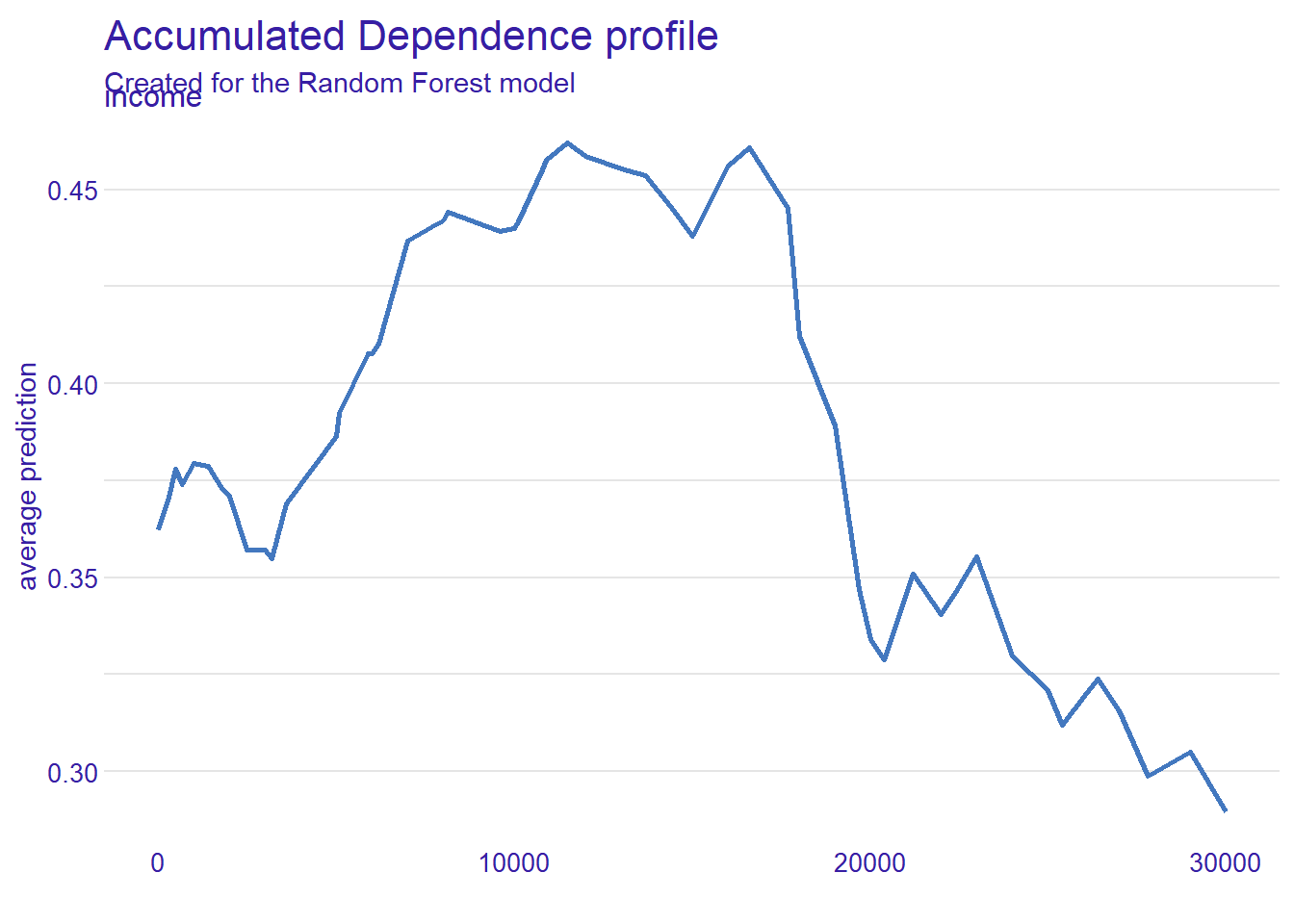
incomevariable.- PDP: Describe the relationship. At what income does the model, on average, predict the highest probability of having public coverage?
- PDP + ICEs: Do all the individual lines (ICE) follow the same trend as the average PDP line?
- ALE plot: Is the shape of the ALE plot significantly different from the PDP?
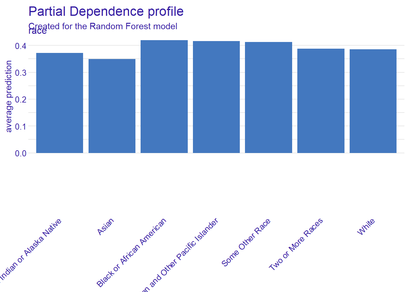
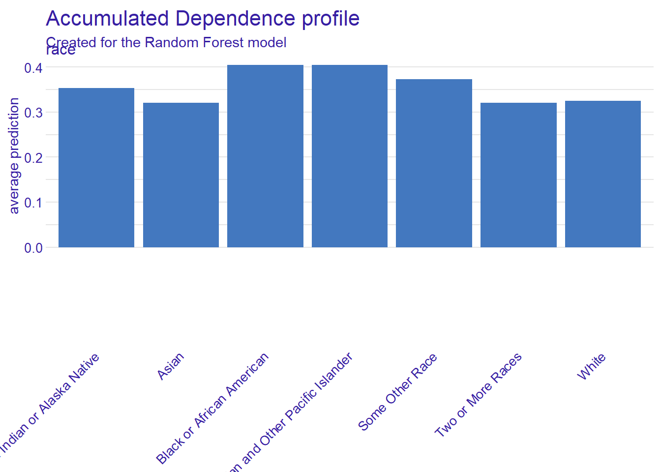
- Now pick a categorical predictor variable from the data (e.g.,
race) and create a PDP and an ALE plot for this categorical variable.- Tip: Use:
+ theme(axis.text.x = element_text(angle = 45, vjust = 0.5, hjust=1))to change the angle of categorical labels - Do you observe any interesting insights?
- Tip: Use:
- Now try to visualize several features (see
names(data)) (Tip: You can only either visualize categorical or numerical ones). Do any unexpected effects on the predictions?
# Load necessary libraries
library(tidyverse)
library(tidymodels)
library(DALEX)


#data <- read_csv(url(sprintf("https://docs.google.com/uc?id=%s&export=download",
#                         "1dnCK79T45Qa7RZrDg1qv6-EdGBoxCPjv")))

data <- read_csv("data/data_acspubliccoverage.csv")
data <- data %>% mutate(across(where(is.character), as.factor))

# Split the clean data
set.seed(123)
data_split <- initial_split(data, prop = 0.80, strata = public_coverage)
data_train <- training(data_split)
data_test  <- testing(data_split)

# Define the recipe and model spec
recipe_rf <- recipe(public_coverage ~ ., data = data_train) %>%
  step_impute_median(all_numeric_predictors()) %>% # Impute numeric NAs
  step_impute_mode(all_nominal_predictors())      # Impute categorical NAs
model_rf <- rand_forest(mode = "classification") %>% set_engine("ranger")

# Create and fit the workflow
workflow_rf <- workflow() %>%
  add_recipe(recipe_rf) %>%
  add_model(model_rf)
fit_rf <- fit(workflow_rf, data = data_train)
# The predict function MUST match the outcome levels ("Yes", "No")
p_fun <- function(object, newdata) {
predict(object, new_data = newdata, type = "prob")$.pred_Yes
}
# Create the explainer
explainer <- explain(
model = fit_rf,
data = select(data_test, -public_coverage),
y = as.numeric(data_test$public_coverage == "Yes"),
predict_function = p_fun,
label = "Random Forest",
type = "classification"
)Preparation of a new explainer is initiated
-> model label : Random Forest
-> data : 1001 rows 18 cols
-> data : tibble converted into a data.frame
-> target variable : 1001 values
-> predict function : p_fun
-> predicted values : No value for predict function target column. ( default )
-> model_info : package Model of class: workflow package unrecognized , ver. Unknown , task regression ( default )
-> model_info : type set to classification
-> predicted values : numerical, min = 0.04400425 , mean = 0.3731088 , max = 0.9963941
-> residual function : difference between y and yhat ( default )
-> residuals : numerical, min = -0.9259466 , mean = -0.007474433 , max = 0.8980712
A new explainer has been created! Answer/Solution(s)
- Exercise 1
- Exercise 2
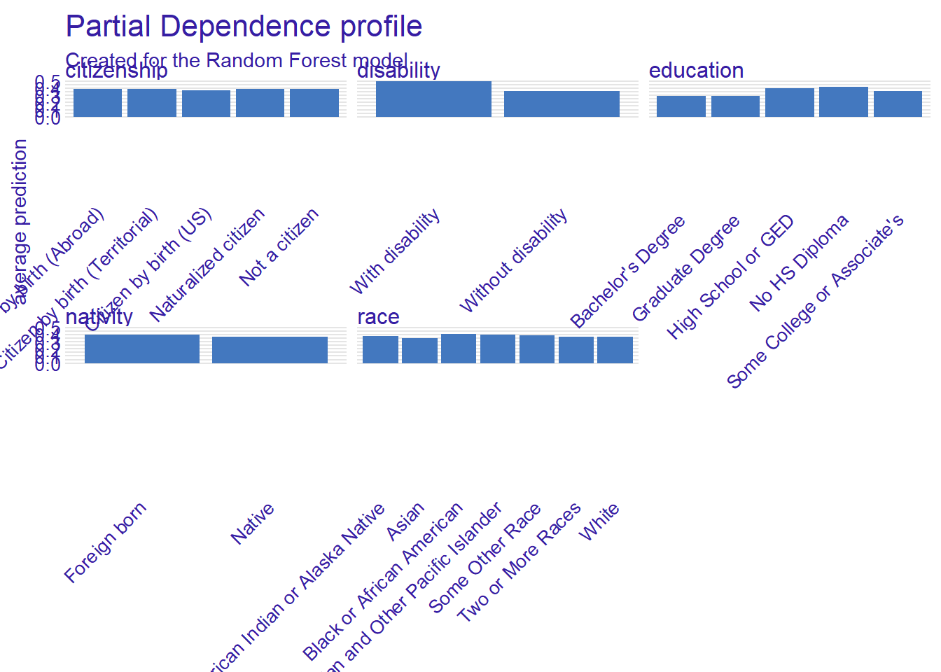
model_profile(explainer, variables = "race")$agr_profiles %>%
  data.frame() %>%
  rename_with(~ str_replace_all(., "_|X", "")) %>%
  mutate(x = fct_reorder(x, yhat, .desc = TRUE))%>%
    ggplot(aes(x = x, y = yhat)) +
    geom_bar(stat = "identity", fill = "black", alpha = 0.8)  +
  theme_minimal() +
  labs(
    title = "Partial Dependence Plot for Race (manual plot)",
    subtitle = "Effect of Race on Predicted Probability of Public Health Coverage",
    y = "Average Predicted Probability",
    x = "Race"
  ) +
  theme(axis.text.x = element_text(angle = 30, vjust = 1, hjust=1))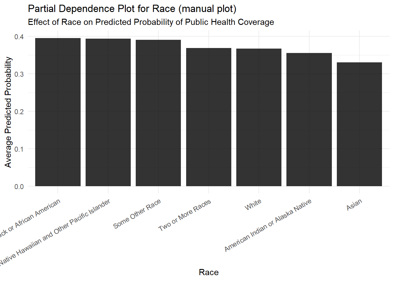
- Exercise 3
7.4 Appendix: 2d & 3d PDP plot with iml
This document demonstrates how to create an interactive 2D Partial Dependence Plot using the iml package to visualize the interaction between two numeric features.
# Load necessary libraries
library(tidymodels)
library(iml)
library(dplyr)
library(readr)
library(plotly) # The plotly package is required for 3D plots

# --- Setup: Train Model (using your previous code) ---
# Load and prepare data
data <- read_csv("data/data_acspubliccoverage.csv")
data <- data %>% mutate(across(where(is.character), as.factor))

# Split the data
set.seed(123)
data_split <- initial_split(data, prop = 0.80, strata = public_coverage)
data_train <- training(data_split)
data_test  <- testing(data_split)

# Define the recipe and model spec
recipe_rf <- recipe(public_coverage ~ ., data = data_train) %>%
  step_impute_median(all_numeric_predictors()) %>%
  step_impute_mode(all_nominal_predictors())
model_rf <- rand_forest(mode = "classification") %>% set_engine("ranger")

# Create and fit the workflow
workflow_rf <- workflow() %>%
  add_recipe(recipe_rf) %>%
  add_model(model_rf)
fit_rf <- fit(workflow_rf, data = data_train)
7.4.1 Creating the 2D Plot
Now, we will create the iml::Predictor object and then calculate the FeatureEffect for the age and income features together.
# 1. Create the iml Predictor object for the fitted workflow
p_fun <- function(object, newdata) {
  predict(object, new_data = newdata, type = "prob")$.pred_Yes
}

predictor <- Predictor$new(
  model = fit_rf,
  data = select(data_test, -public_coverage),
  y = data_test$public_coverage,
  predict.function = p_fun,
  type = "classification"
)

# --- THE KEY STEP ---
# 2. Calculate the Partial Dependence for TWO numeric features
# Provide both names as a character vector to the 'feature' argument.
pdp_3d <- FeatureEffect$new(
  predictor,
  feature = c("age", "income"),
  method = "pdp"
)

# 3. Plot the result. iml will automatically create an interactive 3D surface plot.
plot(pdp_3d)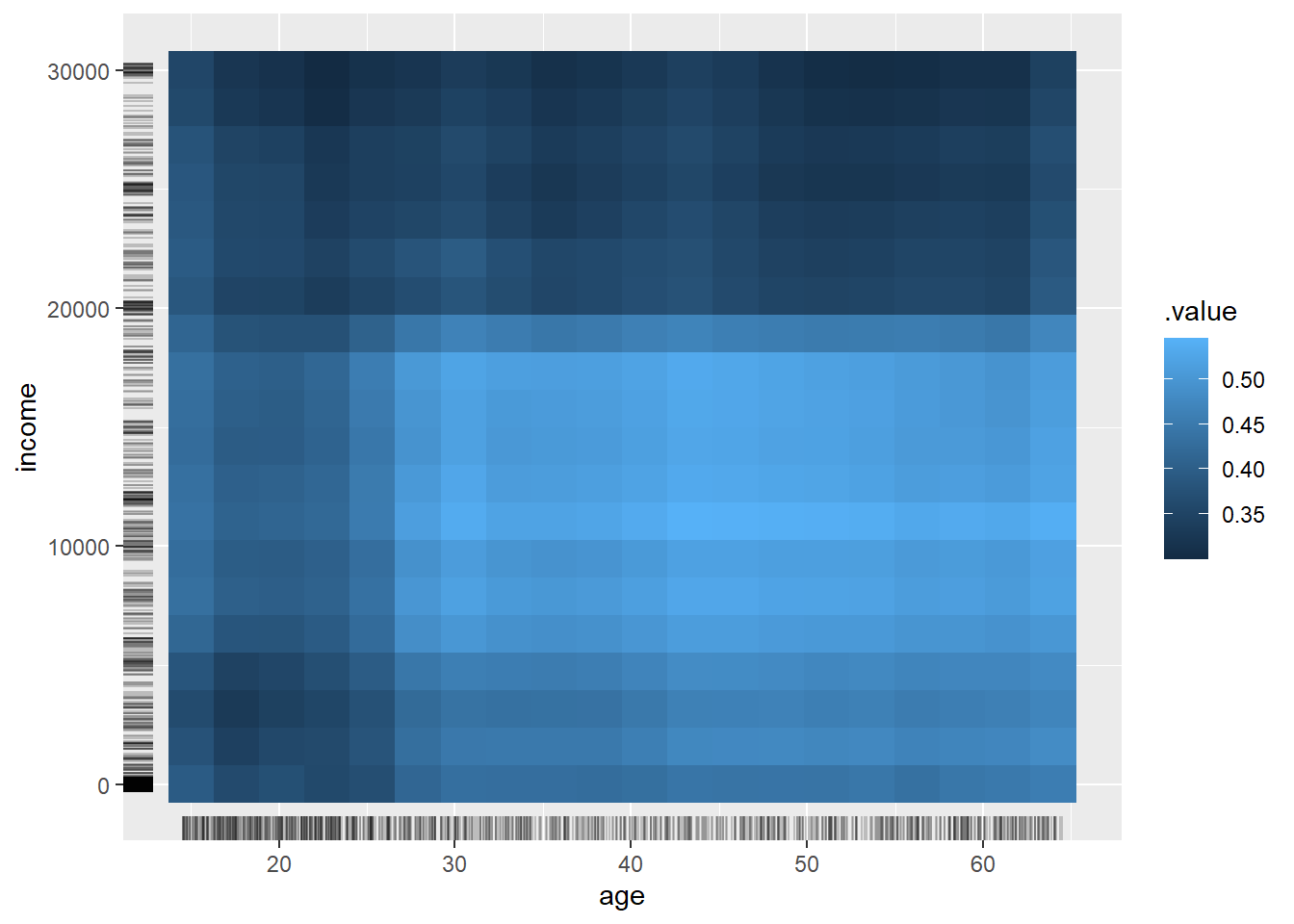
An a 3D version using plotly.
# 2. Calculate the Partial Dependence for TWO numeric features (same as before)
pdp_3d_data_obj <- FeatureEffect$new(
  predictor,
  feature = c("age", "income"),
  method = "pdp"
)

# --- THE FIX IS HERE: Build the plot manually ---

# 3. Extract the results data from the iml object
pdp_results <- pdp_3d_data_obj$results

# 4. Reshape the data into a matrix for the z-axis (height) of the surface
# plotly needs the z-values in a matrix where rows correspond to x and columns to y.
z_matrix <- pdp_results %>%
  select(age, income, .value) %>%
  pivot_wider(names_from = income, values_from = .value) %>%
  select(-age) %>%
  as.matrix()

# 5. Get the unique x and y values for the axes
x_axis_vals <- unique(pdp_results$age)
y_axis_vals <- unique(pdp_results$income)

# 6. Create the 3D surface plot using plot_ly()
plot_ly(
  x = ~x_axis_vals,
  y = ~y_axis_vals,
  z = ~z_matrix
) %>%
  add_surface(
    colorbar = list(title = "Predicted Prob."),
    colorscale = "Viridis"
  ) %>%
  layout(
    title = "3D Partial Dependence Plot for Age and Income",
    scene = list(
      xaxis = list(title = "Age"),
      yaxis = list(title = "Income"),
      zaxis = list(title = "Predicted Probability")
    )
  )
8 Lab Python
Overview: https://docs.google.com/document/d/1mUDDwZMZR-9aRZhvSzDEC85sXmwOMB4Y8okMXbehytY/
References
Apley, Daniel W, and Jingyu Zhu. 2016. “Visualizing the Effects of Predictor Variables in Black Box Supervised Learning Models.” arXiv [Stat.ME].
Friedman, J. 2001. “Greedy Function Approximation: A Gradient Boosting Machine.” Annals of Statistics 29 (5): 1189–1232.
Goldstein, Alex, Adam Kapelner, Justin Bleich, and Emil Pitkin. 2015. “Peeking Inside the Black Box: Visualizing Statistical Learning with Plots of Individual Conditional Expectation.” Journal of Computational and Graphical Statistics: A Joint Publication of American Statistical Association, Institute of Mathematical Statistics, Interface Foundation of North America 24 (1): 44–65.
Molnar, Christoph. 2022. “Interpretable Machine Learning.” https://christophm.github.io/interpretable-ml-book/.
Molnar, Christoph, Gunnar König, Julia Herbinger, Timo Freiesleben, Susanne Dandl, Christian A Scholbeck, Giuseppe Casalicchio, Moritz Grosse-Wentrup, and Bernd Bischl. 2022. “General Pitfalls of Model-Agnostic Interpretation Methods for Machine Learning Models.” In xxAI - Beyond Explainable AI, 39–68. Springer International Publishing.
Footnotes
Global interpretation methods: describe the expected behavior of the entire model with respect to the whole data distribution. Local explanation methods: explain individual predictions or classifications. Feature importance methods: quantify the contribution of a feature to the model performance (e.g. via a loss function) or to the variance of the prediction function. Effect methods: indicate the direction and magnitude of a change in predicted outcome due to changes in feature values (Molnar et al. 2022, 40–41).↩︎
“considers all instances and gives a statement about the global relationship of a feature with the predicted outcome.” (Molnar 2022)↩︎
Partial dependence function: \(\tilde{f}(x)\) is the partial dependence of the feature \(x\); \(n\) is the number of samples in the dataset; \(f(x, x_{iC})\) is the model prediction when \(x\) is fixed to a specific value, while \(x_{C}\) (the complement of \(x\)) contains the actual values from the dataset for other predictors↩︎
The partial dependence function at a particular feature value represents the average prediction if we force all data points to assume that feature value. Lay people usually understand the idea of PDPs quickly.↩︎
If the feature is not correlated with other features, the PDP perfectly represents how that feature influences the prediction on average. This is more complicated when features are correlated.↩︎
Partial dependence plots are easy to implement.↩︎
This is the biggest issue. It assumes the feature of interest is not correlated with others. If features are correlated (e.g., height and weight), the PDP creates unrealistic data instances (e.g., 2m tall, 50kg person) by averaging over the marginal distribution, which biases the plot.↩︎
PDPs only show the average effect. If a feature has a positive effect for half the data and a negative effect for the other half, the PDP could show a flat line, misleadingly suggesting the feature has no effect. Plotting individual (ICE) curves can help reveal this.↩︎
Meaningful visualization is realistically limited to two features. This is not a fault of PDPs, but of our inability to visualize or comprehend more than 3 dimensions.↩︎
Plots that don’t show the underlying data distribution (e.g., with a histogram or ‘rug’) can be misleading, as you might overinterpret regions where there is almost no data.↩︎
Partial dependence plots↩︎
One line represents the predictions for a single data instance if you vary the feature of interest.↩︎
ICE curves are excellent at revealing heterogeneous effects (i.e., relationships that differ across individual data points), which are hidden by average-based methods like PDPs.↩︎
ICE curves can only display one feature meaningfully. Displaying two features would require drawing many overlaying surfaces, making the plot unreadable.↩︎
If many ICE curves are drawn, the plot can become a “spaghetti plot” where you cannot see anything. This is usually solved by adding transparency or drawing only a sample of the lines.↩︎
If the feature of interest is correlated with other features, some points along the lines might represent invalid or unrealistic data points (according to the joint feature distribution).↩︎
With so many individual lines, it might be difficult to see the average effect. This is easily solved by plotting the Partial Dependence Plot (PDP) on top of the ICE curves.↩︎
Notation: \(x_j\) is the feature of interest; \(N_j(k)\) represents neighborhood of cases where \(x_j\) values fall within interval \([z_{k-1,j}, z_{k,j}]\); \(f(z_{k,j}, x_{\setminus j}^{(i)})\) is the model prediction when \(x_j\) is fixed at \(z_{k,j}\) and other features remain unchanged (\(x_{\setminus j}\) represents all features except \(x_j\)); \(n_j(k)\) is the number of observations in interval \(k\); \(k_j(x)\) is the index of the interval containing \(x\).↩︎
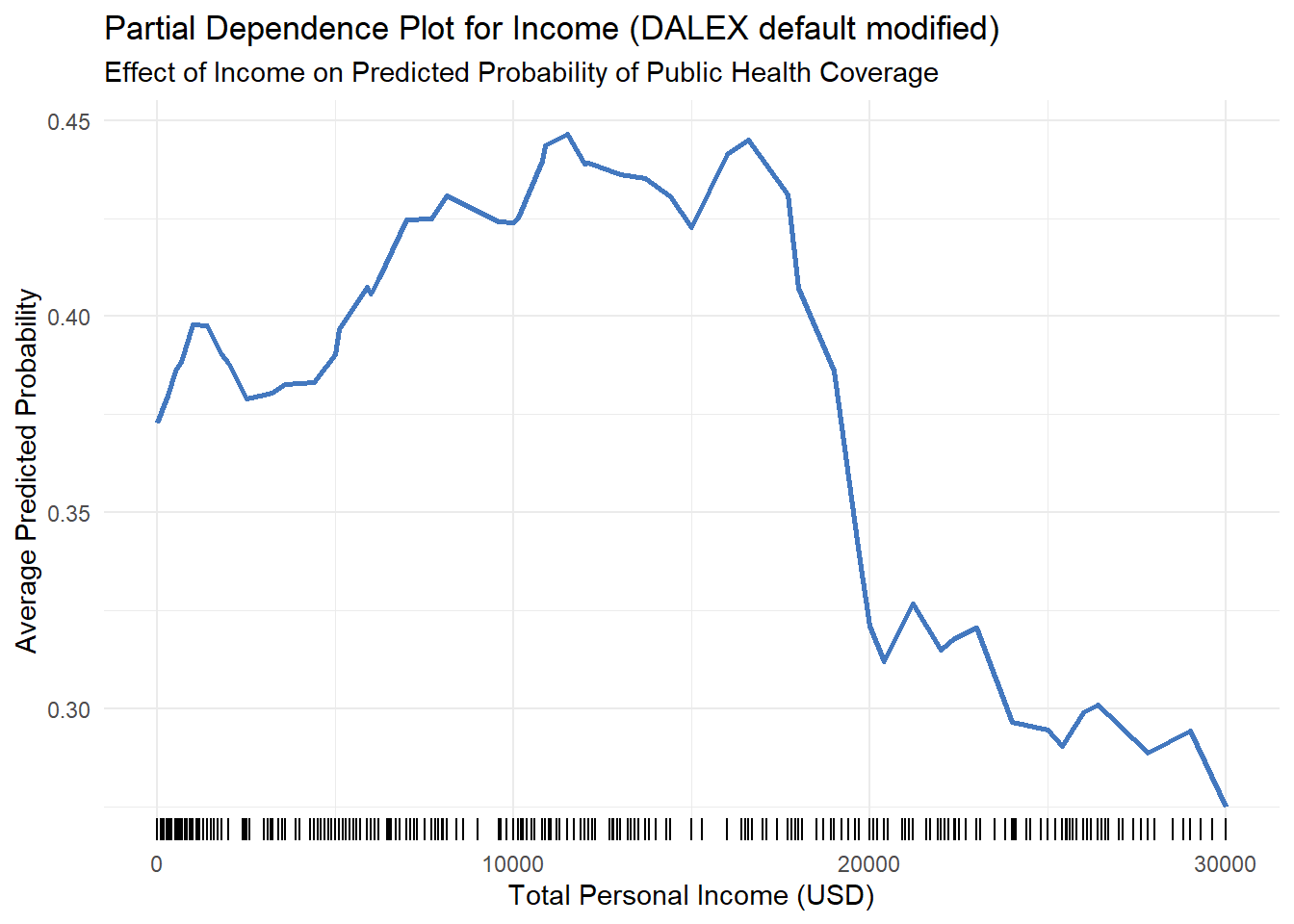
For people with an income of 15,000, the average predicted probability of having public coverage is about 0.43 (or 43%).↩︎
e.g., an income of 11,000 increases the predicted probability of public coverage by about 0.06 (or 6 percentage points) compared to the average.↩︎
ALE plots are “unbiased” and provide correct results even when features are correlated, avoiding the primary failure of PDPs which average over unrealistic data combinations. Why? ALE works correctly with correlated features because they calculate the feature’s effect locally, using only realistic data. ALE respects the natural relationships in your data, while PDPs ignore them and create impossible scenarios.↩︎
When features are correlated, you cannot interpret the curve as the effect of gradually changing a feature. The effect is computed locally within intervals, which contain different data instances.↩︎
ALE plots do not have an equivalent to Individual Conditional Expectation (ICE) curves, making it harder to spot heterogeneous effects across individual instances.↩︎
There is no perfect way to set the number of intervals. Too few intervals can smooth out and hide the true model complexity, while too many can make the plot shaky and unstable.↩︎
The logic and implementation of ALE plots are much more complex and less intuitive than those for Partial Dependence Plots.↩︎